


Table of Contents Show
In the world of architecture, presentation is just as crucial as the design itself. Our architectural presentation boards serve as a visual and technical representation of our projects, helping clients visualize the final product. These boards are not just about showcasing our designs but also about communicating our vision effectively and succinctly.
Creating a compelling architectural presentation board involves more than just placing drawings and images; it requires a strategic arrangement of elements that highlight the project’s strengths. We’ll explore essential tips that ensure our presentation boards stand out, making them not only informative but also inspirational.
From choosing the right color palette to adjusting the layout for clarity, each decision plays a pivotal role in how our project is perceived. Let’s dive into how we can enhance our architectural presentations to capture the attention and imagination of our audience.

Understanding Architecture Presentation Boards
Definition and Purpose
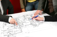
Architecture presentation boards serve as the visual interface between an architect’s ideas and the audience, whether they are clients, professors, or competition judges. These boards aren’t just about displaying drawings and diagrams; they’re curated tools that communicate the essence and details of architectural projects. The main purpose of these boards is to convey concepts clearly and compellingly, ensuring every viewer grasps the project’s scope and intent. They integrate various elements such as sketches, CAD drawings, and 3D models, alongside succinct textual descriptions that articulate the project’s vision and goals.
Different Types of Presentation Boards
Presentation boards can vary significantly depending on their intended use and the stage of the project they represent. Here are a few common types:
- Concept Boards: These focus on the initial ideas and inspirations of the project. Concept boards are often more abstract, emphasizing mood, theme, and the overall feel of the design.
- Design Development Boards: These boards provide a more detailed look into the project, showcasing specific design solutions and detailed descriptions of materials and structures that will be used. They are crucial for stages where feedback from clients or judges might influence the final design.
- Final Presentation Boards: Used commonly in final reviews, these encompass detailed and refined representations of the project. They include highly detailed drawings, realistic renders, and comprehensive project information that showcases the project in its entirety.
Each type is tailored to communicate effectively at different points in a project’s lifecycle, ensuring that the key messages are delivered optimally for maximum impact and understanding.

Designing Your Architecture Presentation Board
Effective Layout and Structure
When we design our architecture presentation boards, the organization and flow of information are crucial. An effective layout ensures that clients understand project details without overwhelming them. It’s best to start by dividing the board into sections that clearly segregate project phases, design elements, and key features. Utilize grids to align content neatly, which improves the overall readability. Architectural drawings, elevations, and site plans should be positioned logically with descriptive text placed adjacent to corresponding visuals to create a seamless flow between elements. Strong borders and subtle background colors can further define different sections, simplifying the navigation through concepts.

Visual Hierarchy and Aesthetics
The visual appeal of your architecture presentation board cannot be understated. It communicates the quality and precision of your work. To establish a successful visual hierarchy, prioritize elements based on their importance. Start with the most critical elements like architectural sketches and 3D renders. These should catch the viewer’s eye first. Use size, color contrasts, and placement to guide the audience’s attention through the board. Typography plays a huge part in aesthetics; choose fonts that are professional yet readable. Consistency in font styles, sizes, and color themes across the board not only beautifies the presentation but also reinforces brand identity. Integration of white space around text boxes and images can prevent the board from feeling cluttered, ensuring every design detail is distinguishable and appreciated.
Selecting Images and Graphics
Choosing the right images and graphics is essential for illustrating the narrative of your architectural project. Opt for high-resolution images that showcase significant aspects of your design. Ensure these images are professionally captured to reflect the true essence of your project, considering various angles and lighting conditions to enhance architectural features effectively. Graphics should not only be visually engaging but also informative, including diagrams that explain complex structures or innovative construction techniques. When incorporating these visuals, balance them with textual information to create a comprehensive understanding of the project without overwhelming the viewer with technical details. Moreover, care should be taken to maintain a coherent visual style throughout the presentation to maintain a professional and polished look.

Technical Considerations
Size, Orientation, and Medium
When selecting the size and orientation of architecture presentation boards, it’s crucial to understand how these elements can impact the viewer’s perception and interaction with the content. The standard dimensions for presentation boards in architecture often range from A3 to A0 sizes. Picking the right size involves considering the detail of the project and the space available for the display. If the details are intricate, larger boards, like A0 or A1, offer ample space to showcase them sufficiently.
Orientation plays another significant role, with portrait orientations suited for projects that benefit from a vertical flow, often used for elevation displays or sectional views. Landscape orientations, meanwhile, provide a broader horizontal field, making them ideal for site plans or panoramic renders. If allowed the liberty to choose, align your decision with what best showcases the project narrative.
For mediums, digital boards have gained popularity due to their versatility and dynamic nature. They allow for interactive elements like video or animations, which traditional prints can’t accommodate. Whether you choose a print or digital medium, ensure it complements the overall presentation style and context.

Color Schemes and Backgrounds
The choice of color schemes and backgrounds can profoundly affect the visual impact of an architecture presentation board. To maintain clarity and ensure that architectural designs stand out, our advice is to use subdued background colors or simple gradients that don’t overshadow the content.
Monochromatic color schemes offer a sleek and unified look, while a grayscale background with a pop of a single color can highlight key areas like landscaping or special materials. For presentations where impact is imperative, use contrasting colors wisely to direct focus and evoke emotions aligned with the design’s intent.
We recommend avoiding overly saturated backgrounds or busy patterns, as they can cause viewer strain and detract from the information presented. The aim is to enhance the viewer’s ability to quickly comprehend the design concept and its merits.
Text and Typography Tips
The text in an architecture presentation board serves to inform and guide the audience through the project. It’s essential to select fonts that are readable and match the project’s tone. Sans-serif fonts like Arial or Helvetica remain popular for their clarity and modern appearance; however, serif fonts like Times New Roman can be appropriate for more formal or traditional presentations.
Keep font sizes consistent and large enough to be legible from a normal viewing distance. Titles and headers can be larger to create visual hierarchy, guiding the viewer’s eye across the board in a logical and aesthetically pleasing manner.
Alignment of text should not disrupt the visual flow of the board. Align text left or justify it to maintain a clean, organized layout. It’s also advisable to limit text blocks to short paragraphs or bullet points to enhance readability and retain viewer interest.
By adhering to these technical considerations, we ensure that every architectural presentation board we design not only conveys the essential information but does so in a manner that is both professional and aesthetically compelling.

Tips for a Successful Presentation
Knowing Your Audience
Understanding your audience is crucial for tailoring your architectural presentation board. Whether you’re presenting to a client or a group of stakeholders, grasp their interests, expertise, and expectations. Clients might prefer a focus on aesthetic and functional aspects of the design, while technical experts may appreciate detailed explanations of structural solutions. By identifying the audience’s primary concerns and knowledge level beforehand, you can adjust the complexity of your content, ensuring it’s both accessible and informative.
Storytelling Through Design
Storytelling through design captivates and engages your audience, making your presentation memorable. Use your architectural presentation board to narrate the project’s concept, evolution, and potential impact. Highlight key elements like the inspiration behind the design or how certain challenges were overcome creatively. These stories not only make the presentation more relatable but also help in demonstrating the thought process and innovation behind the project, thus providing a deeper connection with the audience.
Maintaining Simplicity and Focus
While it’s tempting to display all aspects of your design, maintaining simplicity and focus enhances the effectiveness of your presentation board. Concentrate on the most critical elements that represent the essence of your project. Avoid cluttering the board with too much information, which can distract from the main points. A clean and focused presentation helps the audience appreciate the core aspects of your design without being overwhelmed. Use visual hierarchy wisely, emphasizing important details through size, color, and placement, guiding the viewer’s eye across the board in a deliberate way.

Conclusion
In wrapping up, we solidify our insights on mastering the art of architectural presentation boards. Echoing the discussion on the importance of audience orientation, professionals must tailor their boards to resonate with the specific preferences and technical understanding of their viewers. For instance, a non-technical audience appreciates simplified explanations and fewer technical terms, while a more specialized group benefits from detailed, jargon-rich content.
Continuing with the storytelling aspect, it’s crucial to chart a narrative that captivates and maintains viewer interest. This involves not only the arrangement of visual elements but also the strategic flow of content which guides the viewers’ eyes across the board in a seamless narrative form.
Keeping presentation boards simple yet impactful can’t be overstated. Highlight key architectural elements and avoid cluttering the space with excessive information. This allows for a clearer focus and a stronger impact on the audience, ensuring the essential messages stand out.
In light of this, using visual hierarchies effectively, we establish a connection between text alignment, graphic harmony, and overall layout design. This harmony creates a visually pleasing and coherent board that enhances both understanding and aesthetic appeal.
By integrating these elements—audience-specific content, compelling storytelling, strategic simplicity, and visual coherence—we enhance our ability to deliver architectural presentations that are not only informative but also engage and leave a lasting impression on the audience.
- architectural presentation skills
- architectural presentation techniques
- architecture board design tips
- architecture board examples
- architecture board ideas
- Architecture presentation boards
- architecture presentation tips
- best practices architecture boards
- crafting architecture presentation
- creative architecture presentations
- designing architecture boards
- effective architecture boards
- effective architecture presentation
- how to make architecture presentation boards
- presentation board layout for architects
- presentation boards for architects


Leave a comment