

Table of Contents Show
Architecture & Graphic Design: Visual Communication isn’t a niche mash‑up, it’s how places talk. When we walk into a museum, catch a train, or find a clinic, we’re guided by form, color, light, symbols, and words working in sync. We design for that conversation. In this text, we unpack how architecture and graphic design intersect to create spaces that are legible, expressive, and humane.
The Intersection Of Architecture And Graphic Design
Shared Goals: Function, Form, And Human Experience
We’re chasing the same outcome: a clear, meaningful human experience. Architecture frames movement, access, and atmosphere: graphic design clarifies intent, priority, and meaning. Put together, they orchestrate behavior, where we look, how we move, what we recall.
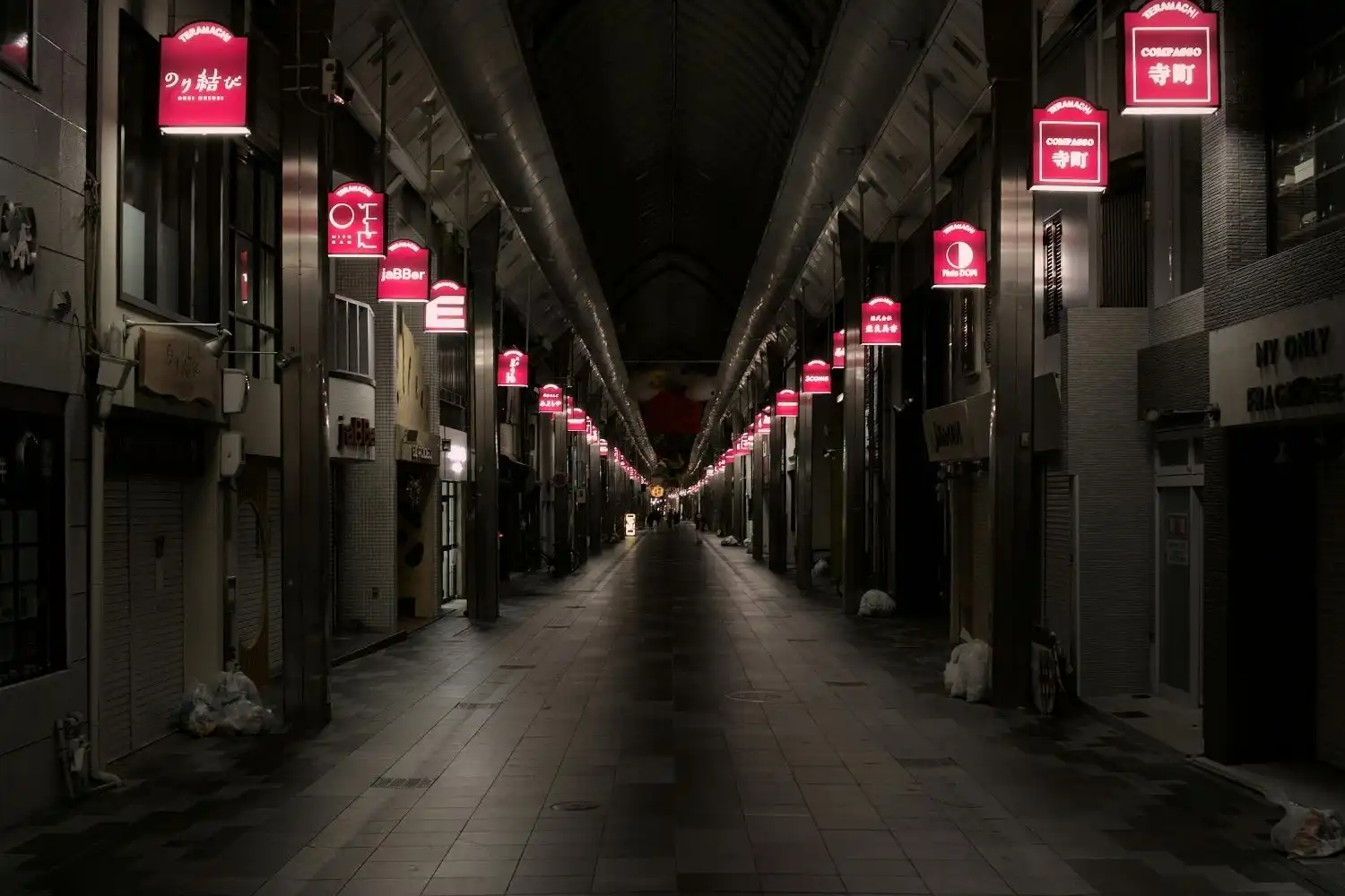
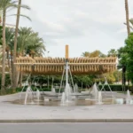
Scale And Context: From Sign To Skyline
Graphic systems operate at hand scale (tickets, kiosks), eye level (signage, maps), and urban scale (facade graphics, light). Architecture sets the canvas, volumes, sightlines, thresholds. The trick is tuning typography, color, and contrast to the viewing distance, dwell time, and ambient conditions the building creates.
When And Why Disciplines Converge
They converge when clarity, brand, or safety is on the line: transit hubs, hospitals, campuses, mixed‑use districts, exhibitions, and workplaces. Early collaboration prevents conflict (a beam blocking a critical sign, glare washing out a display) and unlocks synergy, like embedding wayfinding into floor patterns, lighting cues, or facade rhythms.
Principles Of Visual Communication In Space
Hierarchy, Contrast, And Rhythm
In motion, attention is scarce. We create hierarchy with scale, weight, and spacing so the “you are here” and primary directions beat secondary content. Contrast (color, value, texture) pops essentials under varied lighting. Rhythm, repeated cues at predictable intervals, reduces cognitive load over distance.
Color, Materiality, And Light
Color zones can signal program shifts (clinical vs. public), while materials carry legibility implications. Matte finishes curb glare: specular surfaces can bounce light into confusion. We pair lighting strategy with graphic placement so messages remain readable at 10 am sun and 10 pm maintenance shift.
Typography And Legibility Across Distances
Type faces reality: distance, speed, angle. We pick open counters, generous x‑height, and sane letterspacing. Rule of thumb: 1 inch of cap height reads at roughly 30–40 feet under good light. We avoid ultra‑thin weights and chase high luminance contrast ratios for reliability.
Accessibility And Universal Design
If it isn’t accessible, it isn’t finished. Tactile maps, Braille, audible prompts, generous color contrast, iconography tested with color‑vision deficiencies, and mounting heights that work for wheelchair users turn a design into a system everyone can use.
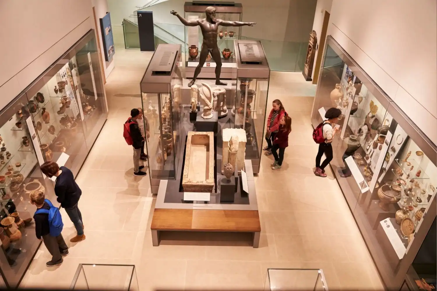
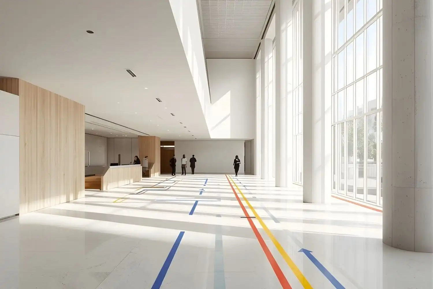
Wayfinding And Environmental Graphics
Information Architecture And Spatial Cues
We start with paths, nodes, and districts. Before signs, we fix sequences: where decisions occur, what questions arise, and what the environment can answer using architecture, sightlines, lighting, flooring changes, so signage becomes reinforcement, not a crutch.
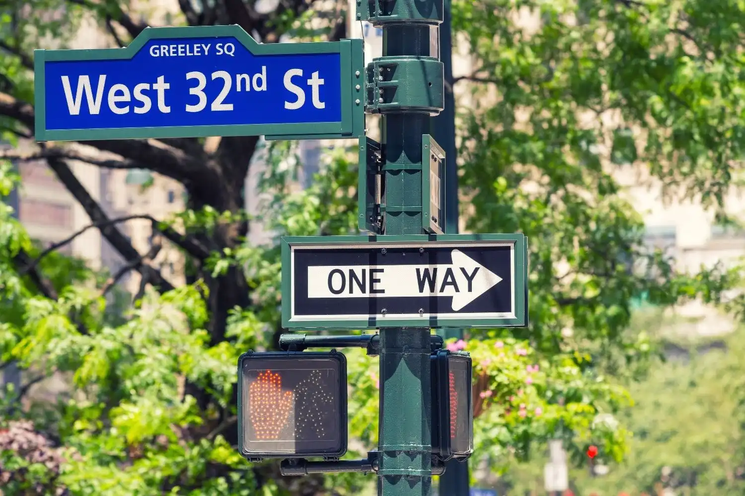
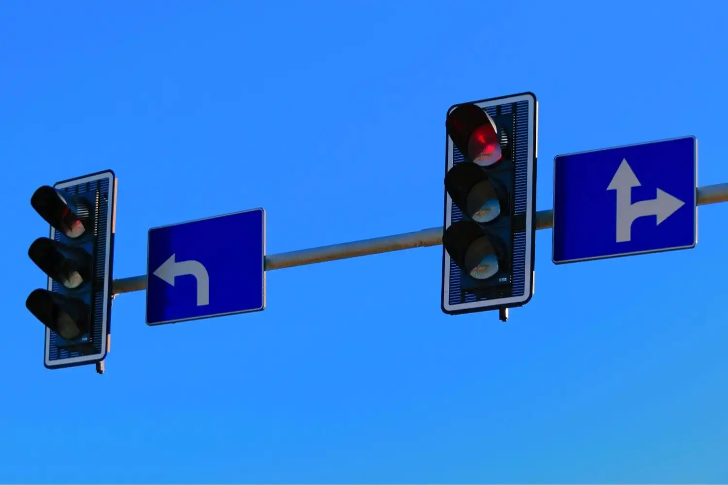
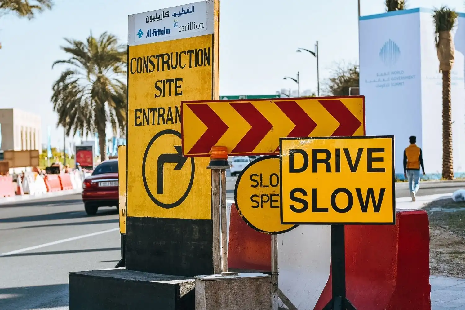
Signage Systems, Symbols, And Standards
A robust kit includes identification, directional, regulatory, and interpretive signs. We lean on standards (e.g., ADA requirements, ISO symbols) and tune to local norms. Consistent arrows, icon families, and message grammar build trust, so one glance is enough.
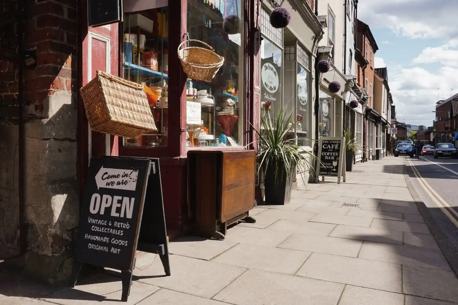
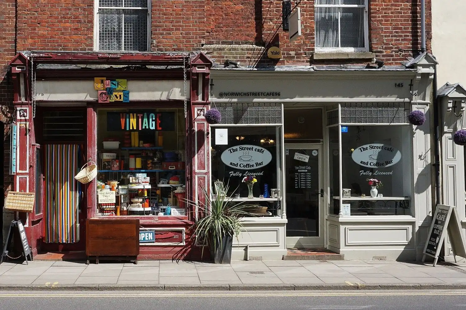
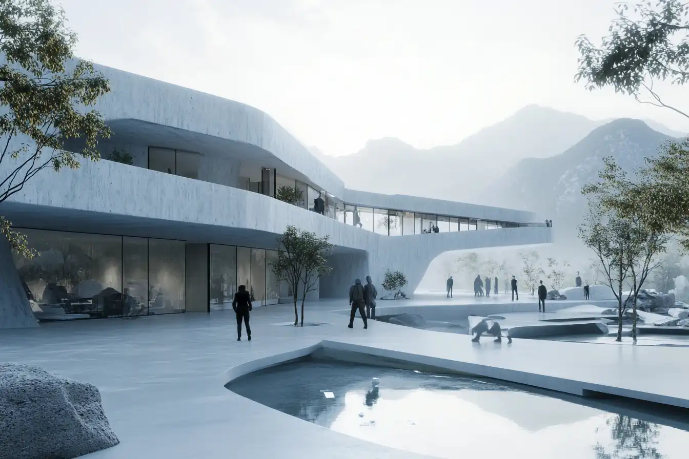
Placemaking: Identity, Landmarks, And Memory
Memorable places have anchors. Supergraphics, public art, custom landmarks, and distinctive materials turn instructions into identity. When visitors say “meet at the red stair,” wayfinding has become culture.
Branding And Narrative In The Built Environment
Translating Identity Into Physical Touchpoints
Brand isn’t just a logo on a wall. It’s tone, motion, and material choices expressed through entries, counters, uniforms, and even acoustics. We translate mission into tactile cues, warm woods for hospitality, resilient finishes for transit, calm palettes for healthcare.
Storytelling Through Journeys And Zones
Every route is a chapter: arrival, orientation, exploration, dwell, and exit. We choreograph reveals, graphics that scale up in public zones and quiet down in focus areas. Exhibits, donor recognition, and digital layers can deepen the plot without shouting.
Balancing Expression With Longevity
Trends fade: buildings don’t. We separate permanent layers (structural graphics, integrated lighting) from changeable ones (posters, digital content). The result is a system that stays fresh without costly rebuilds.
Tools, Workflow, And Collaboration
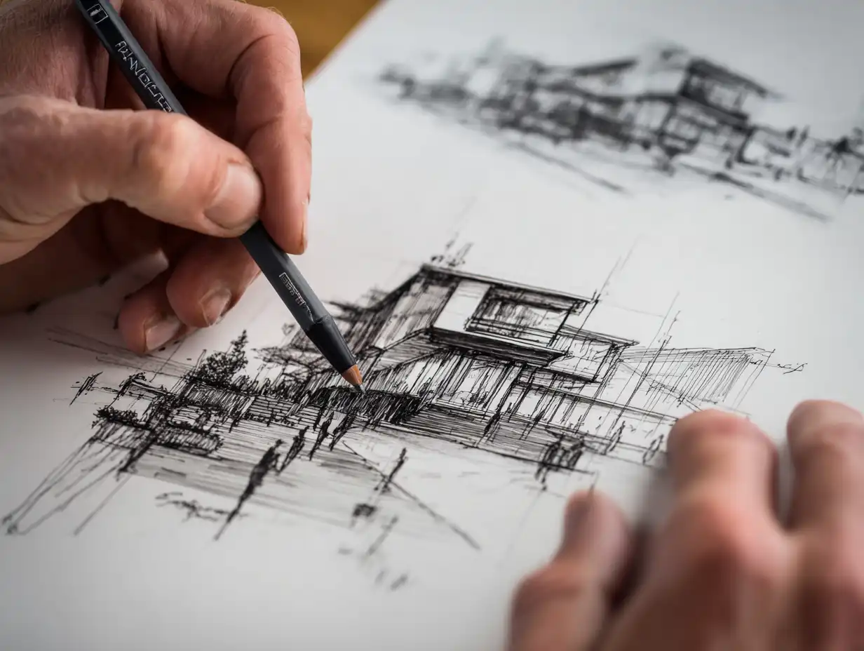
Research, Mapping, And Prototyping
We interview users, shadow routes, and map pain points. Low‑fi prototypes, paper signs, tape lines, let us test hierarchy before fabrication. Pilots answer what workshops can’t: does the night shift find the new ED entrance faster?
Integrating BIM, Parametric Design, And Graphic Systems
BIM gives us exact sightlines, mounting constraints, and clash detection. Parametric rulesets tie typography scale to viewing distances, lighting levels, and ADA clearances. Asset libraries ensure the wayfinding kit stays consistent from model to shop drawings.
Cross-Disciplinary Teams And Governance
Architects, graphic designers, fabricators, facilities, and legal all have skin in the game. We set governance early, message standards, approvals, and maintenance plans, so the system survives turnover and future expansions.
Measuring Impact And Ethics
Metrics: Wayfinding Efficiency, Engagement, And Safety
We track time‑to‑destination, error rates, request‑for‑help counts, and heatmaps. In exhibits or retail, we add dwell time and repeat visits. Safety ties in through compliance checks and visibility at egress routes under low light or smoke.
Inclusivity, Language, And Cultural Sensitivity
Multilingual contexts demand careful prioritization. We use plain language, test icons with diverse groups, and avoid imagery that codes exclusion. Local scripts and right‑to‑left layouts aren’t afterthoughts, they’re core to respect and clarity.
Sustainability And Lifecycle Considerations
Materials matter: recycled substrates, low‑VOC inks, modular components, and repairable fixtures. We design for re-faceability and end‑of‑life separation, and we favor digital only where it genuinely improves clarity without adding clutter or energy load.
Conclusion
When architecture and graphic design truly collaborate, spaces become legible, welcoming, and memorable. That’s the promise of Architecture & Graphic Design: Visual Communication, buildings that speak clearly. If we study behavior, align tools, and measure outcomes, we don’t just help people get from A to B: we give them a place they’ll want to return to.
- architectural communication design
- architectural visual storytelling
- architecture and design studio
- architecture and graphic design
- branding for architectural spaces
- creative space design
- environmental graphic design
- experiential design services
- graphic design for architecture
- integrated graphic design services
- interactive space design
- interior architectural graphics
- memory-shaping design
- navigational signage design
- place-making design
- space planning and design
- spatial design architecture
- user experience in architecture
- visual communication design
- wayfinding design solutions


Leave a comment