


Table of Contents Show
Architect portfolio websites in 2026 are no longer optional. They are the first impression most clients, hiring managers, and academic reviewers form before any conversation happens. A strong site combines a curated selection of projects, clean navigation, fast mobile performance, and a clear point of view that separates one practice from the next.

Why Architect Portfolio Websites Matter More Than Ever
A static PDF still has its place for applications and interview rooms, but a public site does something a PDF cannot: it can be found, shared, and updated without re-sending files. Searchable architect portfolios shape hiring shortlists, client briefs, and even press inquiries. According to the 2024 AIA Firm Survey published by the American Institute of Architects, roughly 73% of small and mid-sized firms report that potential clients arrive having already reviewed their website before the first call.
This shift means the architect portfolio website is doing two jobs at once. It functions as a marketing surface and as professional credibility. Visitors expect it to load in under three seconds, work on a phone, and tell them within ten seconds what kind of work the practice does best.
💡 Pro Tip
When auditing your own architect portfolio website, open it on a 4-year-old phone over a 4G connection, not your studio Wi-Fi. If hero images take more than three seconds to render, compress them before doing anything else. Slow image loading is the single most common reason visitors leave architect sites before reaching the project pages.
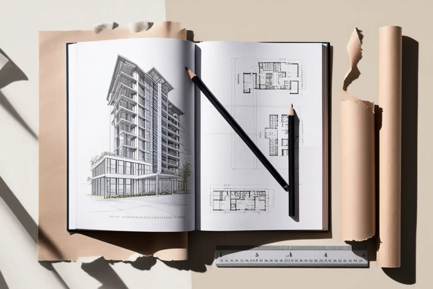
What Makes an Architect Portfolio Website Work in 2026
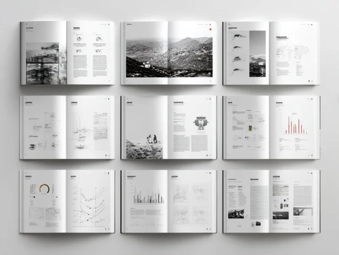
The best architect portfolio websites share a small set of structural decisions. They lead with one or two strong projects rather than a wall of thumbnails. They keep navigation flat, usually no more than five top-level items. They give each project its own page with a consistent template covering brief, site, drawings, and finished images. And they treat typography and white space with the same care as the buildings themselves.
For a closer look at how leading practices handle this, the examples in our review of the best architecture portfolios show how studios like EPT Design, Norm Architects, and Saunders Architecture use full-bleed imagery, layered photography, and tonal contrast to set mood before a single word is read.
1. Lead With Your Strongest Project, Not Your Newest
Hiring managers often form an opinion within the first two scrolls. The opening section of your site should feature the project that best represents the work you want more of, even if it is two years old. Newer work that is weaker dilutes the first impression. Our step-by-step portfolio guide covers this principle in more depth for both PDF and web formats.

2. Keep Navigation to Five Items or Fewer
A typical effective structure looks like this: Work, About, Process, Press, Contact. Anything beyond that begins to bury content. If you offer multiple service types, group them under Work as filterable categories rather than separate menu items.
3. Build a Consistent Project Page Template
Every project page should answer the same questions in the same order: what was the brief, where is the site, who was the client, what did you design, and what was the outcome. Reviewers comparing five sites in an afternoon appreciate predictability. The visual content can vary, but the information architecture should not.
🎓 Expert Insight
“Architecture is really about well-being. I think that people want to feel good in a space.” Zaha Hadid
The same idea applies to portfolio websites. Visitors should feel oriented and at ease, never lost. A site that takes more than two clicks to reach a project page is working against you, no matter how striking the imagery.

How to Choose the Right Platform for Your Portfolio Architect Website
Platform choice usually comes down to three trade-offs: how much design control you need, how much you want to maintain, and where your audience already is. There is no single best option. The right answer depends on whether you are a sole practitioner, a small studio, or a student building a first online presence.
Comparison of Common Platforms for Architect Portfolio Websites
The table below summarises the main platforms used by working architects, based on user-facing features and typical pricing as of early 2026. Pricing tiers and features change frequently, so confirm directly with each provider before committing.
| Platform | Best For | Design Control | Typical Use |
|---|---|---|---|
| Squarespace | Solo architects and small studios | Medium | Image-led portfolios with built-in templates |
| Cargo | Designers wanting layout freedom | High | Editorial-style portfolios, art-direction heavy |
| Webflow | Studios with custom design needs | Very high | Bespoke sites without writing code |
| Behance | Students and emerging architects | Low | Free hosting with built-in audience |
| WordPress | Larger firms with content needs | High | Sites combining portfolio with blog or press |
For most architects, the choice narrows quickly. If you want to be online by next week with minimal fuss, Squarespace or Cargo will get you there. If you want a site that grows with the practice and integrates with editorial content or a journal, WordPress or Webflow are stronger long-term bets. Behance remains a useful supplementary surface for visibility, particularly for emerging architects.
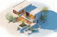
Architect Portfolio Examples That Set the Standard
Looking at real architect portfolio examples is the fastest way to calibrate your own work. The patterns repeat across scales. Boutique firms tend to use minimal navigation and large hero imagery. Larger practices balance project depth with team and press content. Solo architects often lean on a single editorial column structure that reads more like a journal than a corporate site.
Useful reference points include the personal sites of practices known for clear digital presentation, including BIG (big.dk), Snøhetta (snohetta.com), and Foster + Partners (fosterandpartners.com). Each handles project navigation differently, and comparing them side by side reveals how much identity comes from layout decisions rather than image quality alone.
🏗️ Real-World Example
Norm Architects (Copenhagen): Their site uses layered photography and varied image dimensions to create depth across a single scrolling project page. Each project loads as a curated visual essay rather than a thumbnail grid, and the navigation contains only four top-level items. The result is a portfolio architect website that reads as confidently edited rather than densely packed.

Architect Job Portfolio vs Client Portfolio: What Is Different?
Architect portfolio websites built for job applications and client acquisition are not the same. The differences are subtle but consequential, and the most common mistake is treating one site as if it can do both jobs equally well. Our step-by-step architectural portfolio guide walks through how to tailor content for each audience.
An architect job portfolio is read by hiring managers and design directors. They want technical proficiency, drawing quality, evidence of process, and the ability to work across scales. Many will look specifically for construction details, sections, and BIM output.
A client-facing site is read by people who often cannot read a construction drawing. They want to see finished spaces, understand what kind of buildings you make, and feel confident you can guide them through the process. Renderings and photographs do most of the heavy lifting.
⚠️ Common Mistake to Avoid
Many architects merge these two audiences into one cluttered site. The result is a homepage that overwhelms clients with technical sheets and underwhelms hiring managers with marketing copy. The cleaner solution is to keep one public client-facing site and maintain a separate password-protected page or downloadable PDF for job applications, linked only from your CV.
How to Approach a Landscape Architect Portfolio Website
A landscape architect portfolio sits in a related but distinct category. The medium is harder to photograph at a single moment because the work changes with seasons, weather, and growth. The best landscape architect portfolio websites address this directly. They include time-based imagery (the same view across seasons), site plans with clear scale, and ecological data alongside aesthetic shots.
Drawing types also shift. Sections that show planting strategy, hydrology, and topography matter as much as renderings of paved surfaces. If your work is largely landscape-led, do not borrow the structure of an architectural firm site. Build one that shows the systems behind the visible surface. The American Society of Landscape Architects (asla.org) maintains a public awards archive that is a useful reference for how landscape work is presented at the highest level.

Mobile, Speed, and SEO: The Technical Foundation
A beautifully designed architect portfolio website fails if it loads slowly, breaks on a phone, or cannot be found. These three foundations are non-negotiable in 2026.
Mobile-First Layout
More than half of first-time visitors to architect portfolio websites arrive on a phone. Hero images that look stunning on a 27-inch monitor often crop awkwardly on a 6-inch screen. Test every project page on a phone before launch. Headlines, image captions, and contact details should all be legible without pinching.

Image Compression and Loading
Architectural imagery is heavy by nature. Renders and photographs at print resolution can easily exceed 5 MB each. For web use, aim for 200 to 400 KB per image after compression, served as WebP where possible. Lazy-load images below the fold so the homepage feels instant. Our portfolio tips guide covers file specifications in more detail for both web and PDF use.
Searchable Without Being Spammy
SEO for architects is mostly about being clear. Use your firm name in page titles, write project pages with descriptive headings (not “Project 1”), and include the city and project type in the page text. Avoid keyword stuffing. Search engines now reward clarity and depth far more than keyword density.
📐 Technical Note
Google’s Core Web Vitals are the practical performance benchmarks to design against. Aim for Largest Contentful Paint under 2.5 seconds, Interaction to Next Paint under 200 milliseconds, and Cumulative Layout Shift below 0.1. These thresholds are documented in Google’s web.dev guidance and directly affect both user experience and search ranking.

An Architect Portfolio Sample Structure That Works
If you are starting from a blank page, the structure below is a reliable baseline. It works for solo architects, small studios, and student portfolios moving online for the first time.
- Homepage: One hero image, one sentence positioning the practice, three featured projects.
- Work: A grid or list of projects, filterable by type or year. Each item links to a project page.
- Project pages: Brief, site, drawings, finished images, credits. Same structure across every project.
- About: One paragraph on the practice, photographs of the people behind it, a short biography for each principal.
- Press or Journal: Optional but valuable. Lists publications, awards, or short written reflections on the work.
- Contact: Email address, phone if relevant, studio address. Avoid contact forms that obscure the underlying email.
This six-section model handles around 90% of cases. If you find yourself wanting a seventh menu item, look first at whether it can live inside one of the existing six.
💡 Pro Tip
Treat your contact page as a real page, not a form. Include a direct email, a one-line note on what types of project you take on, and an indicative timeline for response. Architects who reply within 48 hours convert significantly more inquiries than those whose contact pages feel like a black box.
Updating and Maintaining Architect Portfolio Websites
The most overlooked part of architect portfolio websites is what happens after launch. A site that has not been touched in three years quietly damages credibility. Visitors notice old copyright dates in the footer, broken project links, and outdated team photos. Treat the site as a living document.
A practical rhythm is one substantive update per quarter. Add a new project, retire one weak project, refresh the homepage hero if the lead project has changed, and check that all links still work. Once a year, take a longer look at the structure. As the practice evolves, the site should evolve with it. Our ultimate architecture portfolio guide covers update strategy in more depth.
✅ Key Takeaways
- Architect portfolio websites work hardest in the first two scrolls, so lead with your strongest project rather than your newest.
- Keep navigation flat (five items or fewer) and use a consistent project page template across every entry.
- Choose your platform based on how much you want to maintain: Squarespace and Cargo for speed, WordPress and Webflow for long-term flexibility.
- Treat job-application portfolios and client-facing portfolios as separate audiences, even if they share the same content library.
- Mobile speed, image compression, and clear search-friendly copy are non-negotiable foundations in 2026.
- Update the site quarterly so it grows with the practice rather than freezing at the moment of launch.

Final Thoughts
An architect portfolio website is the most leveraged piece of marketing most practices ever build. It works for you while you sleep, while you draw, and while you sit in client meetings. The studios that treat it seriously, refresh it regularly, and resist the urge to over-design it consistently win more of the work they actually want. Build a site that is honest, fast, and edited, and the projects will do the rest.
Platform pricing and feature comparisons reflect publicly available information at the time of writing and may change. Always verify current details directly with each provider before subscribing.


Leave a comment