


Table of Contents Show
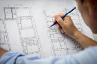
Your architecture portfolio printing choices can shape the way reviewers perceive your entire body of work. The paper stock, binding method, page format, and finishing details all contribute to a first impression that starts before anyone reads a single project description. Whether you are a student preparing for grad school applications or a licensed professional heading into an interview, understanding the physical production side of your portfolio gives you a real advantage.
A printed portfolio is more than ink on paper. It is a tactile object that communicates craftsmanship, attention to detail, and design sensibility. In this article, you will learn how to create an architecture portfolio that looks and feels professional, from selecting the right page size to picking the ideal paper weight and finish.

Choosing the Best Architecture Portfolio Format
The format of your printed portfolio affects everything from layout flexibility to how easy it is to carry to an interview. Before you open InDesign or Photoshop, decide on a page size that fits your goals and audience. There is no single correct answer, but a few standard sizes tend to work well across most situations.
A3 (297 x 420 mm) is popular among architecture professionals because it offers generous space for detailed drawings, renders, and full-bleed images. If you want a more portable option, A4 (210 x 297 mm) keeps production costs lower and fits easily into a bag or briefcase. In the United States, Letter size (8.5 x 11 inches) and Tabloid (11 x 17 inches) are the local equivalents. Many students also use custom sizes through print-on-demand services like Blurb or Lulu, which offer options ranging from square booklets to oversized landscape formats.
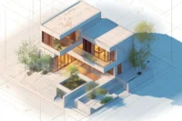
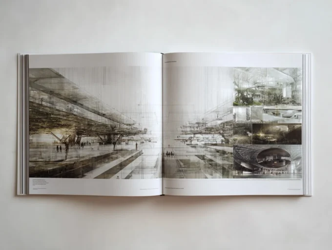
Landscape orientation tends to suit architectural work well because floor plans, sections, and panoramic renders display naturally across a wider spread. Portrait orientation works better for text-heavy pages and vertical compositions. Some architects opt for a square format, which can look striking but adds complexity at the printing stage. Whichever architecture portfolio format you pick, stay consistent with it throughout the entire document. Switching orientations mid-portfolio creates a disjointed reading experience.
If you need help choosing the right dimensions for your specific goals, the ideal portfolio size guide on illustrarch.com breaks down the decision by career stage and audience type.

How to Create an Architecture Portfolio Ready for Print
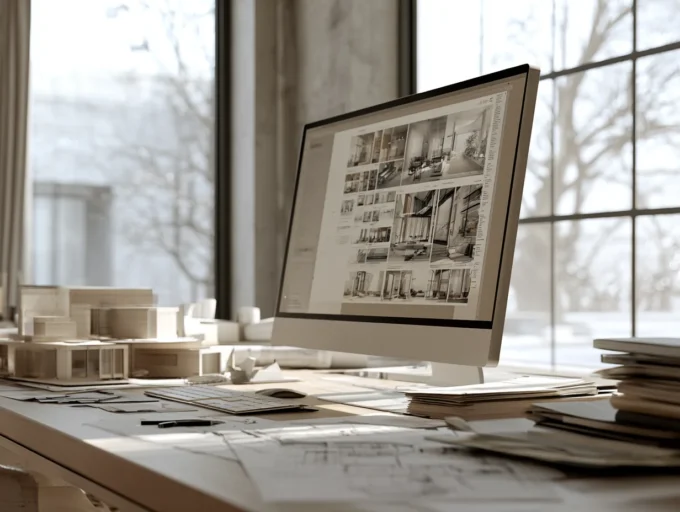
Learning how to create an architecture portfolio that translates well from screen to paper requires some technical preparation. The design might look sharp on your monitor, but printing introduces variables like color shifts, bleed margins, and paper texture that can catch you off guard.
Start by setting your document to CMYK color mode. Screens display colors in RGB, which supports a wider gamut than most commercial printers can reproduce. Working in CMYK from the beginning prevents unpleasant surprises when bright blues or vivid greens turn muddy on the printed page. Adobe InDesign remains the industry-standard tool for portfolio layout, and it handles CMYK workflows natively. If you prefer Photoshop or Illustrator, make sure to convert your color profiles before exporting.
Resolution matters just as much as color. Print files need a minimum of 300 DPI (dots per inch) to look sharp. Images that look fine at screen resolution (72 or 150 DPI) will appear pixelated or soft when printed at full size. Check every image in your layout before sending your file to the printer. According to the American Institute of Architects, professional-quality presentation materials reinforce credibility during client and employer interactions.
Full bleed is another critical detail. When your images extend to the very edge of the page, you need to add a bleed margin (typically 3 mm or 0.125 inches on all sides) so the printer can trim the pages cleanly without leaving white edges. Most print services will reject files that lack proper bleed settings. Export your final portfolio as a high-resolution PDF with fonts embedded and bleed marks included. This is the safest file format for commercial printing because it preserves your layout exactly as designed.
For a deeper look at structuring your portfolio content before you send it to print, check out the architecture portfolio guide on learnarchitecture.net.
Paper Types and Weights for Architectural Portfolios
Paper selection is one of the most overlooked steps in architecture portfolio printing, yet it directly influences how your work feels in the reviewer’s hands. Heavier paper suggests quality and durability, while the surface finish affects how colors and images appear.
For interior pages, a coated matte paper between 150 gsm and 200 gsm strikes a good balance between visual quality and handling comfort. Matte finishes reduce glare under overhead lighting, which is common in offices and interview rooms. Gloss or semi-gloss finishes can make photographs pop with more vibrancy, but they tend to show fingerprints and produce distracting reflections when the portfolio includes text alongside images. Since most architectural portfolio spreads combine renders, drawings, and written descriptions on the same page, matte is usually the safer choice.
For single-sided printing with binder sleeves, consider a heavier cardstock above 200 gsm. The added thickness prevents the pages from bending or curling inside the sleeves and gives the portfolio a more substantial feel. If you are using a bound book format with double-sided printing, stay in the 150 to 170 gsm range so the spine does not become too thick.

Paper Finish Comparison for Portfolio Printing
The table below compares the most common paper finishes used in architecture portfolio printing.
| Feature | Matte | Semi-Gloss | Gloss |
|---|---|---|---|
| Glare under lighting | Minimal | Moderate | High |
| Color vibrancy | Good | Very good | Excellent |
| Fingerprint visibility | Low | Medium | High |
| Text readability | Excellent | Good | Fair (glare affects small text) |
| Best suited for | Mixed layouts (text + images) | Photo-heavy spreads | Photography portfolios |
| Recommended for architecture | Yes (most versatile) | Situational | Rarely |
Eco-conscious paper options are becoming more relevant in architecture, where sustainability often features as a core design value. Recycled and FSC-certified papers are widely available from commercial printers and can subtly reinforce your environmental commitments without any sacrifice in print quality. The Royal Institute of British Architects (RIBA) increasingly emphasizes sustainability across all aspects of architectural practice, including how professionals present their work.
Binding Methods and Cover Options
How your portfolio is bound determines how pages turn, how flat the book sits when open, and how durable it is over repeated handling. The binding also contributes to the overall aesthetic, so it is worth matching the binding style to the level of formality you want to project.
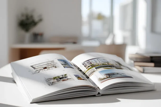
Perfect binding (glued spine) creates a clean, book-like appearance and works well for portfolios with 20 or more pages. This is what you see in most published photo books and self-published prints from services like Blurb. Saddle-stitch binding (stapled at the center fold) is more affordable and suits thinner portfolios of around 8 to 16 pages, but it can feel less substantial in hand. For a premium presentation, sewn binding with a hardcover offers the most durability and a luxurious feel. Hardcovers typically use 2 to 3 mm gray board wrapped in printed, laminated paper or specialty materials like cloth or leatherette.
Layflat binding deserves special mention for architects. It allows the portfolio to open completely flat at any spread, which is ideal for displaying wide panoramic renders, site plans, or double-page project layouts without losing content in the gutter. Many print-on-demand services now offer layflat options, and the result is visually striking.
Your cover sets expectations before the first page is turned. A custom-designed cover with your name, a subtle project image, or a debossed logo creates an immediate sense of professionalism. Avoid overly decorative covers that distract from the work inside. The cover should hint at your design sensibility without overshadowing your projects. You can explore various examples of the best architecture portfolios to see how professionals handle cover design and layout.

Architecture Portfolio Template and Layout Tips for Print
Using an architecture portfolio template can save significant time, especially if you are working under a tight deadline. Templates from platforms like illustrarch.com provide pre-built grid systems, typography hierarchies, and page structures in InDesign and Photoshop formats. You can find both free portfolio templates and premium options with hundreds of customizable pages.
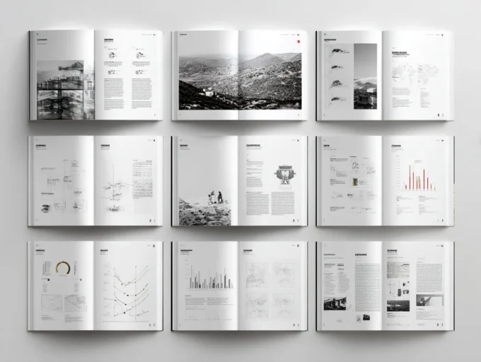
Whether you use a template or start from scratch, a few layout principles apply to every printed architects portfolio. Keep margins generous enough to prevent content from being trimmed during cutting. A safe zone of at least 5 mm inside the trim edge protects important text and small details. Establish a consistent grid across all pages so that headings, body text, and images align predictably from spread to spread. Readers should be able to follow the visual rhythm of your portfolio without effort.
Limit each spread to one project or one clearly defined idea. Overcrowding pages with too many images and text blocks makes the portfolio feel cramped and difficult to read. White space is your ally in print design. It draws the eye to the most important elements and gives the reviewer room to absorb your work. The ArchDaily portfolio showcase offers a useful reference for how leading firms and students handle page composition.
Typography should remain clean and consistent. Stick to one or two typefaces throughout the portfolio. Sans-serif fonts like Helvetica, Arial, or Futura work well for headings and captions, while a clean serif like Garamond or Georgia can add warmth to longer project descriptions. Make sure your chosen fonts are embedded in the PDF so the printer renders them correctly.
Print vs. Digital: When to Invest in a Physical Portfolio
Digital portfolios have become the default submission method for most job applications and academic programs. A well-optimized PDF can be emailed in seconds, uploaded to platforms like Issuu or Behance, and viewed on any device. So why bother with printing at all?
The answer comes down to context. During in-person interviews, a printed portfolio creates a shared physical experience between you and the reviewer. Turning pages together, pointing at specific details, and handing over a beautifully produced book all create moments of engagement that a laptop screen cannot replicate. Many top-tier firms and graduate programs still expect a physical portfolio during the final stages of their selection process.
A practical approach is to maintain both formats. Keep a polished digital PDF (under 10 MB for easy sharing) for initial applications and online submissions. Reserve your printed version for interviews, portfolio reviews, and strategic leave-behinds at firms you want to impress. This dual strategy is discussed in more detail in the architecture portfolio tips guide on illustrarch.com.
If budget is a concern, print selectively. Choose your strongest 15 to 20 pages rather than printing your entire body of work. A shorter, focused portfolio with high production values will always outperform a thick binder stuffed with average pages. Print-on-demand services let you order single copies affordably, so you can update and reprint as your work evolves without committing to a large print run.

Preparing Your Files and Working with Print Services
Once your layout is finalized, the export and proofing stage is where many architects stumble. Submitting your final artwork as a print-ready PDF is standard practice. This means your file should include crop marks, bleed, embedded fonts, and images at 300 DPI. Most professional print shops provide detailed file specifications on their websites, so review those before exporting.
Always order a proof copy before committing to a full print run. A proof lets you check color accuracy, trim alignment, binding quality, and overall feel. Colors on a calibrated monitor will still look different on paper because of the CMYK translation, and only a physical proof reveals how your images will actually appear. If a proof reveals issues, you still have time to adjust levels, swap images, or tweak the layout.
When communicating with print shops, be specific about your requirements. Mention the exact paper weight, finish, binding method, and any special finishing like spot UV, embossing, or foil stamping. Getting quotes from two or three providers helps you compare pricing and turnaround times. Many printers offer student discounts or reduced rates for single-copy orders, so do not hesitate to ask.
For more guidance on how to create an architectural portfolio that leaves a lasting impression, the table of contents guide on learnarchitecture.net walks you through structuring your content for maximum impact. If you are also preparing your resume alongside your portfolio, the architecture resume guide covers how to align both documents into a cohesive professional package.


This article has some useful points about architecture portfolios. I didn’t know about the different paper types and how they affect the look of the work. The tips on binding methods are also helpful. Overall, it’s good information for anyone working on their portfolio.