


Table of Contents Show
Crafting the perfect architecture portfolio can often seem like a daunting task. Whether it’s your first job application or your 50th client pitch, the impact of a well-assembled portfolio cannot be overstated. It’s not just about showcasing your projects; it’s about presenting your vision, skills, and potential in a way that resonates with prospective employers or clients.
Navigating through the myriad of questions—like whether to opt for a digital or physical portfolio, how much detail to include, or how to effectively use design software—can be overwhelming. That’s why we’re here to guide you through refining your architectural portfolio. Our aim is to help you create a portfolio that not only displays your work but also enhances your professional narrative, making a compelling case for your capabilities.
By keeping your portfolio concise, focused, and regularly updated, you’ll be able to make a strong impression quickly. Let’s dive into how you can achieve a portfolio that stands out and effectively communicates your architectural prowess.

Understanding the Purpose of an Architecture Portfolio
Why You Need One
An architecture portfolio serves as a critical tool in a professional journey, acting as your visual resume and personal brand all in one. At its core, the portfolio demonstrates your architectural skills, design sensibility, and technical proficiencies. Whether you’re aiming for employment, seeking client engagements, or applying to academic programs, a well-crafted portfolio makes your case convincingly and compellingly. It’s essential not only for showcasing past projects but also for highlighting your approach to problem-solving and design thinking. Each project within your portfolio adds to a narrative that you are the ideal candidate for the opportunity you seek. Examples include, but are not limited to, securing your first job, transitioning to a new specialty within architecture, or engaging with a prestigious academic institution.
Identifying Your Audience
Knowing your audience tailors your portfolio’s content to meet their specific expectations and needs effectively. For potential employers, it’s vital to demonstrate that your skills align with their projects and company culture. If your audience is a freelance client, emphasizing versatility might appeal to diverse project requirements. In academic settings, showcasing innovative concepts and depth of thought can reflect well on your candidacy for admission. Recognize what resonates with your audience: employers might prioritize technical skills and project management, while private clients could prefer creativity and prior experience with similar projects. This alignment ensures your portfolio not only appeals to the viewer but also speaks directly to their values and needs, maximizing its impact.

Selecting Content for Your Portfolio
When creating an architecture portfolio, selecting the right content is crucial. This section provides insights into how to choose projects and skills to feature, aiming to construct a compelling portfolio that highlights your strengths effectively.
Choosing Your Best Projects
Choosing the best projects involves more than selecting the most visually appealing work; it requires strategic thinking about your career goals and the preferences of your potential audience. Firstly, prioritize projects that showcase a wide range of skills and have received accolades or recognition, such as architectural awards or publications. Select projects that not only display your aesthetic sense but also emphasize your problem-solving capabilities, project management skills, and ability to meet clients’ needs.
It’s advisable to include projects completed within the last five years, as these more accurately reflect your current skills and technology use. Ensure each project included in the portfolio has a clear and concise description, mentioning the project’s scope, your specific role, and any unique design solutions you implemented.

Demonstrating Technical and Soft Skills
A well-rounded portfolio showcases both technical proficiency and soft skills. Technical skills can be demonstrated through detailed drawings, model photographs, and advanced software utilization, such as Revit or AutoCAD. Highlight your proficiency in these areas by choosing projects where these tools played a significant role, and where you achieved measurable success.
Soft skills, on the other hand, are showcased through your project management and collaboration projects. Include scenarios where you led a team, coordinated with various stakeholders, or navigated complex project requirements effectively. These demonstrate your leadership, communication, and organizational skills, making you a valuable addition to any firm or project team.
The Role of Academic and Professional Works
Incorporating both academic and professional projects can provide a comprehensive view of your growth and versatility as an architect. Academic projects highlight your foundational skills and creative ability, often showcasing innovative and theoretical designs that may not be present in your professional work. These projects reflect your education and training, providing insights into your architectural perspective and design philosophy.
Professional works, conversely, demonstrate your real-world application of skills, including adherence to client specifications, budget constraints, and regulatory requirements. They show your capability to transfer theoretical knowledge into practical, functional, and aesthetically pleasing architectural solutions. Balancing these two types of projects within your portfolio highlights your development from a student to a practicing professional, appealing to both academic reviewers and potential employers.
By strategically selecting content that showcases your best work, demonstrates a comprehensive skill set, and balances academic theory with professional practice, your portfolio will not only capture the attention of your audience but also convincingly display your readiness and suitability for advancing in the field of architecture.

Building Your Portfolio
Deciding Between Digital and Print Formats
When deciding between digital and print formats for your architecture portfolio, consider your target audience and the nature of your submissions. For instance, a human resources department at a firm might prefer digital submissions, easily shared and reviewed online. In contrast, an advisory board at a university may value the tactile impression of a physical portfolio. Digital portfolios provide a dynamic platform for interactive elements, such as links and videos, enhancing the presentation of your projects. On the other hand, print portfolios can make a significant impact with their physical quality, showcasing your attention to detail and design aesthetics.
Design Considerations and Layout Tips
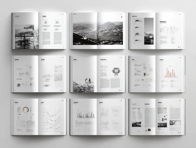
Key design considerations and layout tips can elevate the presentation of your portfolio. First, maintain a clean and professional appearance with consistent formatting throughout your portfolio. This includes using a uniform font type, size, and color scheme. Organize your content strategically; start with a strong project to capture attention, and then follow with works that demonstrate your range and depth in architecture. Each project should be accompanied by succinct, impactful descriptions and high-quality visuals. It’s critical to leave white space around your content to prevent a cluttered look and emphasize your designs.
Using Design Software Effectively
To leverage design software effectively, choose tools that match your skill level and design needs. Adobe InDesign is widely used by professionals for its extensive layout capabilities and flexibility. It allows for precise control over margins, spacing, and typographic settings, which are crucial for creating a polished portfolio. If you are less experienced with complex software, consider simpler alternatives like Canva or Adobe Spark, which offer user-friendly interfaces and pre-designed templates. Regardless of the software, ensure to routinely save your work in multiple formats, such as PDF for digital submissions and high-resolution images for print, to make your portfolio versatile and easily accessible.
By employing these strategies, you can construct a compelling architecture portfolio that effectively showcases your skills, creativity, and professionalism. Remember, the combination of thoughtful content selection, aesthetic consistency, and adept use of technology forms the backbone of a standout portfolio.

Fine-Tuning Your Presentation
Importance of Proofreading and Feedback
Fine-tuning your architecture portfolio isn’t just a matter of adding impressive visuals or descriptions; proofreading and seeking feedback play crucial roles in refining your presentation. Imperfections in text, such as typos or grammatical mistakes, can significantly detract from the professionalism of your portfolio, undermining the quality of your work. Ensuring your content is error-free shows attention to detail, a valued trait in the architecture industry.
Moreover, feedback from peers, mentors, or professionals provides invaluable insights that you might overlook. This feedback process helps identify areas of improvement and strengths, allowing you to adjust the content, design, and structure effectively. If you’re part of a professional network or have accessibility to forums where you can receive unbiased critiques, make the most of these resources. Constructive criticism not only polishes your portfolio but also enhances your personal growth and adaptability as an architect.
The Impact of Visual Aesthetics
The visual impact of your portfolio cannot be overstated. A visually appealing portfolio not only attracts attention but also retains it. Selecting a coherent color scheme, consistent typography, and professionally rendered images reflects your design philosophy and attention to detail. Each page of your portfolio should be a testament to your capability as a designer, ensuring that visuals complement the content without overwhelming it.
Moreover, the layout of your projects should guide the viewer through your portfolio in a logical and engaging manner. Use white space wisely to prevent clutter, allowing your work to stand out. This strategic use of design elements makes your portfolio memorable and distinguishes your work in the competitive field of architecture.

Updating Your Portfolio Regularly
Keeping your portfolio updated is essential in showing your evolution as an architect. Regular updates ensure that your portfolio reflects your current abilities and latest projects. Incorporate projects that showcase advanced skills or new technologies you have mastered. As you progress in your career, older projects may no longer represent your best work; review and revise your portfolio at least once a year.
This ongoing process not only demonstrates your growth and development but also keeps your portfolio relevant for potential opportunities. An updated portfolio is particularly crucial when seeking new job roles or pitching for projects, as it assures potential clients or employers of your continued engagement and proficiency in the field of architecture.
What to Include and How to Tell a Story
A strong architecture portfolio is curated, not exhaustive: choose six to ten of your best projects and show each one through a clear narrative rather than a dump of images. For every project, set up the brief and site, walk through your concept and process with sketches and diagrams, and finish with resolved drawings and visuals. Order projects so the strongest open and close the set, keep the layout and typography consistent, and tailor the selection to the role or school you are targeting. Whether you present it in print or digitally, the goal is the same: make your thinking, not just your output, easy to follow.
Conclusion
As we’ve explored the intricacies of building an architecture portfolio, it’s evident that presenting a well-rounded showcase of capabilities is paramount. Ensuring your portfolio encompasses a comprehensive array of projects highlights your versatility and adeptness in handling diverse architectural challenges. This includes displaying both your conceptual and technical proficiencies.
In keeping up with ongoing professional development, updating your portfolio is crucial. Regularly incorporating your latest projects and achievements maintains its relevance and demonstrates your growth in the field. Each update provides an opportunity to refine your presentation and narrative, aligning your portfolio more closely with current industry trends and employer expectations.
Proofreading remains essential, guaranteeing the professionalism of your presentation. A portfolio free from errors conveys attention to detail, a critical attribute in architecture. Additionally, securing feedback from peers or mentors not only enhances your portfolio but also broadens your perspective, allowing you to identify areas for improvement that you might have overlooked.
Ultimately, your architecture portfolio is more than just a collection of projects; it’s a personal brand statement. It narrates your professional journey and your vision as an architect. Ensuring it’s meticulously curated, regularly updated, and visually compelling will set you apart in the competitive landscape of architecture.
- architect portfolio creation
- architecture portfolio design
- architecture portfolio format
- Architecture Portfolio Guide
- architecture portfolio layout ideas
- architecture portfolio presentation
- architecture portfolio projects
- architecture portfolio update
- best architecture portfolio examples
- creating an architecture portfolio
- design tips for architecture portfolios
- digital architecture portfolio guide
- how to build an architecture portfolio
- impressive architecture portfolio tips
- improve architecture portfolio
- modern architecture portfolio
- portfolio guide for architects
- ultimate architecture portfolio strategies
- updating architecture portfolio


Leave a comment