

Table of Contents Show
Color psychology is the study of how hues affect human emotion, behavior, and perception. In architecture, it determines whether a room feels calming or stimulating, whether a corridor seems wide or narrow, and whether occupants feel focused or restless. Architects and designers apply these principles to shape spaces that serve specific functions, from hospitals to schools to office buildings.
Every surface inside a building carries a color, and that color sends a signal to the brain. A pale blue wall in a hospital corridor does not produce the same psychological response as a bright orange accent in a co-working lounge. The psychology of color sits at the intersection of neuroscience, cultural studies, and design practice, and its influence on architecture has been documented for decades. Faber Birren, widely regarded as the father of applied color psychology, established the profession of color consultant in 1936 and spent his career proving that human response to color is both psychological and physiological. His work laid the groundwork for how architects think about hue, saturation, and brightness in built environments today.
What Is Color Psychology and Why Does It Matter in Architecture?
Color psychology examines the way specific colors trigger emotional and cognitive reactions. Red tends to raise heart rate and increase alertness. Blue lowers blood pressure and encourages calm. Green signals safety and balance. These are not arbitrary associations; they are rooted in evolutionary biology, cultural conditioning, and repeated exposure. A deeper look at color and light in architectural psychology reveals just how intertwined these elements are.
For architects, understanding these reactions is a design tool. Selecting the wrong palette for a space can undermine its purpose entirely. A children’s classroom painted in dark grey will feel oppressive regardless of how well the furniture is arranged. A meditation center bathed in fluorescent orange will agitate rather than relax. Color theory psychology provides the framework for making informed decisions that align a room’s visual identity with its intended function.
🎓 Expert Insight
“The study of color is essentially a mental and psychological science, for the term color itself refers to sensation.” — Faber Birren, Color Consultant and Author
Birren’s observation, published in his 1950 book Color Psychology and Color Therapy, remains one of the most cited statements in architectural color research. It reinforces the idea that color is not decoration; it is a sensory input that the brain processes before any conscious evaluation takes place.
How Warm Colors Shape Energy and Interaction
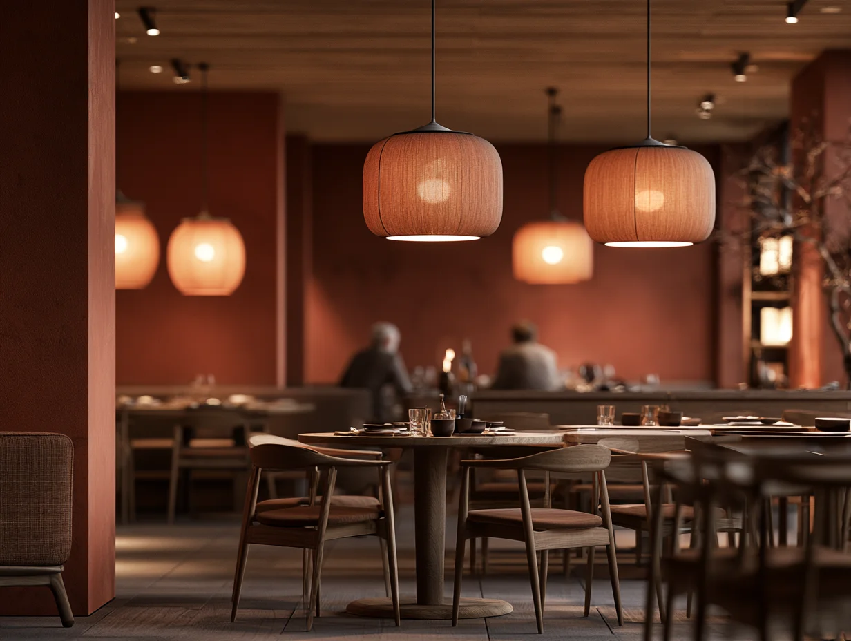
Warm colors, including red, orange, and yellow, activate the sympathetic nervous system. They stimulate appetite, raise perceived room temperature, and encourage social interaction. Restaurants have relied on this effect for decades: fast-food chains consistently use red and yellow in their interiors because these hues increase eating speed and customer turnover.
In architectural practice, warm tones serve specific spatial goals. A vibrant red accent wall in a gym locker room raises energy levels before a workout. Soft amber tones in a hotel lobby create a sense of welcome without overwhelming guests. Yellow, when used at moderate saturation, can improve concentration in study areas. However, highly saturated yellow over large surfaces can increase anxiety, which is why color psychology charts often flag it as a color to use sparingly.
The psychology behind colors is never one-dimensional. Context, lighting, and adjacent hues all modify how a warm color is perceived. A terracotta-toned floor reads very differently under natural daylight than under cool LED panels. Architects who understand these interactions can control mood with far greater precision than those who pick colors based purely on trend forecasts.
Cool Tones and Their Calming Effects on Occupants
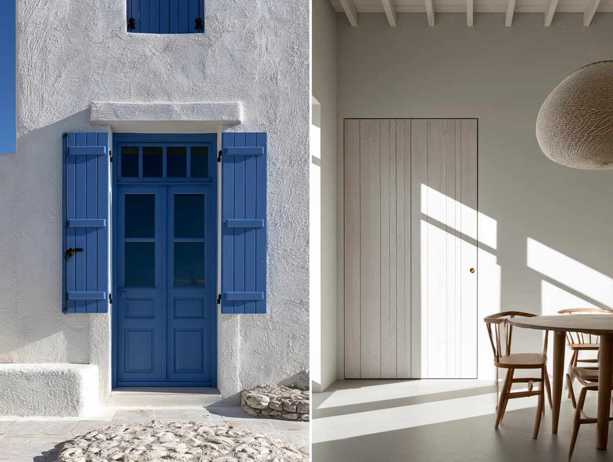
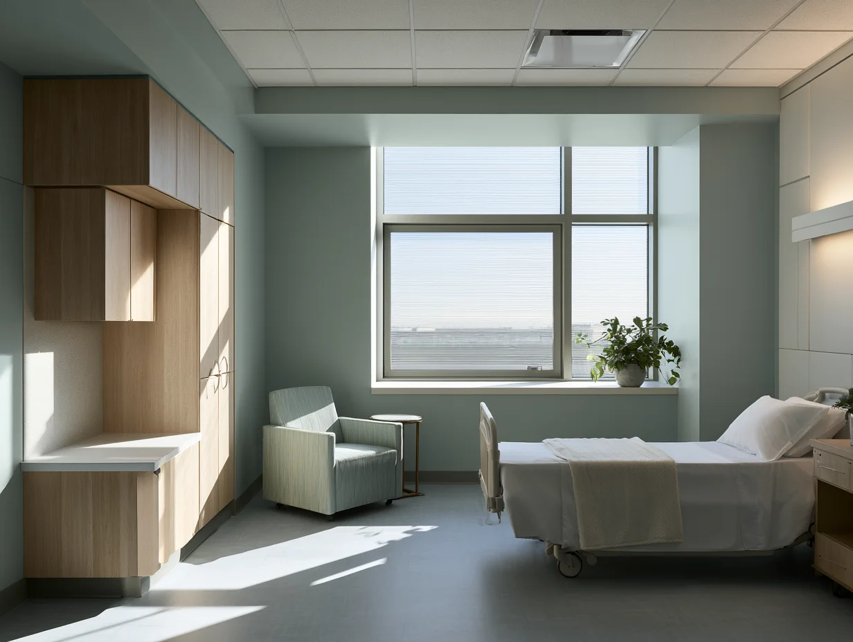
Blue, green, and violet sit on the opposite end of the color wheel and produce opposite psychological effects. They slow heart rate, reduce cortisol levels, and promote a sense of spaciousness. Healthcare facilities are among the most studied environments for cool-color application. Research published in the Journal of Environmental Psychology has shown that patients in rooms with soft blue or green walls report lower stress and higher satisfaction compared to those in neutral or warm-toned rooms.
Green occupies a unique position in the broader discussion of color in architecture. It is the color the human eye processes most easily, which makes it ideal for spaces where occupants spend long hours, such as offices and libraries. Biophilic design strategies often pair green wall finishes with live planting to reinforce the psychological connection to nature.
💡 Pro Tip
When specifying blue tones for healthcare interiors, avoid highly saturated blues (like cobalt or electric blue), which can feel clinical and cold. Instead, opt for muted, desaturated blues in the range of Munsell 5B to 10B with a value of 7 or higher. These tones read as calming without triggering associations with sterility.
Violet, though less commonly used in architecture, appears in meditation spaces, spas, and certain hospitality environments. Its association with introspection and creativity makes it a strong choice for rooms designed for reflection, though overuse can make a space feel heavy or somber.
The Role of Neutral Palettes in Spatial Perception
Neutrals, including white, grey, beige, and taupe, form the backbone of most architectural color schemes. They allow flexibility, reduce visual noise, and serve as a canvas for accent colors or material textures. But calling them “neutral” is somewhat misleading. A warm beige produces a very different spatial feeling than a cool grey, and the psychology of colors applies to these tones just as much as to vivid hues.
White expands perceived space and reflects the most light, making it a standard choice for small apartments and galleries. However, all-white interiors can feel sterile and unwelcoming when not balanced with warm materials like wood or textiles. Grey offers sophistication and restraint, but in excess it can dampen mood, particularly in climates with limited natural light. Light and architecture are deeply linked here, as the same neutral tone can shift dramatically depending on the quality and direction of incoming daylight.
Understanding color constancy is essential for working with neutrals. The color constancy psychology definition refers to the brain’s ability to perceive a color as the same even when lighting conditions change. A white wall appears white whether lit by warm incandescent bulbs or cool daylight, because the brain compensates for the shift. Architects rely on this perceptual stability when designing spaces that transition between natural and artificial light throughout the day.
Color Psychology in Specific Building Types
Educational Facilities
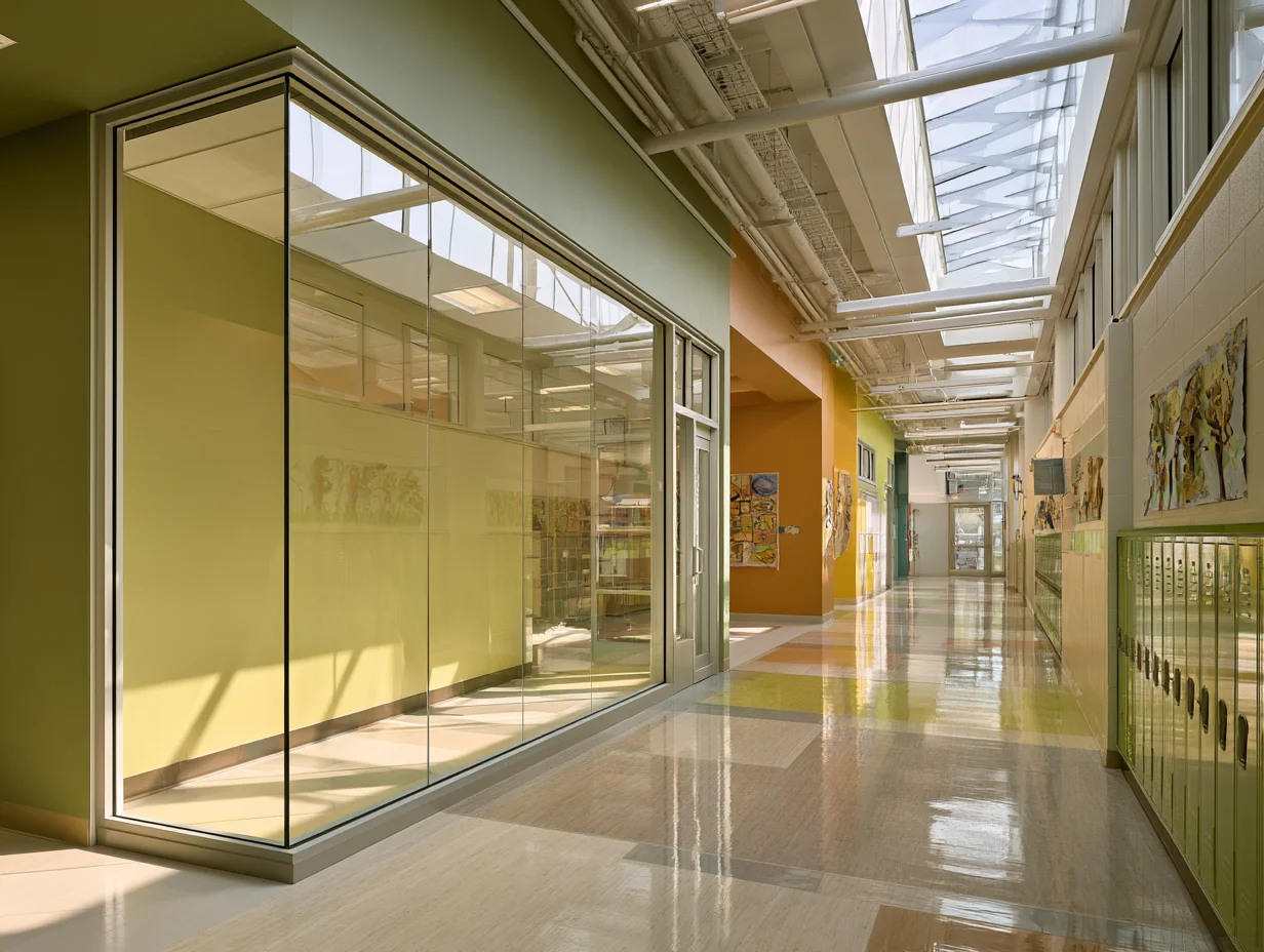
Schools and universities use color to support different modes of learning. Classrooms benefit from soft yellows or light greens that promote focus without overstimulation. Libraries lean toward cool, muted palettes that encourage sustained concentration. Common areas and cafeterias often use warmer, more saturated colors to signal a shift from study to social time.
Healthcare Environments
Color choices in hospitals are backed by clinical evidence. Soft greens and blues in patient rooms reduce anxiety before surgery. Warm neutrals in waiting areas help families feel less exposed. Wayfinding systems use high-contrast color coding, not just for aesthetics, but to reduce cognitive load in large, unfamiliar buildings. Architectural spaces that promote mental health rely heavily on these evidence-based color strategies.
📌 Did You Know?
The ancient Egyptians used color as a form of therapy as early as 2000 BC, painting rooms in specific hues and using sunlight filtered through colored crystals to treat ailments. This practice, documented in the medical text Huangdi Neijing, represents one of the earliest recorded links between color and human well-being (source: Wikipedia, Color Psychology).
Commercial and Retail Spaces
Retail environments are among the most deliberate users of color psychology. Luxury brands often rely on black, deep navy, or muted gold interiors to signal exclusivity. Fast fashion stores use bright, high-energy palettes to encourage impulse buying. Grocery stores typically place green and brown tones near fresh produce sections to reinforce perceptions of freshness and organic quality.
Residential Design
In homes, color choices reflect personal identity as much as psychological function. However, the same principles apply. Bedrooms painted in soft lavender or warm grey promote better sleep. Home offices benefit from muted greens or desaturated blues that support long periods of screen-based work. Kitchens and dining areas perform well with warm accent tones that stimulate appetite and conversation. Understanding the principles of architectural lighting design helps ensure that chosen colors behave consistently across different times of day.
How Cultural Context Changes Color Meaning
A color psychology chart may list red as “energizing” and white as “pure,” but these associations are not universal. In many East Asian cultures, red symbolizes luck and prosperity, while white is the traditional color of mourning. In Western contexts, the associations are nearly reversed. Architects working on international projects must account for these differences or risk creating spaces that feel culturally tone-deaf.
Regional climate also plays a role. Mediterranean and tropical architecture favors bold, saturated exteriors, partly because strong sunlight desaturates colors visually, so brighter tones are needed to maintain visual impact. Scandinavian architecture tends toward pale, cool-toned interiors that maximize the psychological benefit of limited daylight. These are not arbitrary style preferences; they are functional responses to how color interacts with local light conditions.
🏗️ Real-World Example
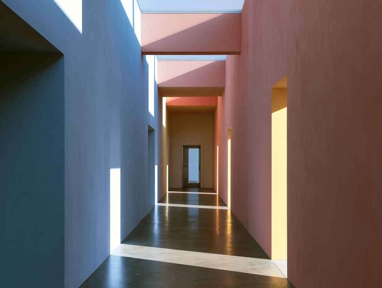
Casa Gilardi (Mexico City, 1976): Luis Barragán’s final residential commission is one of architecture’s most celebrated uses of color. The indoor pool corridor is drenched in saturated blue and vivid pink, with natural light filtering through a yellow glass panel. Rather than decorating the space, the color becomes the architecture, shaping mood, directing movement, and dissolving the boundary between wall and atmosphere. The project demonstrates how a single palette decision can define the entire experience of a room (source: ArchDaily).
The Bigger Picture
Color is one of the least expensive elements an architect can change, yet it remains one of the most psychologically powerful. A fresh coat of paint costs a fraction of a structural alteration, but it can shift how an entire building feels. The gap between architects who treat color as an afterthought and those who treat it as a design driver is often the gap between a space that merely functions and one that truly supports the people inside it. As research in color psychology continues to grow, the argument for evidence-based color decisions in architecture only gets stronger.


Leave a comment