


Table of Contents Show
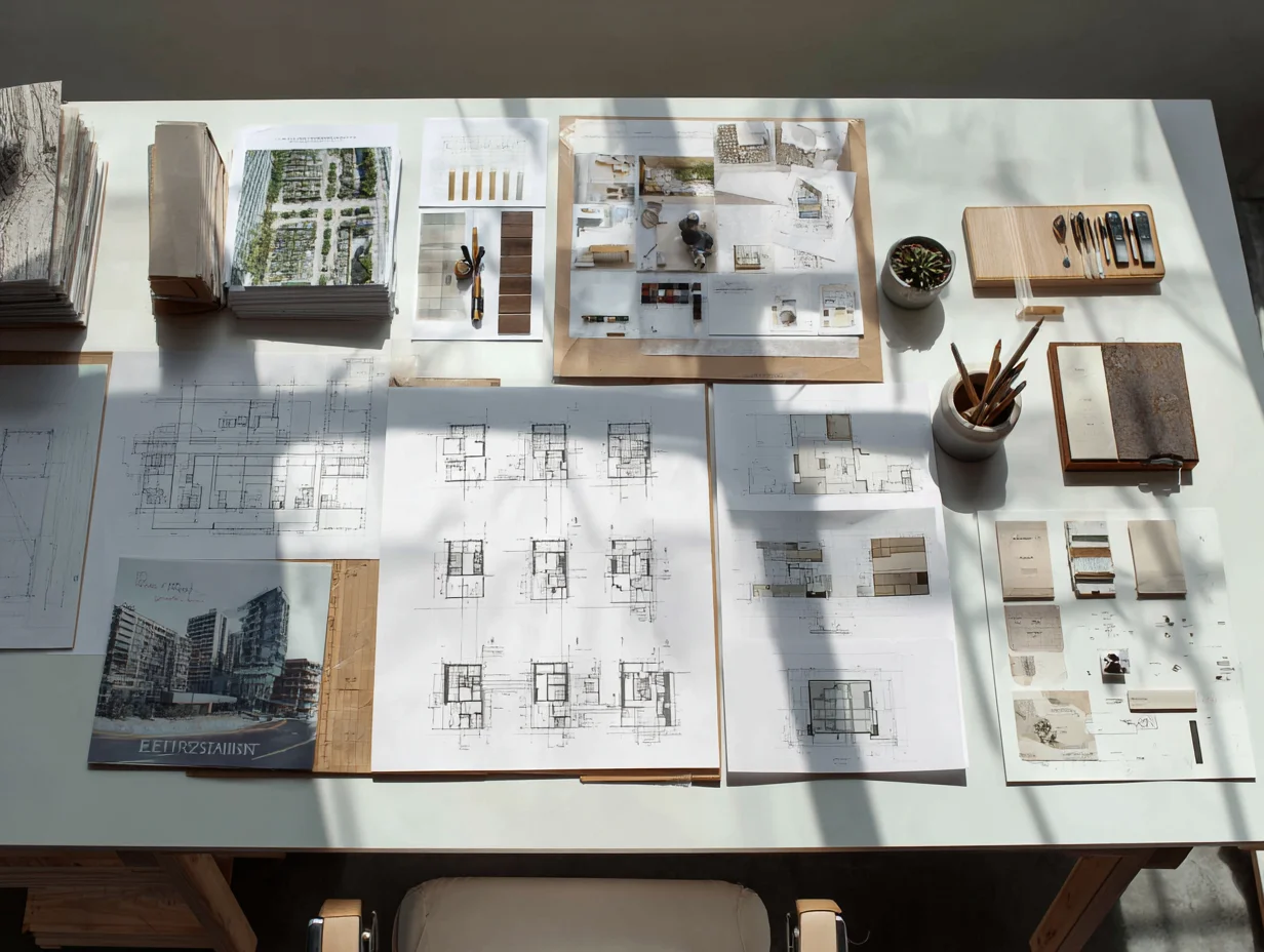
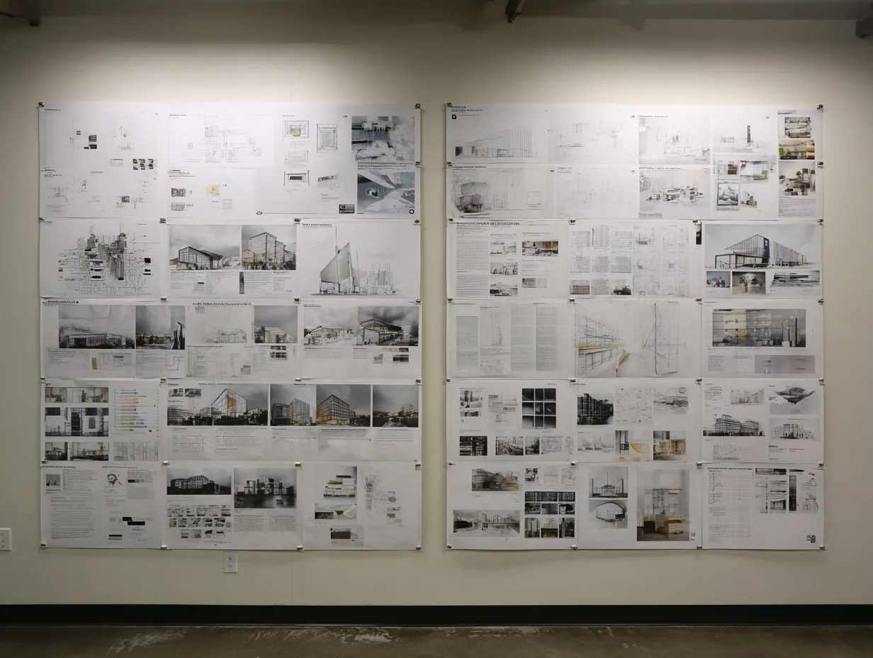
An architecture presentation board is a single-surface visual summary of a design project, combining drawings, renders, diagrams, and text into one readable layout. Students who build their boards with a clear grid, strong visual hierarchy, and restrained typography consistently score higher marks and leave stronger impressions during jury reviews.
Most architecture students spend months refining a design, then rush through the presentation in a couple of late nights. The result is predictable: cramped layouts, mismatched fonts, and a board that forces the viewer to search for the story instead of following it. Your architectural presentation board is the first thing a jury sees and the last thing they remember. Getting it right is not optional. Below are nine targeted tips, drawn from studio review patterns and competition board analysis, that will help you build boards your reviewers actually want to look at.
Start with a Grid Before You Place Anything
A grid is the invisible skeleton behind every strong architecture presentation. It divides your board into consistent modules, keeps margins uniform, and gives you anchor points for aligning drawings, images, and text blocks. Without a grid, elements float at random distances from each other, and the board looks improvised rather than intentional.
Open your layout tool (InDesign, Illustrator, or even PowerPoint) and set up a column grid first. For a standard A1 vertical board, a six-column grid works well because it divides cleanly into halves and thirds. Add horizontal guides at equal intervals to create rows. Every image, plan, and text block should snap to these guides. If something does not fit neatly, resize it or reconsider its position rather than breaking the grid.
💡 Pro Tip
Before placing any content, print your empty grid at full scale and tape it to a wall. Stand two meters back and check that the column widths feel balanced. Adjusting proportions at this stage takes five minutes; fixing them after content is placed can take hours.
Consistency in spacing matters more than most students realize. Keep the gap between elements (the “gutter”) identical across the board. A 10 mm gutter between columns and a 15 mm margin around the edges is a safe starting point for A1 boards. These small decisions add up to a board that feels polished even before the viewer reads a single word. For more on structuring visual information in architecture, see this guide on architecture site analysis presentation and diagrams.
Build a Clear Visual Hierarchy
Visual hierarchy tells the viewer where to look first, second, and third. On an architecture presentation board, the hero image (your strongest render, section, or perspective) should dominate. It needs to be the largest element on the board, typically occupying 30 to 40 percent of the total area. Everything else plays a supporting role.
Arrange the remaining content by importance. Floor plans and sections come next because they explain the spatial logic. Diagrams and analytical drawings follow. Text occupies the smallest visual footprint. A common student mistake is giving every drawing equal size, which flattens the hierarchy and forces the jury to decide what matters. That is your job, not theirs.
Reading direction also plays a role. Western audiences scan from top-left to bottom-right. Place your project title and hero image in the upper portion of the board. Move supporting drawings and details toward the lower half. If you are working on a horizontal board set (multiple boards side by side), the narrative should flow left to right across the series. Each board should be readable on its own, but together they should tell a sequenced story from context and analysis through to design resolution.
How to Choose Typography for Architectural Presentations
Typography on a presentation board serves two purposes: readability and tone. Pick one sans-serif typeface for headings and one for body text (or use the same family in different weights). Helvetica, Futura, and Roboto are safe choices that pair well with architectural drawings. Avoid decorative or script fonts entirely; they distract from the work and date quickly.
Limit yourself to two font sizes for body text and two for headings. A four-level type scale (board title, section heading, body text, captions) is enough for most boards. Going beyond four levels introduces visual noise. For a deeper look at font selection in architecture, read this article on effective font usage in architectural designs and presentations.
⚠️ Common Mistake to Avoid
Many students use five or six different font sizes, sometimes across three typeface families, on a single board. This fragments the visual flow and makes the board look like a collage of unrelated pieces. Stick to one typeface family and a strict four-level type scale to keep everything cohesive.
Text alignment matters too. Left-aligned text is easier to read in short blocks than justified text, which can create awkward gaps on narrow columns. Keep paragraphs short (three to five lines maximum) and use white space between text blocks rather than cramming descriptions next to drawings.
Use Color with Purpose, Not Decoration
Color on an architectural presentation board should guide the viewer’s eye, not compete with the drawings. A neutral background (white, off-white, or light grey) lets your renders and plans stand forward. If you add accent colors, limit them to one or two and use them consistently across titles, diagram highlights, and callout lines.
Pull your accent palette from the project itself. If your building uses exposed timber and concrete, warm earth tones and cool greys make natural accent colors. If the project is coastal, a muted blue might work. This creates a visual connection between the board design and the architecture it presents. For guidance on how color shapes perception in architecture, explore this article on color in architecture.
Avoid bright, saturated backgrounds. A black background can work for competition boards where drama is expected, but it demands high-contrast images and careful typography to remain legible. For studio reviews, white or near-white backgrounds are almost always the safer option.
What Should an Architecture Presentation Board Include?
Every architectural design concept presentation needs a core set of deliverables. The exact mix depends on the project brief, but most jury-ready boards include these elements: a hero image (perspective render or key section), floor plans at a readable scale, at least one section or elevation, concept or parti diagrams, a site plan or context drawing, and a short written description.
Diagrams deserve special attention. A well-placed concept diagram at the top of your board tells the jury what the project is about before they read a word. Keep diagrams simple: three to five elements maximum. If a diagram needs a legend with ten entries, it is too complex for a presentation board.
🎓 Expert Insight
“The best presentation boards I see in reviews are the ones where I understand the project in 30 seconds, before the student even begins speaking.” — Licensed architect and studio critic with 20+ years of teaching experience
This observation reinforces a key principle: the board should communicate independently. If a viewer cannot grasp the project’s intent without a verbal walkthrough, the board is not doing its job.
Scale bars and north arrows are small details that signal professionalism. Include them on every plan and section. Label rooms and key spaces directly on the drawing rather than in a separate legend when possible, because legends force the viewer’s eye to jump back and forth.
Design Your Board for Two Viewing Distances
A presentation board needs to work at two scales: from across the room (roughly two to three meters) and up close (arm’s length). From a distance, the viewer should be able to identify the project type, read the title, and see the hero image clearly. Up close, they should be able to examine plan details, read annotations, and follow diagrams.
Test this by exporting your board as a PDF, printing it at full size, and taping it to a wall. Step back and squint. If the title, hero image, and key drawings do not pop, you need to increase their size or boost contrast. Then walk up close. If text is smaller than 8 pt or drawings lack annotations, the board will frustrate anyone who tries to study it in detail.
This two-distance principle also affects line weights. Thick outlines on section cuts read well from afar. Thin lines for furniture and detailing reward close inspection. Using a single line weight throughout makes everything look flat, regardless of the quality of the drawings themselves.
How to Present Your Architectural Design Concept on a Board
Your concept is the backbone of the entire project, and the board should make it visible within the first few seconds. Place a small set of parti diagrams near the top of the board, alongside the project title. These should explain the core idea in three to five simple sketches or icons, moving from site response through massing to spatial organization.
Write a project statement of no more than 50 words. This statement should name the site, the program, and the central design idea. Avoid abstract language (“a dialogue between light and materiality”) and use concrete terms (“a community library organized around a central courtyard that brings daylight to every reading room”). Juries read dozens of statements in a single session; clarity wins over poetry.
🏗️ Real-World Example
OMA’s Seattle Central Library Competition Entry (2004): The presentation boards for this project used a diagrammatic sequence showing how programmatic “platforms” were stacked and connected by a continuous ramp. Three diagrams at the top of the board explained the entire spatial strategy before any plan or section appeared. This approach helped the jury grasp a complex building concept almost instantly.
If your project evolved significantly during the design process, consider including a small “design development” strip showing two or three key iterations. This demonstrates critical thinking and shows that the final design was not arbitrary but the result of testing and refining. Learn more about how to develop and refine your project idea in this article on what an architectural concept is and how to develop one.
Software and Tools for Building Presentation Boards
Adobe InDesign is the industry standard for assembling architecture presentations because it handles multi-page layouts, linked images, and precise typographic controls better than any alternative. If you are not comfortable with InDesign, Adobe Illustrator works for single-board layouts, and Canva offers a faster (if less flexible) option for students who are short on time.
Your drawings and renders should be produced in separate software (Rhino, Revit, SketchUp, or similar) and exported as high-resolution PNG or PDF files before being placed into the layout tool. Never scale up a low-resolution export; pixelated images on a printed board are immediately visible and damage credibility. Export renders at a minimum of 300 DPI at the final print size.
Comparison of Popular Layout Tools for Architecture Presentations
The following table compares four commonly used tools for assembling architectural presentation boards:
| Tool | Best For | Learning Curve | Cost |
|---|---|---|---|
| Adobe InDesign | Multi-board sets, precise typography, linked images | Moderate to steep | Paid (Adobe CC subscription) |
| Adobe Illustrator | Single boards with vector diagrams and graphics | Moderate | Paid (Adobe CC subscription) |
| Canva | Quick layouts, students with limited design software experience | Low | Free tier available; Pro is paid |
| Photoshop | Image-heavy boards, post-processing renders | Moderate | Paid (Adobe CC subscription) |
For AI-assisted rendering and visualization workflows that feed into your presentation boards, this guide on AI tools for architectural visualization covers current options and how to integrate them into a student workflow.
Common Presentation Board Mistakes and How to Fix Them
Knowing what to avoid saves as much time as knowing what to do. Here are the mistakes that appear most often in student architecture presentations, along with quick fixes.
Overcrowding the board. When every square centimeter is filled, nothing stands out. Leave at least 15 to 20 percent of your board area as intentional white space. White space is not wasted space; it gives drawings room to breathe and directs focus to what matters.
Inconsistent drawing styles. Mixing hand-drawn sketches, photorealistic renders, and flat CAD exports on the same board creates visual conflict. Pick a consistent graphic language for the board. If you use hand-drawn elements, apply them throughout. If your renders are photorealistic, keep your diagrams in a similarly polished style.
Missing or illegible labels. A beautiful plan without room names, dimensions, or scale bars is just an abstract composition. Label clearly, and make sure text is large enough to read at arm’s length (minimum 8 pt for captions, 10 pt for body text on an A1 board).
💡 Pro Tip
Print a test strip of your board at actual size before committing to a full print. Include a section with your smallest text, thinnest line work, and a portion of your hero image. This 10-minute test catches resolution issues, color shifts, and readability problems that screens hide.
Ignoring the narrative arc. A board should tell a story: from site and context, through concept and analysis, to final design. If your board reads like a random arrangement of drawings, the jury will struggle to follow your thinking. Map out the sequence before you start placing content. Reviewing how other students structure their work can help; this piece on the best projects for an architecture student portfolio covers how to build a clear narrative from your academic work.
Low-resolution exports. Screen resolution (72 DPI) looks fine on a laptop but turns to mush on a printed A1 board. Always export at 300 DPI at the target print dimensions. Check file sizes: a high-resolution A1 image should be at least 20 to 30 MB as a PNG.
Video: The Ultimate Guide to Architecture Presentation Boards
This video from Show It Better covers presentation skills, board structure, content selection, and layout principles specifically for architecture students preparing for reviews and competitions.
✅ Key Takeaways
- Set up a column grid before placing any content; a six-column grid on an A1 board gives you flexible layout options without complexity.
- Make your hero image the largest element on the board (30 to 40 percent of the area) and let everything else support it in descending size order.
- Stick to one typeface family with a four-level type scale: board title, section heading, body text, and captions.
- Design your board for two viewing distances: readable from three meters and detailed at arm’s length.
- Leave 15 to 20 percent of the board as white space; overcrowded boards flatten hierarchy and exhaust viewers.
Final Thoughts
An architecture presentation board is not a scrapbook of everything you produced during the semester. It is an edited, designed artifact that tells the story of your project in a single glance. The tips above focus on structure, hierarchy, and restraint because those are the qualities that separate boards that communicate from boards that simply display. Start with the grid, build the hierarchy, choose your fonts and colors deliberately, and always print a test before the final run. Your design deserves a board that matches its ambition.
FAQ
What size should an architecture presentation board be?
The most common sizes are A1 (594 x 841 mm) for individual studio reviews and A0 (841 x 1189 mm) for thesis or competition submissions. Always check the brief or competition guidelines for required dimensions, as using the wrong size can lead to disqualification.
How many boards do I need for a typical studio review?
Most undergraduate studio reviews require two to four boards. A strong set typically includes one board for context and concept, one or two for plans, sections, and elevations, and one for detail and materiality. Quality always beats quantity; three focused boards outperform five cluttered ones.
Should I use a white or black background for my presentation board?
White or off-white backgrounds work best for most studio reviews because they let drawings and renders come forward naturally. Black backgrounds create a dramatic effect suited to competitions, but they require high-contrast images and careful color management to avoid a heavy appearance.
What is the best software for making architecture presentation boards?
Adobe InDesign is the most widely used tool in practice and academia because of its precise layout controls and ability to manage linked image files across multiple boards. For students who need a faster solution, Canva offers usable templates, though with less control over typography and print resolution.
How do I make my architecture presentation board stand out?
Focus on one strong hero image, maintain a strict grid, and leave generous white space. Boards stand out not because they contain more content, but because they communicate a clear idea quickly. A well-placed set of design principles applied to your layout will do more than any visual trick.


Leave a comment