


Table of Contents Show
An architecture presentation is how you translate weeks of design work into a story your jury, clients, or professors can follow in minutes. Strong presentations pair clear visuals with confident speaking, guiding the viewer from concept to detail without confusion. The tips below cover board layout, verbal delivery, model use, and software choices so you can walk into your next review prepared.
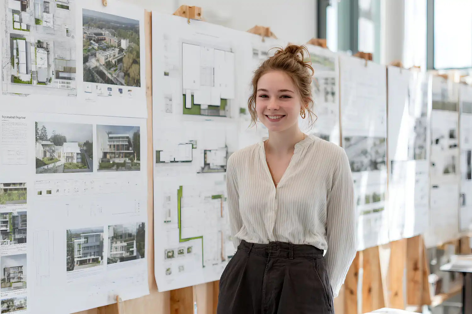
Most architecture students spend 90% of their time on design and less than 10% on how they will actually present it. That imbalance shows up in jury rooms every semester: solid ideas fall flat because the boards are cluttered, the speaker reads from notes, or the drawing sequence makes no sense. A good architecture presentation does not require flashy graphics. It requires structure, rehearsal, and a few deliberate choices about what to show and when to show it.
Start with a Clear Narrative Structure
Every strong architecture presentation follows a story arc. You move from context to concept, from concept to design response, and from design response to detail. Jumping between these stages confuses the viewer, even if each individual drawing is excellent. Before you open InDesign or Photoshop, write down three to five bullet points that describe the logical flow of your project. These bullets become the backbone of your board sequence and your spoken explanation.
Place your site analysis diagrams early in the sequence to establish location and constraints. Follow those with concept diagrams that show how the site forces shaped your design decisions. Only then should floor plans, sections, and renders appear. This general-to-specific order mirrors how the human brain processes new information, and it prevents jurors from asking “but why?” halfway through your talk.
💡 Pro Tip
Rehearse your presentation by explaining each board to someone outside architecture. If they can follow the logic without asking clarifying questions, your narrative structure works. If they get lost at any point, that board needs revision or repositioning in the sequence.

How to Design an Effective Presentation Board Layout
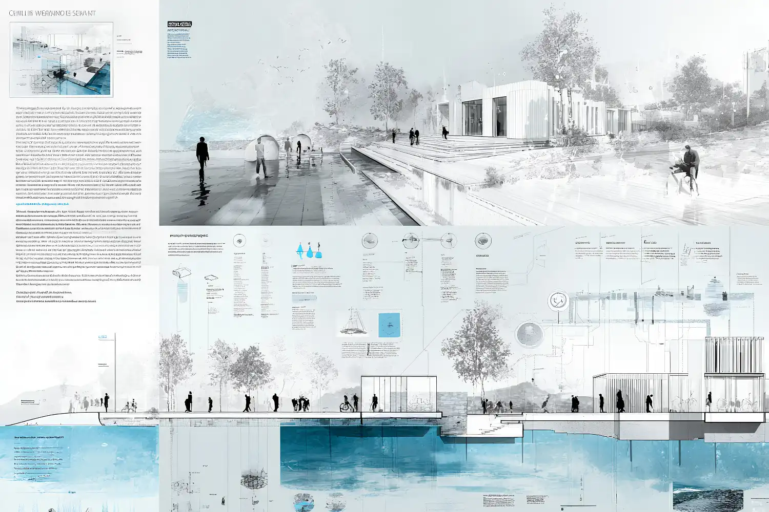
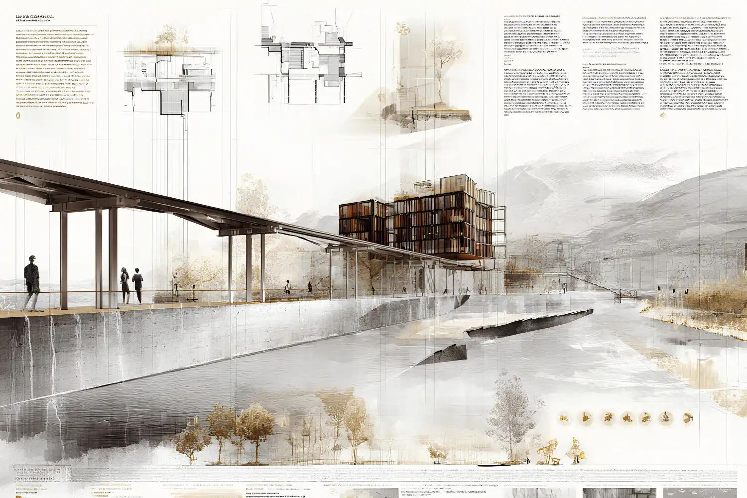
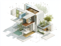
Board layout is where most architecture student presentation tips focus, and for good reason. A disorganized board forces jurors to search for information instead of absorbing it. Start every board with a grid. A simple three-column or four-column grid keeps drawings aligned and creates natural white space that lets each image breathe. Avoid filling every square centimeter of the board, because density does not equal quality.
Group related drawings together. Plans, sections, and elevations of the same design area should sit near each other so jurors can cross-reference without scanning the entire board. Place your most important image (usually a perspective render or a key section) in the upper-left quadrant, where the eye naturally lands first. According to the American Institute of Architects (AIA), clear visual hierarchy is one of the most frequently cited factors in successful project presentations.
Typography and Color Choices
Pick one sans-serif typeface and stick with it across all boards. Helvetica, Futura, and DIN are safe options that read well at both large and small sizes. Use no more than three font sizes: one for board titles, one for section labels, and one for annotations. Anything beyond that creates visual noise.
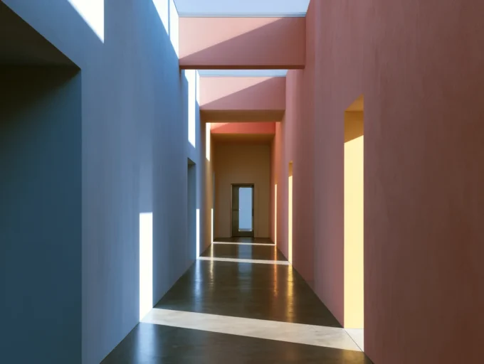
Color should support your architectural presentation layout, not compete with it. A muted background (white, light gray, or off-white) keeps the focus on your drawings. If you use accent colors, limit them to two and tie them to your concept. For example, if your project emphasizes water management, a blue accent on diagrams reinforces that theme without extra explanation.
⚠️ Common Mistake to Avoid
Many students use dark or heavily textured backgrounds on their architectural presentation boards because they look dramatic on screen. In print and at jury distance, dark backgrounds reduce legibility of annotations and make sections harder to read. Stick with light backgrounds and test print a small section before committing to a full set.
Speak to Your Drawings, Not About Them
Verbal delivery separates a good architecture presentation from a forgettable one. The most common mistake during architecture school reviews is reading descriptions aloud while pointing at a board. Jurors can read. What they cannot do is understand your design intent without you explaining the reasoning behind each move.
Instead of saying “this is the ground floor plan,” say “the ground floor opens directly to the park on the south side because pedestrian flow analysis showed 70% of foot traffic comes from that direction.” The first version describes what the jury already sees. The second version adds the why, which is the part only you can provide.
Time yourself. Most studio reviews give each student 10 to 15 minutes. Divide that time roughly into thirds: one-third for context and concept, one-third for the design, and one-third for questions. Finishing early is better than being cut off. Practice at least three full run-throughs before review day.
Video: Architecture Presentation Tips | 4 Fundamental Principles
Architect Dami Lee breaks down four principles that make presentations memorable, covering concept-wrapping, audience engagement, and how to structure a satisfying ending for your review.
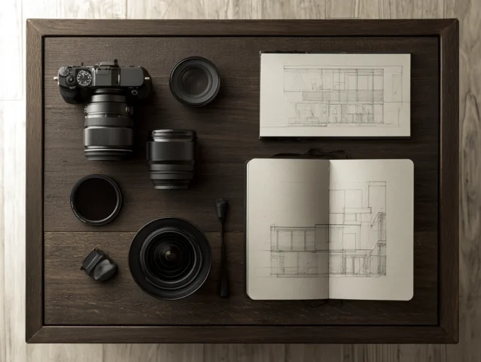
Use Physical Models and Mixed Media
Digital renders look polished, but a well-crafted physical model adds a layer of spatial understanding that screens cannot replicate. Jurors can walk around a model, look through openings, and immediately grasp scale relationships. Even a simple massing model cut from chipboard gives your architecture presentation a physical anchor that keeps the conversation grounded.
If you want to go further, combine your model with projected images or overlay printed acetate diagrams on top. This mixed-media approach shows range and keeps the jury engaged. For a deeper look at how physical models strengthen design communication, we covered the topic separately.
💡 Pro Tip
Bring your model to the presentation table before the review starts and position it where jurors will naturally sit or stand. A model that is already visible when the conversation begins draws attention and often prompts questions early, giving you control of the discussion flow.
Software and Tools for Architecture Presentations
Choosing the right software depends on what stage your project is at and what kind of output you need. For board layout, Adobe InDesign remains the industry standard because it handles large-format printing, vector graphics, and image placement without quality loss. Canva works for quick mockups and early-stage boards but lacks the precision controls needed for final output.
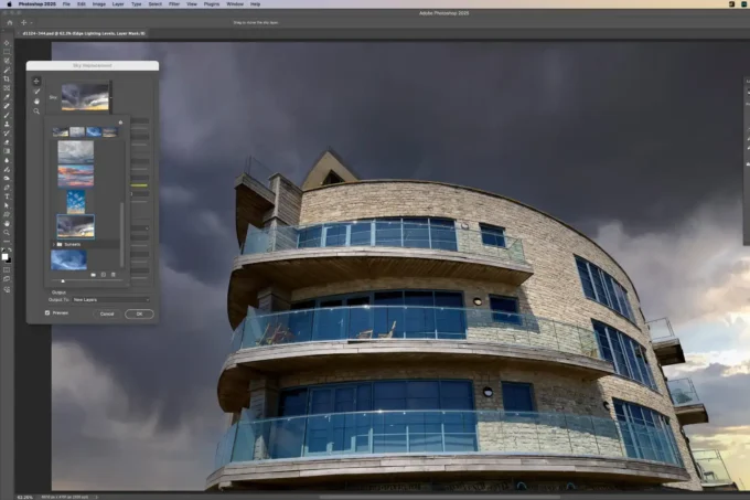
For renders, students often start with SketchUp paired with V-Ray or Enscape. More advanced workflows involve Rhino with Grasshopper for parametric geometry and Lumion or Twinmotion for real-time walkthroughs. If you are comfortable with AI-assisted visualization, AI tools for architectural visualization can speed up early concept renders dramatically.
Diagram creation is just as important as rendering. Adobe Illustrator gives you full vector control for site analysis, circulation, and exploded axonometric diagrams. For students on a budget, Figma offers similar vector tools with free access. Pair these with hand sketching techniques for concept-stage drawings that feel personal and direct.
📌 Did You Know?
A 2023 survey by ArchDaily found that 62% of architecture students ranked presentation skills as the area where they felt least prepared, even though jury reviews account for a significant share of their final grades. Schools increasingly address this gap by adding dedicated presentation workshops to their curricula.

Where to Go From Here
Your Next Step: Before your next review, take your current boards and pin them on a wall at jury distance (roughly 2 to 3 meters away). If you cannot read your annotations or follow the narrative flow from that distance, adjust font sizes, drawing scale, and board sequence until you can. This single test eliminates the most common architectural presentation board issues before they reach the jury room.
Frequently Asked Questions
How many boards should an architecture student prepare for a presentation?
Most studio reviews work well with 3 to 5 boards at A1 or A0 size. Fewer boards force you to edit ruthlessly and keep only the strongest drawings. For digital slides, 15 to 20 is a practical upper limit for a 10-minute talk.
What is the best font size for architecture presentation boards?
For A1 boards viewed at 2-3 meters, board titles should be 36 to 48 points, section headings 18 to 24 points, and body annotations 10 to 14 points. Always print a test strip at actual size before committing to a full print run. What looks fine on a laptop screen often becomes unreadable at board scale.
How can I reduce nervousness during an architecture review?
Rehearsal is the most reliable method. Practice your talk at least three times in front of someone, ideally a peer from outside your studio group who can spot gaps in your logic. Arrive early, set up your boards and model calmly, and take a few deep breaths before you start. Knowing your material well enough to explain it without notes removes most of the anxiety.
Should I include process work on my presentation boards?
Yes, but selectively. One or two images showing early sketches or iterative massing studies demonstrate that your final design did not appear out of thin air. Place process work in a supporting role (smaller size, secondary position) rather than giving it equal weight with final drawings.
- architectural presentation board tips
- architectural presentation boards tips
- architectural presentation layout tips
- architecture presentation for students
- architecture presentation tips
- architecture presentation tips students
- architecture student presentation tips
- tips for architecture students presentation


Leave a comment