

Table of Contents Show
Architecture presentations rely on typography as much as drawings, and the right architectural font choice keeps your boards readable, consistent, and professional. The best approach pairs one clean sans-serif for headings with a legible body face, sets sizes for jury scanning distance, and limits the layout to two typefaces with a clear visual hierarchy.
Typography often gets treated as an afterthought once the renders are done, yet jurors and clients form an impression of your work in seconds. A messy label or a hard-to-read project description can undercut months of design effort. This guide covers the fonts that work for architecture presentations, the pairing and sizing rules that hold a board together, and the mistakes that quietly weaken otherwise strong submissions.
Why Does Typography Matter in Architecture Presentations?
Typography shapes how quickly a viewer understands your project and how seriously they take it. Architecture presentations carry titles, scale bars, room labels, diagrams, and longer narrative text, and each layer needs to read cleanly at a glance. When the type is inconsistent or poorly sized, the eye works harder, and the design story gets lost.
A well-chosen architecture font does three things at once. It signals the character of the project, whether that is a restrained civic building or a playful pavilion. It builds a reading order so the viewer knows where to look first. And it ties separate panels into one coherent presentation rather than a set of unrelated sheets.
📌 Did You Know?
Helvetica, one of the most widely used architectural fonts, was released in 1957 by the Swiss foundry Haas and originally named Neue Haas Grotesk. Its neutral, geometric forms made it the default voice of modernist signage and corporate identity, which is why it still reads as clean and professional on presentation boards today.
For a deeper look at how type influences perception in design work, our breakdown of effective font usage in architectural designs and presentations covers the serif and sans-serif distinction in more detail.
What Are the Best Fonts for Architecture Presentations?
The best fonts for architecture presentation work are clean, neutral, and available in several weights. Sans-serif families dominate because their even strokes stay legible at small label sizes and reproduce well in print. A short list of reliable choices covers most academic and professional needs.
- Helvetica and Helvetica Neue: the modernist standard, neutral and highly legible across sizes.
- Futura: a geometric face with strong personality, well suited to titles and cover sheets.
- Gotham: balanced and contemporary, popular for headings and large captions.
- Univers and Akzidenz-Grotesk: precise Swiss-style faces that pair well with technical drawings.
- Garamond or Baskerville: serif options that add warmth to longer project descriptions.
If you want professional results without licensing costs, several free Google Fonts cover the same ground. Montserrat, Open Sans, Work Sans, and Inter all offer multiple weights and read cleanly on boards. You can preview and download them from the Montserrat specimen on Google Fonts, which shows each weight at presentation scale.
🏗️ Real-World Example
Centre Pompidou (Paris, 1977): The Rogers and Piano scheme used a bold, systematized graphic identity, and its color-coded service ducts and signage drew on clear sans-serif lettering. The lesson for boards is the same one the building teaches, a single disciplined typographic system reads as confident and intentional rather than decorative.
How Many Fonts Should a Presentation Board Use?
Limit a board to two typefaces at most: one for headings and one for body text. A single family with several weights can even do the job alone, using bold for titles and regular for descriptions. More than two unrelated faces creates visual noise and weakens the hierarchy you are trying to build.
Contrast between the two faces should come from weight and size, not from mixing competing personalities. A geometric sans for titles paired with a quiet serif for paragraphs is a dependable combination. If you choose two sans-serif faces, make sure they differ clearly so the pairing reads as deliberate.
How Do You Build a Clear Typographic Hierarchy?
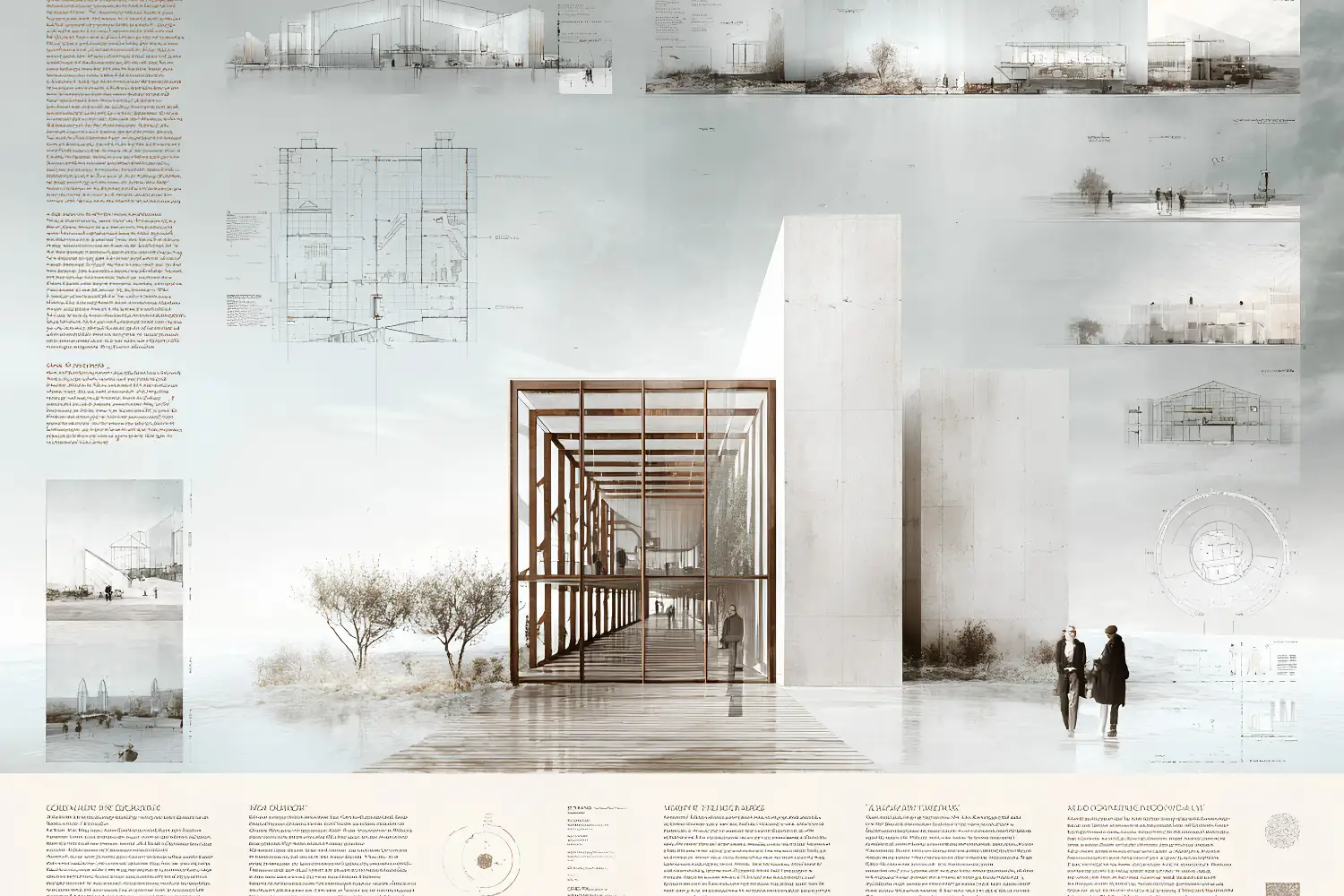
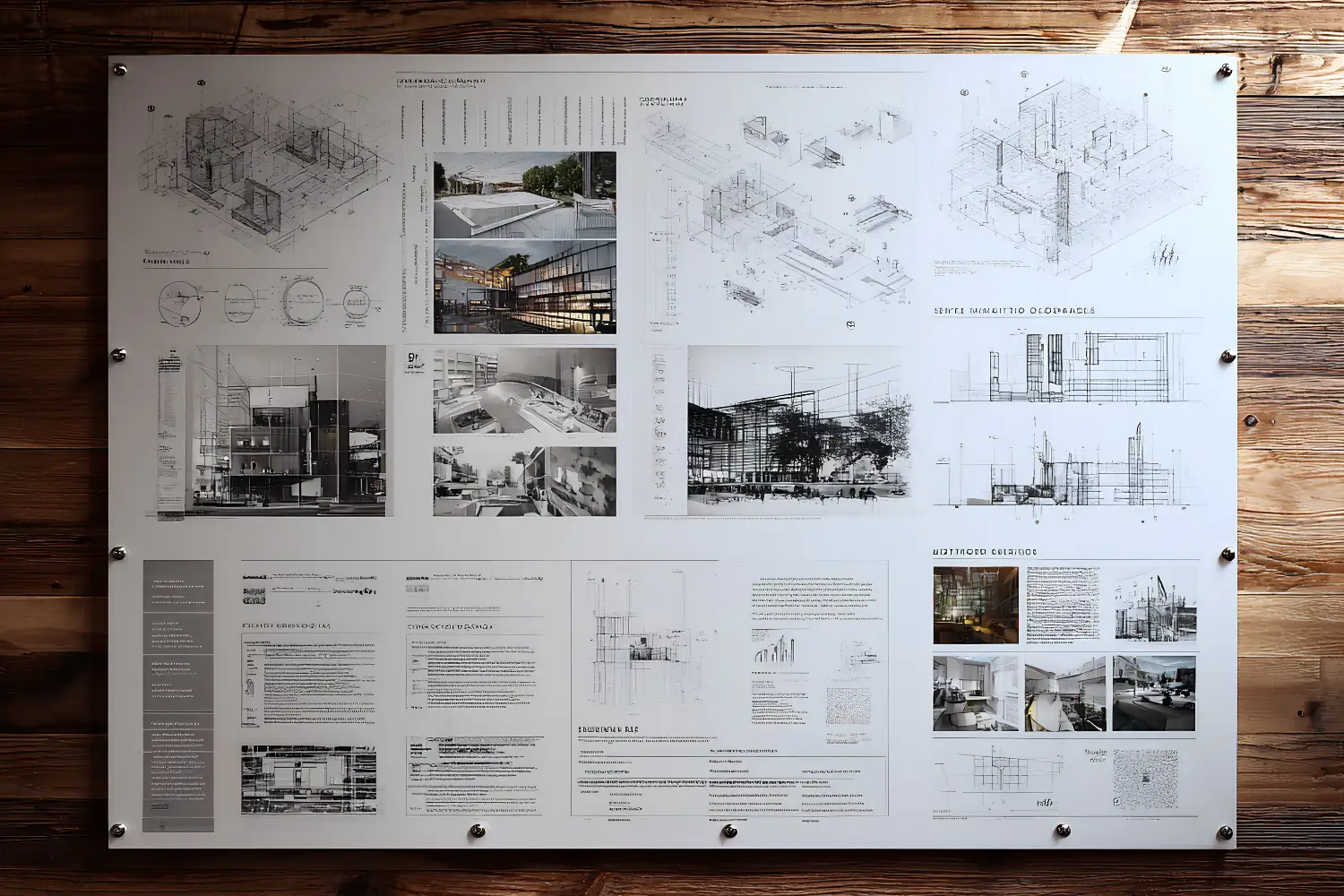
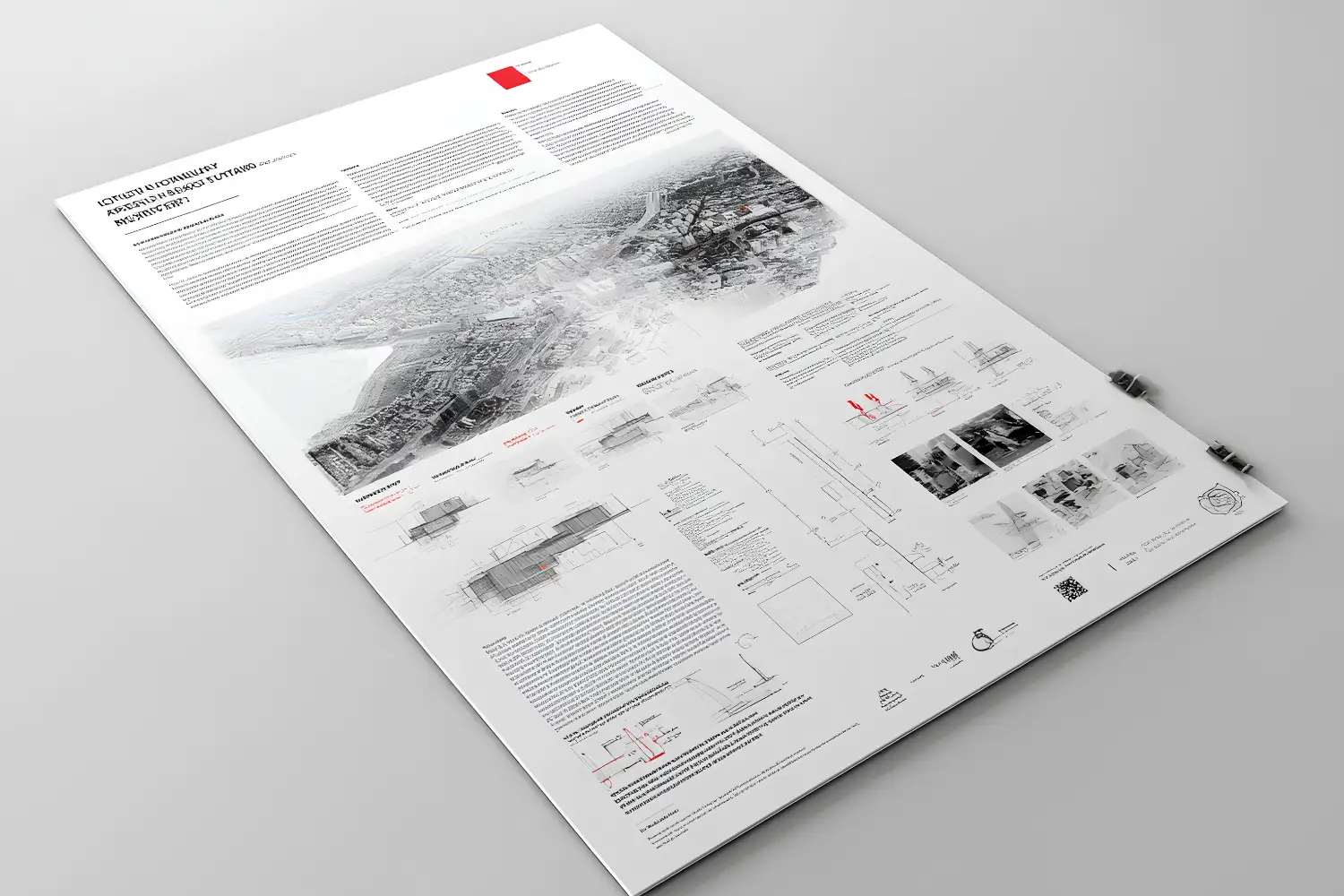
A clear hierarchy guides the viewer from project title to subtitle to body text without confusion. Set distinct sizes for each level and keep those sizes consistent across every panel. A jury scanning a row of boards should be able to find the project name, the key diagram label, and the explanatory text in that order.
A practical sizing structure for a typical A1 or A0 board looks like this. Project titles sit large and bold, section headings drop to a clear secondary size, and body text stays in a comfortable reading range. The table below gives a starting point you can adjust to your layout and viewing distance.
Recommended Type Sizes for Presentation Boards
The following table summarizes a workable hierarchy for printed boards viewed from roughly one to two meters:
| Text Level | Suggested Size | Weight | Use |
|---|---|---|---|
| Project title | 40-72 pt | Bold | Main board heading |
| Section heading | 20-28 pt | Medium or Bold | Concept, site, plan labels |
| Body text | 10-12 pt | Regular | Project descriptions |
| Captions and labels | 8-10 pt | Regular | Scale bars, drawing notes |
💡 Pro Tip
When you build a board, print one panel at full scale early and tape it to a wall, then step back two meters. Body text that looked fine on screen at 100 percent often disappears at real viewing distance. Adjusting the size before you finalize the layout saves a costly reprint the night before submission.
Which Typography Practices Keep Boards Readable?
Readability comes from a handful of consistent habits rather than any single font. Keep generous margins, align text to a grid, and leave white space around blocks of type so the eye can rest. Dark text on a light background almost always reads better than light text on a dark photo, which is where many boards lose clarity.
Line spacing matters as much as font size. Tight leading makes paragraphs feel cramped, while overly loose spacing breaks the connection between lines. A line height of roughly 1.3 to 1.5 times the font size keeps body text comfortable. Left-aligned text with a ragged right edge reads more naturally than fully justified blocks, which can open uneven gaps between words.
⚠️ Common Mistake to Avoid
Placing dark text directly over a busy render or photograph is the fastest way to make a label unreadable. If text must sit on an image, add a subtle solid panel or a soft gradient behind it, or move the caption to a clear margin. Legibility should never depend on the viewer squinting through a background.
Color discipline supports readability too. Stick to one or two text colors across the whole presentation, usually a near-black and a mid-gray for secondary notes. Bright colored type can pull attention away from the drawings, which should remain the focus. The same restraint applies when you carry these choices into a printed booklet, where ink and paper interact differently from a screen. Our guide to architecture portfolio printing walks through CMYK setup, paper weight, and embedded fonts for clean output.
Where Do You Find and License Architecture Fonts?
Reliable architectural fonts come from a few trusted sources. Google Fonts offers a large free library with full commercial rights, which makes it the default starting point for students. Adobe Fonts gives subscribers access to professional families like Futura PT through a Creative Cloud plan. For premium standards such as Helvetica Neue or Univers, you license directly from foundries like Linotype or Monotype.
Check the license before you commit a font to a printed portfolio or a published board. Free for personal use does not always mean free for commercial or competition entries. The Futura PT family on Adobe Fonts shows how a single typeface can span many weights, which is exactly the range you want for building hierarchy without adding a second face.
📐 Technical Note
When exporting boards for print, embed your fonts in the PDF rather than relying on the print shop having them installed. In InDesign or Illustrator, choose a press-ready PDF preset and confirm font embedding is enabled, or convert text to outlines as a fallback. Missing-font substitution at the print stage can silently change your entire typographic hierarchy.
ArchDaily keeps a useful reference on type selection for the profession in its feature 10 Fonts For Architects, which discusses why architects treat typefaces as part of their visual vocabulary. Pairing that perspective with hands-on testing on your own boards gives you a practical sense of what holds up at scale.
How Does Font Choice Connect to the Wider Presentation?
Type is one layer of a board that also carries drawings, diagrams, and renders, and it should support those elements rather than compete with them. Consistent labeling across plans, sections, and details makes a complex sheet legible. The same typographic system should carry through every panel and into any digital version you present on screen.
Strong projects treat typography as part of the overall composition from the start, not a finishing step. Reserving space for titles and captions during layout prevents the cramped, squeezed text that signals a rushed board. For a fuller view of how type fits alongside images and narrative, our guide to the essential elements of an architectural portfolio shows how layout, hierarchy, and visual quality work together. If you also produce rendered plans, the techniques in our Photoshop floor plan rendering guide help you keep labels crisp against detailed graphics.
Frequently Asked Questions
What is the best font for an architecture presentation?
There is no single best font, but Helvetica, Futura, and Gotham are dependable professional choices, while Montserrat and Open Sans offer strong free alternatives. The right pick depends on your project character and the need for several weights to build a clear hierarchy.
Should architecture boards use serif or sans-serif fonts?
Sans-serif fonts are the common choice for labels, titles, and captions because they stay legible at small sizes. A serif face like Garamond can work well for longer project descriptions, adding warmth without sacrificing readability.
How many fonts should I use on a presentation board?
Use two typefaces at most, one for headings and one for body text. A single family with multiple weights can also carry an entire board, and limiting your choices keeps the layout clean and the hierarchy clear.
What font size should body text be on an A1 board?
Body text on a large board generally reads well between 10 and 12 points, with captions at 8 to 10 points. Always test at full scale from one to two meters away, since on-screen previews underestimate how small print text appears in person.
Putting It All Together
Bottom Line: Good typography on architecture presentations is mostly discipline, not decoration. Pick one or two legible fonts, set a consistent size hierarchy, give text room to breathe, and test everything at real viewing distance. When the type quietly does its job, the design gets the attention it deserves.


Leave a comment