Table of Contents Show
Transit hubs aren’t just places we pass through: they’re where a city shows us who it is. When we look closely at concourses, platforms, and plazas, we read the local priorities, craft, climate, cadence, even humor. In this text, we explore how transit hubs reflect city identity, from architecture and language to culture, sustainability, and technology, and we ground it with case studies that prove the point.
Architecture As A Civic Signature
Materials, Forms, And Skyline Context
Architecture is the fastest way a transit hub declares its intent. Materials speak first: granite and brass telegraph permanence: glass and timber suggest openness and warmth. Forms follow, vaults that soar in civic grandeur or lean, horizontal profiles that tuck into tight street grids. Crucially, a hub’s massing should respect the skyline: in Chicago, the rebuilt Union Station concourse aligns with a canyon of mid-rise masonry, while in Shenzhen, newer terminals play with luminous skins that echo the city’s tech-forward silhouette. When we stitch these choices into the surrounding urban fabric, think of Rotterdam Centraal’s sharp roofline pointing toward the city center, or Lisbon’s Oriente Station fusing Santiago Calatrava’s lattice with the riverfront, we get hubs that feel inevitable rather than imposed.

Old Meets New: Preservation Versus Reinvention
Every city negotiates its past at the station door. Do we restore ornamental ticket halls, or clear the decks for efficiency? We’ve seen persuasive hybrids: Antwerp-Centraal’s historic dome floats above modern platforms: Madrid’s Atocha keeps its iron-and-glass shell while inserting a tropical garden as a social buffer. The key is legibility. If we’re going to splice eras, we should reveal the joints, leave a readable seam where brick meets steel, and let daylight mark the threshold between heritage and new work. That honesty becomes part of the civic story.
Language, Wayfinding, And Local Vernacular
Typography, Symbols, And Multilingual Messaging
Wayfinding is the city’s voice. The typeface, color system, and iconography say as much as a mayoral speech. London’s Johnston and New York’s Helvetica/Transit mix have become cultural exports: Seoul uses crisp pictograms to cut across language barriers: Doha blends Arabic script with clear English to invite global travelers. The trick is balancing personality with clarity: distinctive, not gimmicky: inclusive, not overloaded.
Street-Level Interfaces And Entrances
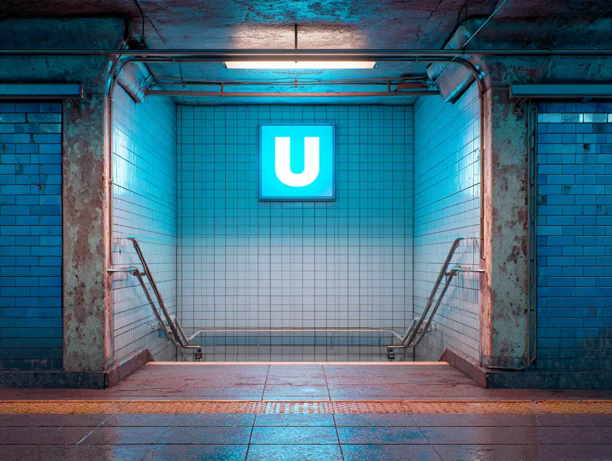
How we meet the building from the sidewalk reveals values about public life. Generous canopies and transparent corners signal safety and welcome: arcades protect queues from rain or sun. Entrances that align with desire paths, those informal routes we all take, show respect for daily patterns. In Mexico City, metro portals double as tiny civic stages for vendors and musicians. In Copenhagen, bike-integrated entries let cyclists glide directly to platforms. These touchpoints braid the station into the surrounding urban fabric: a few high-functioning examples include Union Station in Denver spilling into a public plaza, and São Bento in Porto where tiled narratives meet the street and set the tone before a single ticket is scanned.
Culture, Memory, And Belonging In Transit
Informal Economies, Food, And Daily Rituals
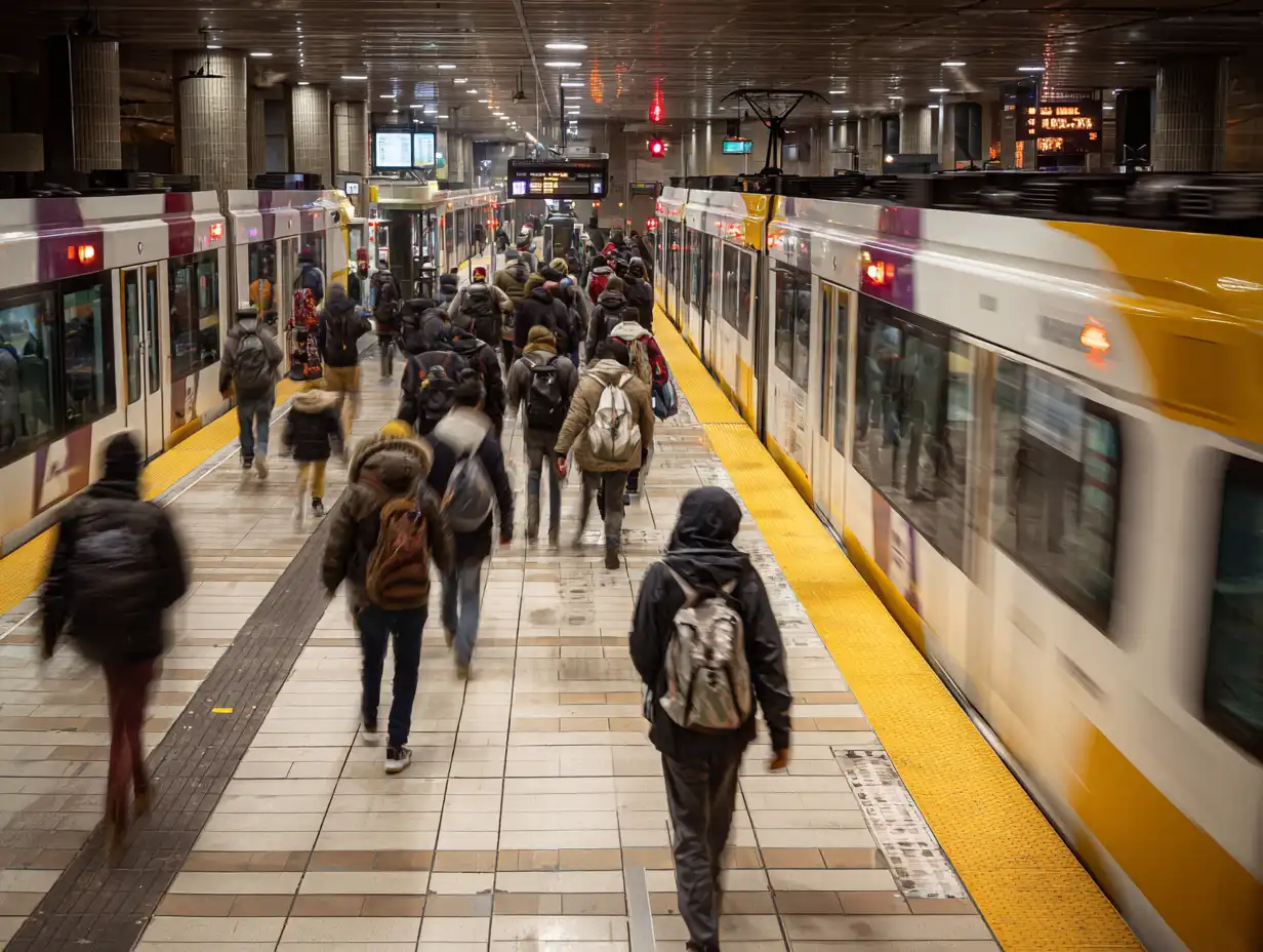
We recognize a city by what it eats at rush hour. Bangkok’s station snacks, New Orleans’ coffee-and-beignets at dawn, Tokyo’s ekiben culture, each micro-ritual reinforces place. When we carve out permanent stalls for local vendors instead of generic chains, we legitimize the informal economies that keep stations lively and safe. Seating, shade, and clean water matter as much as storefronts: they turn waiting into dwelling.
Commemoration, Place-Naming, And Inclusion
Names are memory tools. Stations that honor neighborhoods, Indigenous languages, or overlooked histories make riders feel seen. Minneapolis–St. Paul’s stops reference rivers and Dakota names: in Cape Town, art programs narrate township histories along commuter lines. Inclusion also shows up in the details: tactile paving with consistent logic, audible announcements in multiple languages, and quiet rooms for neurodiverse riders. Identity isn’t a mural: it’s a thousand small affordances.
Sustainability And Technology As Identity Shapers
Climate Responses Matched To Place
Sustainability isn’t a universal kit. In Phoenix, deep overhangs, high albedo roofs, and evaporative cooling courtyards make more sense than all-glass boxes. In Helsinki, triple glazing and vestibules tame winter winds: in Singapore, porous concourses ride the breeze and manage monsoon runoff with bioretention gardens. When climate responses mirror local conditions, the hub reads as authentic, not performative.

Data, Ticketing, And The User Experience
Back-end tech shapes front-end trust. Contactless, account-based ticketing reduces friction and stigma (no more hunting for exact change). Real-time crowding data lets us choose a quieter car: dynamic signage keeps lines moving without barked orders. But we need restraint. Good systems reveal just enough: a clear map, a reliable ETA, and an SOS that actually works. The best tech presence fades into calm competence, part of the identity of a city that respects our time.
Case Studies: Hubs That Embody Their Cities
Grand Central Terminal, New York
Grand Central wears New York’s swagger with precision. Beaux-Arts bones, celestial ceiling, and a concourse that handles chaos with choreography. The station’s ramps and balconies make vertical movement feel theatrical, while the whispering gallery and oyster bar ground it in everyday delight. Its retail mix favors local stalwarts alongside global names, and the terminal’s alignment with Midtown’s grid keeps it stitched tightly into the city’s work-life metabolism.

Shinjuku Station, Tokyo
Shinjuku is Tokyo’s pulse at full tempo. It’s a megastructure with a million daily riders, yet wayfinding remains legible through color-coded lines, consistent iconography, and a lattice of exits that meet the neighborhood’s fine-grain streets. The food courts and convenience stores are not afterthoughts: they’re core services for a city that snacks on the move. Tech-forward, yes, but polite: gate arrays process crowds quietly, and platform doors add safety without drama.
St. Pancras International, London
St. Pancras marries Victorian ambition with European reach. The restored Barlow Shed is a cathedral of iron and light, and the brick frontage fronts a revived public realm with art, books, and yes, a champagne bar that feels very London. Eurostar platforms integrate border control with minimal fuss, while retail curation leans British without lapsing into souvenir-land. The station doesn’t just connect London to Paris and Brussels: it announces London’s confidence in its past and future.
Conclusion
Transit hubs reflect city identity because they compress everything, architecture, language, culture, climate, and code, into a place we all pass through. If we design for clarity and character, we get stations that work beautifully on Tuesday at 8:15 a.m. and still feel like us on a holiday evening. That’s the bar we should set: useful first, unmistakably local always.
- city branding through transport
- city identity through transit infrastructure
- city image and public transportation
- city planning transit hubs
- city transit systems
- how transit systems shape cities
- identity of cities through transport
- impact of transit on city culture
- influence of public transit on cities
- metro systems and urban identity
- metropolitan transit identity
- public transit and city culture
- role of transit in urban design
- transit architecture and cityscape
- transit hubs and city identity
- transit station architecture
- transportation and urban culture
- transportation hubs identity
- transportation infrastructure and city identity
- urban design and transit systems
- urban identity and transportation
- urban transit design







Leave a comment