


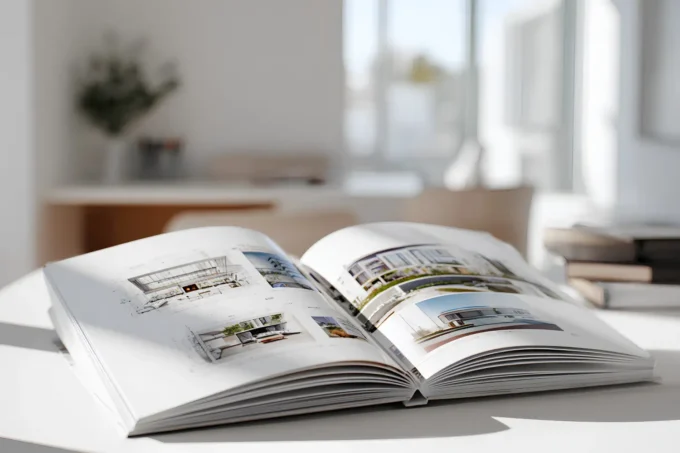
Table of Contents Show
Color shapes how we feel, think, and connect with the spaces around us. It’s not just about picking a shade that looks good—it’s about creating harmony that transforms a room into a reflection of who we are. In interior design, color isn’t just decoration; it’s a powerful tool that sets the tone and mood of our spaces.
When we understand the balance between color and design, we can craft interiors that feel cohesive, inviting, and uniquely ours. From bold statements to subtle palettes, the right combinations can bring energy, calm, or warmth to any room. It’s all about finding that perfect blend that speaks to both function and style.

Understanding The Harmony Between Color And Interior Design
Harmony in interior design integrates color seamlessly to create balanced and visually pleasing spaces. This connection impacts how we perceive and experience the environments around us.

What Is Harmony In Interior Design?
Harmony in interior design refers to the arrangement of colors, textures, and forms to achieve a balanced aesthetic. When all elements work cohesively, the space feels unified and intentional. For example, using complementary colors like blue and orange in varied tones can ensure continuity while maintaining visual interest. The goal is to blend elements so no single detail overpowers another, resulting in a tranquil and engaging atmosphere.
Importance Of Color In Creating Harmony
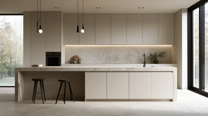
Color serves as the foundation for creating harmony in design, defining a space’s character and emotional undertone. Selecting a cohesive color palette connects different areas, ensuring the space feels unified. For instance, neutral tones like beige or gray can provide a backdrop, allowing accent colors, like green or teal, to enhance the room’s vibrancy. The deliberate use of shades ensures balance and avoids visual clutter, affecting both functionality and aesthetics.
Key Principles Of Color Harmony
Understanding key principles of color harmony helps achieve coherent and aesthetically pleasing interior spaces. By applying these principles, we can ensure that our designs evoke the desired mood and create a balanced atmosphere.

The Color Wheel And Its Role In Design
The color wheel is a foundational tool for creating harmonious interior designs. It organizes colors into primary, secondary, and tertiary shades, illustrating their relationships. Complementary colors, like blue and orange, sit opposite each other on the wheel and provide vibrant contrast. Analogous colors, such as green, blue, and teal, sit side by side and create a serene and cohesive look. Monochromatic schemes use variations of a single color to promote subtle harmony. Incorporating the color wheel helps us curate combinations that align with the space’s purpose and atmosphere.
Balance, Contrast, And Unity In Color Schemes
Balance in color schemes ensures that no single hue dominates the space unless intended. Equal distribution of bold, neutral, and muted tones maintains visual harmony. Contrast adds depth and focus by pairing light and dark shades, like charcoal gray with soft beige. Unity ties the elements together by repeating colors throughout different design features, such as furniture, walls, and décor. Creating a cohesive flow while balancing contrast enhances the sense of completeness in a room’s design.
Choosing The Right Colors For Your Space
Selecting colors for a space involves more than personal preference. Each hue interacts with the room’s purpose, lighting, and surrounding elements to create a cohesive design.

Matching Colors To Room Function
Colors influence the functionality and atmosphere of a room. For living rooms and social spaces, warm tones like gold, rust, or terracotta foster energy and comfort. Bedrooms benefit from calming shades like soft blues, greens, or lavender, promoting relaxation. In kitchens, vibrant reds or yellows stimulate appetite and encourage activity. For workspaces, neutral shades and muted tones such as beige or gray aid focus and reduce distractions. Understanding these roles ensures that colors align with the room’s intended use.
Considering Natural And Artificial Lighting
Lighting alters how colors appear. Rooms with abundant natural light enhance warm and bright colors, making them feel more vivid. Cool shades like blue or gray balance the brightness in such spaces. For interiors with limited daylight, incorporating lighter neutrals, soft yellows, or whites prevents the room from feeling dim or closed in. Artificial lighting plays a similar role—incandescent bulbs amplify warm tones, while LED lighting accents cooler shades. Testing color samples in various lighting conditions ensures the chosen palette complements the space throughout the day.
Common Mistakes To Avoid In Color Harmony
Creating color harmony is essential in interior design, but missteps can disrupt the balance and detract from a space’s appeal. Avoiding these common mistakes helps maintain cohesion and ensures a well-designed environment.

Overusing Bold Colors
Excessive bold colors overwhelm a space, leading to a chaotic atmosphere. Large areas dominated by intense shades, such as bright reds or neon yellows, strain visual harmony. Instead, we recommend balancing bold hues by pairing them with neutral tones like white, beige, or gray. For instance, use a vibrant color on accent walls, furniture, or decor while keeping the rest of the palette subdued to emphasize contrast without overpowering the room.
Ignoring The Emotional Impact Of Colors
Choosing colors without considering their psychological effects disrupts mood consistency. For example, overly energetic colors like bright orange in a bedroom can hinder relaxation, while muted tones in a workspace may reduce focus. We suggest aligning color choices with the intended purpose of each room. Opt for calming shades, such as pastels or soft greens, in rest areas, and use stimulating tones like cobalt blue or mustard in active spaces to enhance functionality while preserving harmony.
Enhancing Interior Spaces Through Harmonious Colors
Harmonious colors, when applied purposefully, elevate the functionality and aesthetics of interior spaces. They create balance, unify design elements, and influence how we experience a room’s atmosphere.

Creating Visual Flow Between Rooms
Consistency in color choices ensures seamless transitions between rooms. By using a cohesive color palette, we can connect different areas while maintaining each room’s unique identity. Neutral base tones like beige or gray serve as anchors, linking spaces without overwhelming the design.
Adding subtle variations or tints from the primary palette in adjacent rooms enhances the sense of unity. For instance, a soft green in a living room can transition into a muted sage in a dining area. This gradual shift eliminates harsh contrasts and fosters a visual flow.
Using Accent Colors Effectively
Accent colors add depth and personality when applied strategically. To maintain harmony, we recommend limiting accent hues to 10% of the overall design palette. These pops of color work best in decor items, such as throw pillows, artwork, or rugs, avoiding disruption in larger structural elements.
Selecting complementary or contrasting accent tones amplifies focal points. For example, pairing navy blue with burnt orange creates dynamic energy, while incorporating gold accents in a monochromatic scheme adds elegance. This intentional use of accents ensures balance and visual interest in any interior space.
Conclusion
Achieving harmony between color and interior design enhances both the visual and emotional experience of a space. By integrating carefully chosen color palettes with textures and forms, we create rooms that feel cohesive and intentional. Balanced hues establish a sense of unity, while thoughtful variations and accents add depth and interest.
Color harmony plays a critical role in connecting the functionality and aesthetics of interiors. For instance, uniting spaces with neutral bases ensures smooth transitions, while accented elements provide unique identities. Testing colors under different lighting conditions guarantees compatibility with each room’s ambiance throughout the day.
When we align color choices with the purpose of each room, the design not only looks appealing but also serves its intended function. Balancing bold and neutral tones prevents overwhelming the space, and understanding emotional impacts allows us to craft environments that evoke desired feelings—whether calm, energized, or inspired.
- best colors for interior design
- color consulting for interiors
- color harmony in room design
- color harmony interior design
- color palette interior design
- color psychology in interiors
- creative color interior design
- integrating color interior design
- interior aesthetics color design
- interior color coordination
- interior design color schemes
- interior design color specialist
- interior design color trends
- interior designer color expert
- perfect color interior design
- personalized color interior design
- professional color interior design
- stunning spaces interior design
- using color in interior design
- vibrant interiors color design


Leave a comment