


Table of Contents Show
Cut a wall open in a drawing and you are left with an outline. Hatching is what fills that outline with meaning. It tells the reader that this band is concrete and that one is insulation, that the ground below is undisturbed earth rather than hardcore, that the thin dark line inside the cavity is a membrane rather than a drafting error. It does this without labels, which is why a well-hatched section is readable in any language.
This guide covers the difference between poché and hatching, the standard material conventions, how hatch behaves as scale changes, and how to control it in CAD and BIM instead of fighting it.
What Hatching Does
Hatching answers a question that line weight cannot: not where is the solid material, but what is it made of. Line weight separates cut from seen; hatch identifies the substance inside the cut.
That gives it two distinct jobs, and confusing them is the source of most bad hatching. The first job is identification: a pattern that stands for a specific material by convention, so that dots and triangles read as concrete and a looping line reads as quilt insulation. The second job is tonal weight: giving cut mass enough density to read instantly as solid against the open space around it, regardless of what the material is.
At large scales the first job dominates, because there is room to draw a pattern that is genuinely distinguishable. At small scales the second takes over, because no pattern survives being shrunk to a two-millimetre band. Knowing which job the hatch is doing on a given drawing tells you how much effort it deserves.
Poché and Hatching Are Not the Same Thing
Poché, from the French for “pocketed”, is the solid or near-solid darkening of material cut in plan or section. Traditionally it was a wash or a dense fill inside the thickness of a wall, and its purpose is purely tonal: to make the mass of the building read as figure against the ground of the space. Poché does not say what the wall is made of. It says this is solid, and this is not.
Hatching is a pattern that identifies a material. It carries information rather than just weight, and it needs to be legible as a pattern to do its job at all.
The practical consequence: on general arrangement drawings at 1:100 or 1:200, use poché, because material patterns will not resolve anyway and the drawing benefits from the tonal clarity. On details at 1:20 and below, use hatching, because the reader now needs to know which layer is which. At 1:50 you often use both, with poché on secondary walls and true hatching where the construction matters. This is one of the ways drawing scale changes not just how much you draw but what kind of drawing you are making.
Standard Material Hatches
Material conventions are widely shared but not fully standardised, and they differ between regions and between practices. The patterns below are the ones an architect anywhere will recognise, though a drawing set should still carry a legend for anything not obvious.
| Material | Conventional pattern in section |
|---|---|
| Concrete (in situ) | Scattered dots and small triangles, representing aggregate |
| Brickwork | Regular diagonal hatch at 45°, or drawn courses at large scale |
| Blockwork / CMU | Diagonal hatch, usually coarser and lighter than brick |
| Quilt or batt insulation | Continuous looping or zigzag line filling the void |
| Rigid board insulation | Fine regular crosshatch, or plain fill with a diagonal |
| Timber, cut across grain | Rectangle with diagonals, or a cross |
| Timber, cut along grain | Wavy parallel grain lines |
| Steel | Solid black at small scale; tight 45° hatch at large scale |
| Undisturbed earth | Irregular short diagonal strokes, uneven spacing |
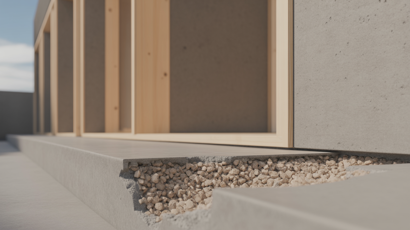
| Hardcore or gravel | Irregular angular fragments |
| Sand, screed, mortar | Fine even stipple |
| Glass | Left blank, or a pair of fine parallel lines |
Two of these are worth memorising above the rest. Concrete’s aggregate stipple and insulation’s looping line are the two patterns that appear on almost every detail drawing, and misreading them changes what you think the wall is. Beyond that, the guide to architectural symbols covers the wider notation vocabulary that sits alongside hatching.
🔢 Quick Numbers
- Use poché at 1:100 and 1:200; use true material hatch at 1:20 and below
- AutoCAD’s ANSI31 is the generic 45° diagonal used for masonry; AR-CONC is the aggregate concrete pattern
- Revit distinguishes drafting patterns, which stay fixed on the sheet, from model patterns, which scale with the building
- Hatch belongs at the lightest line weight tier, never at cut weight
Hatch Behaviour Changes With Scale
A hatch pattern has a spacing, and that spacing is measured on the sheet, not on the building. Halve the scale and the same pattern packs twice as many lines into the same printed band, which is how a clean concrete stipple at 1:20 turns into a solid grey block at 1:50.
There are two ways to handle this, and the distinction matters more in BIM than in CAD. A drafting pattern is defined relative to the sheet: its spacing stays constant in millimetres on paper no matter what scale the view is at, so it always looks the same density. A model pattern is defined relative to the building: a brick pattern set to real course heights shrinks with the drawing, which is correct for anything representing actual physical modules such as brick coursing, tiling or cladding joints.
The rule that follows is straightforward. Use model patterns for anything that exists at a real size on the building. Use drafting patterns for symbolic material indication, where the pattern is a code rather than a picture. Getting this backwards produces either brickwork with implausible course heights or concrete stipple so fine it prints as grey.
Hatching in CAD and BIM
In AutoCAD, hatches come from pattern libraries. The ANSI series covers generic engineering materials, with ANSI31 as the 45° diagonal used for masonry and ANSI32 for steel. The AR series is the architectural set, including AR-CONC for concrete aggregate, AR-BRSTD for standard brick and AR-SAND for a fine stipple. Two properties govern how they print: pattern scale, which sets the spacing, and associativity, which keeps the hatch bound to its boundary so it updates when the geometry moves. Non-associative hatch left over from an edited boundary is a common source of drawings that look right until you zoom in.
Revit handles it through materials rather than through drawing commands. Each material carries a cut pattern, used wherever the view cuts through it, and a surface pattern, used where the material is seen in elevation or plan without being cut. Both can be drafting or model patterns, and both can carry a foreground and background pattern, which is how you get a coloured fill with a hatch overlaid. Because the pattern belongs to the material rather than to the drawing, changing a wall’s material updates every view at once, which is the main practical advantage over CAD hatching.
In either program the discipline is the same as with line weight: define it once at the template or material level rather than drawing by drawing. If you find yourself adjusting hatch scale view by view, the pattern definition is wrong rather than the view.
Common Mistakes
Hatch drawn too heavy. Material pattern belongs at the lightest line weight. Hatch at cut weight competes with the geometry and turns the section into texture.
Hatching at general-arrangement scale. Detailed material patterns at 1:100 or 1:200 collapse into grey. Use poché there and save the hatch for details.
Inventing patterns. A pattern nobody recognises is a label with no legend. Either use the conventional one or add it to a materials legend on the sheet.
Ignoring the direction. Diagonal hatch running the same way across two adjacent materials makes them read as one. Vary angle or spacing between neighbouring layers so the boundary stays visible.
Leaving hatch unassociated. In CAD, an edited boundary with a stale hatch produces a drawing that is quietly wrong, which is worse than one that is obviously wrong.
Frequently Asked Questions
What is poché in architectural drawing?
Poché is the solid or dense darkening of material cut through in plan or section, traditionally a wash or fill inside the thickness of a wall. Its purpose is tonal rather than descriptive: it makes the solid mass of the building read instantly against the open space, without saying what the material is. Hatching, by contrast, uses a pattern to identify a specific material.
How is concrete shown in a section drawing?
By a scattering of dots and small triangles representing aggregate within the cut area. It is one of the two most recognisable hatches in architectural drawing, alongside insulation. In AutoCAD the pattern is AR-CONC; at small scales it is usually replaced by a plain grey fill or poché, because the stipple would pack too densely to read.
How is insulation drawn in architectural details?
Quilt or batt insulation is drawn as a continuous looping or zigzag line filling the void, which reads as something soft and compressible. Rigid board insulation is usually shown as a fine regular crosshatch or a plain fill with a diagonal through it, reading as something firm. The distinction matters because the two behave differently in construction, so the drawing should make clear which is specified.
What is the difference between a hatch pattern and a fill?
A hatch pattern is made of lines with spacing, so it reads as texture and carries material meaning. A fill is a flat tone with no pattern, so it reads only as weight. Most drawings use both: fill or poché where the point is to show mass, hatch where the point is to identify a material. Revit lets a material carry a background fill and a foreground pattern together, producing a coloured tone with a hatch over it.
Why does my hatch look solid black when I zoom out?
Because the pattern spacing is defined on the sheet while the drawing has shrunk. The same pattern packs more lines into the same printed area at a smaller scale until they merge. Either increase the pattern scale for that view, switch to a model pattern if the material has a real physical module such as brick coursing, or replace the hatch with poché at that scale.
What is ANSI31 used for?
ANSI31 is AutoCAD’s generic 45° diagonal hatch, nominally defined for iron, brick and stone masonry but used very widely as a general-purpose section hatch. It is the default that appears when nobody has chosen a pattern deliberately, which is why it turns up on drawings representing materials it was never meant for. Where the material matters, use the specific pattern instead.
Should hatch be a different colour or line weight from the drawing?
It should be lighter, always. Hatch sits at the lightest tier of the line weight hierarchy, below the cut lines and below seen elements, because its job is to fill the geometry rather than compete with it. In CAD this is usually handled by putting hatch on its own layer with a thin plotted weight; in Revit it follows from the material and object style settings.
Do hatch conventions vary between countries?
Yes, in the details. The most recognisable patterns, concrete aggregate, insulation loops, earth, are broadly international, but blockwork, timber and finishes vary between British, European and North American practice, and individual offices maintain their own libraries. This is why a drawing set should include a materials legend for anything beyond the obvious, rather than assuming the reader shares your office’s conventions.
Where to Go From Here
Hatching, line weight and scale are the three conventions that between them make a technical drawing legible, and they are best learned together, since each one constrains the others. For the hierarchy that separates cut from seen, see the guide to architectural line weights. For what a cut through a building is actually showing you in the first place, see understanding section drawings.












Leave a comment