


Table of Contents Show
A floor plan is a flat sheet of paper, and the building it describes is not flat. Line weight is the device that closes that gap. It is how a drawing tells you what has been cut through, what is standing behind the cut, and what is merely a change of surface, all without a single word of explanation. Get the hierarchy right and a drawing reads instantly. Get it wrong and every line carries equal importance, which is the same as no line carrying any.
This guide covers what line weight communicates, the standard pen widths and line types, how the hierarchy changes between plan, section and elevation, and how to set it up in CAD and BIM rather than fighting it.
What Line Weight Actually Communicates
Line weight encodes distance from the viewer. In a plan or a section, the drawing represents a horizontal or vertical cut through the building, and everything in the drawing sits at some depth relative to that cut plane. The convention is simple and almost universal: the closer something is to the cut, the heavier its line.
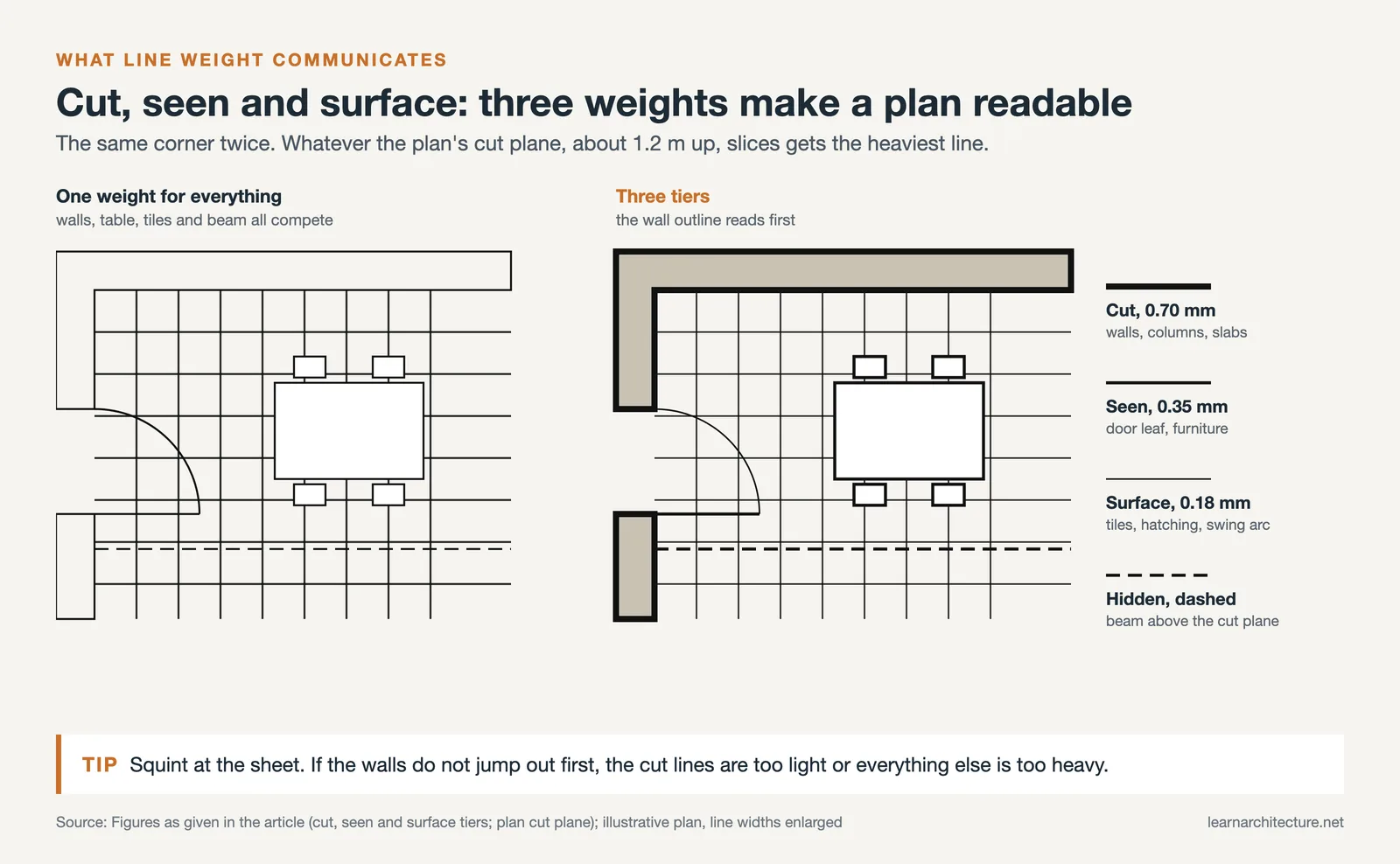
That gives three basic tiers.
Cut. Anything the cut plane passes through, walls, columns, floor slabs, the treads of a stair below the cut line, gets the heaviest line on the sheet. This is the profile of solid material sliced open.
Seen. Elements below or beyond the cut that are visible in the view, door leaves, furniture, window sills, the edge of a step, get a medium line. They exist in the space but the cut has not touched them.
Surface and texture. Floor patterns, tile joints, material hatching, grading and annotation leaders get the lightest line. These carry information but should never compete with the geometry.
Once you internalise this, reading an unfamiliar drawing becomes much faster, because the heaviest lines describe the shape of the building and everything else is commentary. The guide to reading architectural drawings covers how plans, sections and elevations relate; line weight is the mechanism that makes each of them legible on its own.
Standard Pen Weights and Line Types
Technical drawing inherited its line widths from the drafting pen. The standard series steps by a factor of roughly the square root of two, so each width is visibly distinct from the next without the jumps becoming coarse.
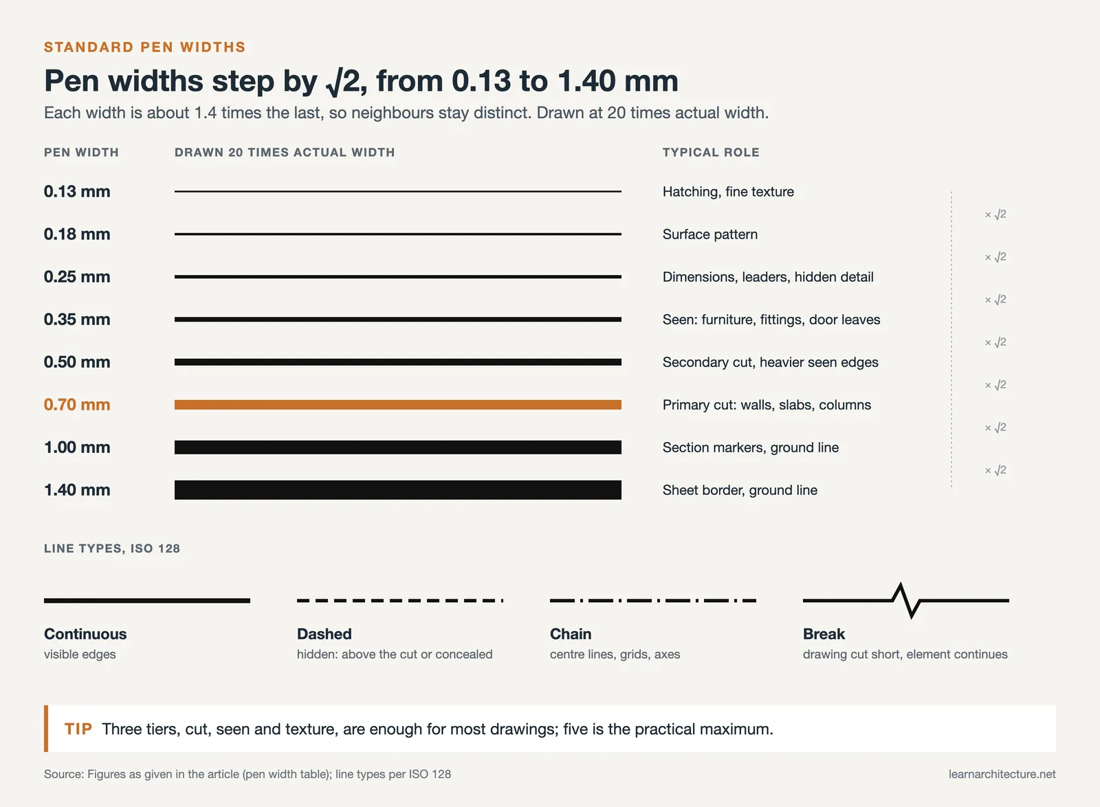
| Width | Typical role |
|---|---|
| 0.13 to 0.18 mm | Hatching, surface pattern, fine texture |
| 0.25 mm | Dimension lines, leaders, hidden detail |
| 0.35 mm | Seen elements: furniture, fittings, door leaves |
| 0.50 mm | Secondary cut elements, heavier seen edges |
| 0.70 mm | Primary cut: walls, slabs, columns |
| 1.00 to 1.40 mm | Section markers, ground line, sheet border |
Alongside width, the type of line carries meaning, and ISO 128 sets out the conventions used across technical drawing.
Continuous lines describe what is visible. Dashed lines describe what is hidden: an element above the cut plane such as a beam or an overhead cabinet, or something concealed within construction. Chain lines, alternating long and short dashes, mark centre lines, grid lines and axes of symmetry. Break lines, a freehand zigzag or a ruled line with a jog, indicate that the drawing has been cut short and the element continues beyond.
🔢 Quick Numbers
- Standard pen widths step by roughly √2: 0.13, 0.18, 0.25, 0.35, 0.50, 0.70, 1.00, 1.40 mm
- Three tiers, cut, seen, texture, are enough for most drawings; five is the practical maximum
- ISO 128 defines the line types used in technical drawings
- Revit assigns 16 numbered pen weights, each with a separate width per view scale
How the Hierarchy Shifts Between Drawing Types
Plans
The cut plane sits roughly 1.2 m above floor level, high enough to pass through doors and windows and low enough to stay below most overhead work. Walls and columns cut by that plane take the heaviest line. Door swings, furniture and floor finishes sit lighter. Anything above the plane, a beam, a mezzanine edge, a canopy, is drawn dashed rather than heavy, because it is hidden from the cut.
Sections
The same rule applies vertically, and sections are where line weight earns its keep. The cut through slabs, walls and ground gets the heaviest line, often with poché or solid fill. Everything visible beyond the cut, the far wall of a room, a stair beyond, a window opposite, steps down in weight as it recedes. A section drawn with uniform lines is genuinely hard to read; the same section with three tiers reads as space. The guide to understanding section drawings covers what the cut is doing in the first place.
Elevations
Elevations have no cut, so the hierarchy is driven by depth instead. The outline of the building against the sky takes the heaviest line, major recesses and projections take a medium line, and surface articulation, cladding joints, glazing bars, material texture, takes the lightest. A ground line heavier than the building outline anchors the drawing. Without this graduation an elevation collapses into a flat pattern, which is the single most common weakness in student elevations.
Line Weight Changes With Scale
A line weight set is not portable between scales. At 1:20, a 0.70 mm wall line looks correct against the amount of detail on the sheet. Reuse it at 1:200 and the same wall becomes a black smear, because the drawing has shrunk but the pen has not.

The working principle is that line weights should be recalibrated whenever the scale changes by more than one step. As drawings get smaller, the whole set moves down: what was 0.70 becomes 0.50, what was 0.35 becomes 0.25, and the finest texture lines are simply deleted rather than thinned, because below about 0.13 mm they will not print reliably. As drawings get larger, the range widens and new tiers become useful, since a detail at 1:5 can carry distinctions that a plan at 1:100 cannot.
This is one of the reasons choosing the right drawing scale matters before you start drawing rather than after. Scale sets the amount of information; line weight makes that information legible.
Setting Line Weights in CAD and BIM
In AutoCAD, line weight can be assigned directly as an object property, but the convention in most offices is to control it by layer and let plotting resolve the widths. Colour-dependent plot styles, the CTB approach, map each drawing colour to a printed width, which is why an AutoCAD drawing often looks like a rainbow on screen and prints as a clean grey hierarchy. Named plot styles, the STB approach, do the same thing without hijacking colour. Either works, but mixing object-level overrides with layer control is how drawing sets become unpredictable.
Revit handles it differently. Line weights are defined centrally as sixteen numbered pens, and critically, each pen number can carry a different width at each view scale. That means a wall assigned pen 5 automatically prints heavier in a 1:20 detail than in a 1:100 plan, and the recalibration described above happens without manual intervention. Object styles then map each category, walls, doors, furniture, to a pen number for both cut and projection. Overriding line weights view by view is possible but usually a sign that the object styles need fixing instead.
The principle in either program is the same: set the hierarchy once at the template level, then draw. If you are adjusting individual line weights on individual objects, the system is working against you rather than for you.
Common Line Weight Mistakes
Using one weight for everything. The most common student drawing has a single line width throughout, which flattens the building into a diagram. Three tiers is a small effort for a large gain.
Too many tiers. The opposite failure. Beyond about five distinguishable weights the reader stops perceiving a hierarchy and starts perceiving noise, and the finest distinctions vanish in printing anyway.
Heavy hatching. Material hatch and floor pattern drawn at the same weight as the geometry pulls the eye away from the building. Hatching belongs at the lightest tier, always.
Forgetting the ground line. In sections and elevations, a heavy ground line does more to make the drawing sit convincingly than any amount of surface detail.
Judging weights on screen. Screens do not show print widths accurately at any zoom level. Print a test sheet at final size and scale before committing a set, because 0.18 mm and 0.25 mm look identical on a monitor and quite different on paper.
Frequently Asked Questions
What are the standard line weights in architectural drawing?
The conventional series is 0.13, 0.18, 0.25, 0.35, 0.50, 0.70, 1.00 and 1.40 mm, each step roughly the square root of two larger than the last. In practice most drawings use three or four of these: around 0.70 mm for cut elements, 0.35 mm for seen elements, and 0.18 to 0.25 mm for hatching, dimensions and texture.
Which lines should be the thickest on a floor plan?
Anything the cut plane passes through, which in a plan means walls, columns and any structure sliced by a horizontal cut about 1.2 m above the floor. These define the shape of the space and should be the heaviest lines on the sheet. Door leaves, furniture and floor patterns sit lighter, and anything above the cut plane, such as a beam or overhead unit, is drawn dashed rather than heavy.
What do dashed lines mean in architectural drawings?
Dashed lines show something hidden from the view: an element above the cut plane such as a beam, mezzanine edge or wall cabinet, or something concealed within the construction. They are distinct from chain lines, which alternate long and short dashes and mark centre lines, grid lines and axes of symmetry.
How many line weights should a drawing use?
Three as a minimum, five as a practical maximum. Three tiers, cut, seen, and texture, are enough to make almost any drawing readable. Adding a fourth for dimensions and a fifth for the sheet border or ground line is useful. Beyond that the reader can no longer distinguish the tiers, and the finest ones disappear when printed.
Do line weights change with drawing scale?
Yes, and they must. A 0.70 mm wall line that looks right at 1:20 becomes a solid smear at 1:200, because the drawing shrinks while the pen does not. As scale reduces, move the whole set down a step and delete the finest texture lines rather than thinning them below about 0.13 mm, where printing becomes unreliable. Revit automates this by allowing each pen number a different width per view scale.
How do I set line weights in AutoCAD?
Control them by layer rather than by object, then resolve widths at plotting. Colour-dependent plot styles, the CTB method, map each drawing colour to a printed width, which is why an AutoCAD file often looks multicoloured on screen and prints as a clean hierarchy. Named plot styles, the STB method, achieve the same without using colour. Avoid mixing object-level line weight overrides with layer control, because the result becomes impossible to predict across a set.
Why do my elevations look flat?
Almost always because every line is the same weight. An elevation has no cut plane, so its hierarchy comes entirely from depth: heaviest for the building outline against the sky, medium for significant recesses and projections, lightest for cladding joints, glazing bars and surface texture, plus a heavy ground line to anchor the building. Introducing that graduation is usually the single change that fixes a flat elevation.
What is poché and how does it relate to line weight?
Poché is the solid or dense fill given to material cut in plan or section, traditionally a dark tone inside the wall thickness. It works alongside heavy cut lines rather than replacing them, and its job is the same: to make the solid mass of the building read instantly against the open space. On small-scale drawings poché often does the work on its own, since at 1:200 the wall is too thin to express through line weight alone.
Where to Go From Here
Line weight is one half of drawing legibility; the other half is choosing the right amount of information to begin with, which is a question of scale. Once both are under control, the remaining conventions are largely a matter of vocabulary, and the guide to architectural symbols covers the notation that sits on top of the line work. If you are still building the plan itself, the step-by-step guide to drawing a floor plan is the place to start.










Leave a comment