


Table of Contents Show
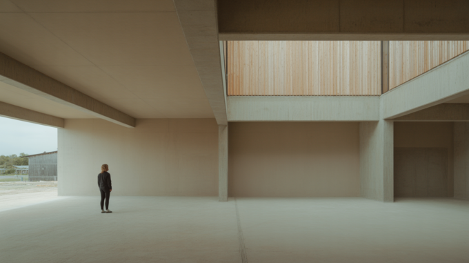
A liminal space is a place of transition, a threshold between one state and the next, where you are no longer where you were and not yet where you are going. In architecture the term covers verandas, corridors, arcades, terminals, forecourts and cemeteries: spaces designed for passing through rather than staying in.
The phrase has had a second life online, attached to photos of empty malls and fluorescent hallways. This article leaves that aesthetic to one side and looks at the architecture: where the idea comes from, what makes a space feel in-between, and 10 real buildings and landscapes, each with a date, a designer and a number you can check, that were built around the experience of crossing a threshold.
What Is a Liminal Space? The Meaning Behind the Word
The word comes from the Latin limen, threshold. The folklorist Arnold van Gennep used it in Les Rites de Passage (1909), where he split every rite of passage into three stages: separation, a liminal or transition stage, and incorporation. In the middle stage a person has left one status and not yet taken on the next. The anthropologist Victor Turner took the idea further in his 1967 essay “Betwixt and Between” and in The Ritual Process (1969), where he described liminal people as “threshold people” whose attributes are “necessarily ambiguous.”
That is the core liminal space meaning, and it translates directly into buildings. A doorway, a porch or a departure lounge is a physical version of Turner’s middle stage. You have left the street but are not yet home. You have checked in but have not yet flown. A useful liminal space definition for designers is a space whose main job is to change your state: from public to private, from outside to inside, from ordinary time to ceremony.
What are liminal spaces in architecture made of?
Looking across the examples below, liminal spaces tend to share four tools. Compression then release, where a low or narrow passage opens into a larger volume. A change of floor, light or sound that tells your body you have crossed a line. A route with a clear direction but a delayed arrival. And a degree of emptiness, either built in or produced by timing, as in an airport at 3 a.m. Circulation codes treat these spaces as plumbing, which is why the site’s guide to minimum corridor width is about safe egress rather than experience. The buildings below show what happens when the passage itself is the point.
1. Katsura Imperial Villa (1600s) – Kyoto, Japan
Built by: Prince Hachijo Toshihito and Prince Toshitada | Style: shoin and sukiya | Module: tatami mat, about 3 x 6 ft (0.9 x 1.8 m) | Managed by: Imperial Household Agency
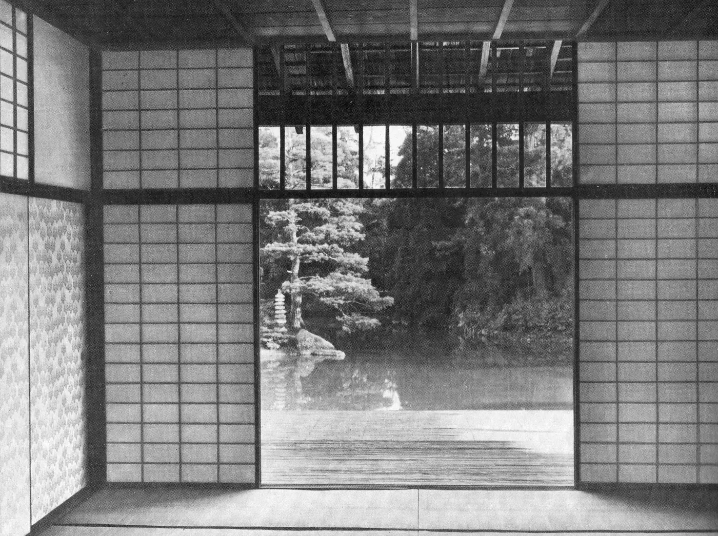
Katsura is the classic answer to “what does a liminal space house look like?” Prince Toshihito began the villa on the Katsura River in the early Edo period, and his son Toshitada later extended it. The Old Shoin, the first building, has a veranda on its south side, and beyond the veranda a bamboo platform built for viewing the moon over the pond.
That sequence, from tatami room to wooden engawa to open bamboo deck to water, is a threshold stretched into four steps. The engawa is neither inside nor outside: it sits outside the paper shoji but inside the storm shutters, raised on the same posts as the house. Rooms are sized in tatami, so the step from a nine-mat room to the veranda is a change in unit as well as in material. Even the Geppa-ro, or Moon-wave Tower, a pavilion of only about 15 by 24 ft (4.6 by 7.3 m), looks out over the pond. The villa is a place where arriving is drawn out on purpose.
📌 Did You Know?
Katsura became a reference for European modernists largely through a book by the German architect Bruno Taut, published in 1934 after he arrived in Japan. Walter Gropius visited in 1953 and, like Le Corbusier, drew on the villa’s minimal, orthogonal plan.
2. Galleria Vittorio Emanuele II (1877) – Milan, Italy
Architect: Giuseppe Mengoni | Built: 1865 to 1877 | Dome: about 37.5 m (123 ft) internal diameter, 17.1 m (56 ft) high | Owner: City of Milan
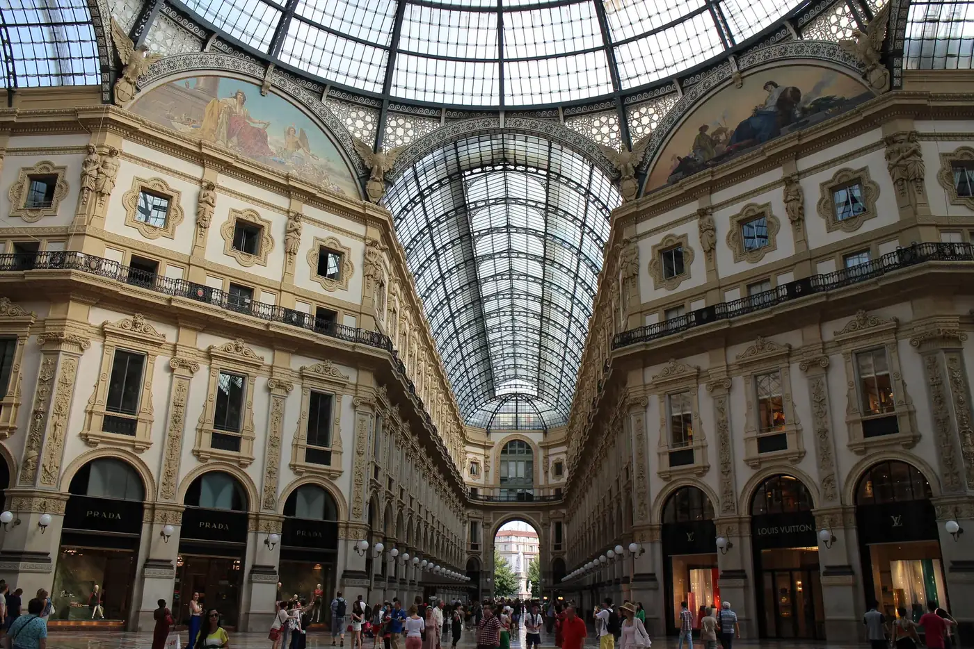
The Galleria is a street with a roof, and that makes it permanently in-between. Two glass-vaulted arcades cross in an octagon, linking Piazza del Duomo to Piazza della Scala. You walk under cast iron and glass, on mosaic floors, past shopfronts, yet you are still on a public route between two squares. Each barrel vault is about 14.5 m (48 ft) wide and 8.5 m (28 ft) high, and the central dome was one of the major construction feats of the 19th century.
Mengoni’s arcade was larger than its predecessors in Brussels and St Petersburg and is widely described as the direct ancestor of the enclosed shopping mall. That lineage is the uncomfortable part. The Galleria keeps the civic quality of a street, the mall that descended from it mostly dropped it, and the difference is whether the in-between space belongs to the city or to a landlord. Even here, use wears the threshold down: a tradition of spinning on the heel over the bull in the floor mosaic has worn a hole that had to be restored in September 2017 and again in May and June 2026.
3. Skogskyrkogården, the Woodland Cemetery (1917 to 1940) – Stockholm, Sweden
Architects: Gunnar Asplund and Sigurd Lewerentz | Competition: 1915 | Area: 108 ha (267 acres) | UNESCO World Heritage: 1994
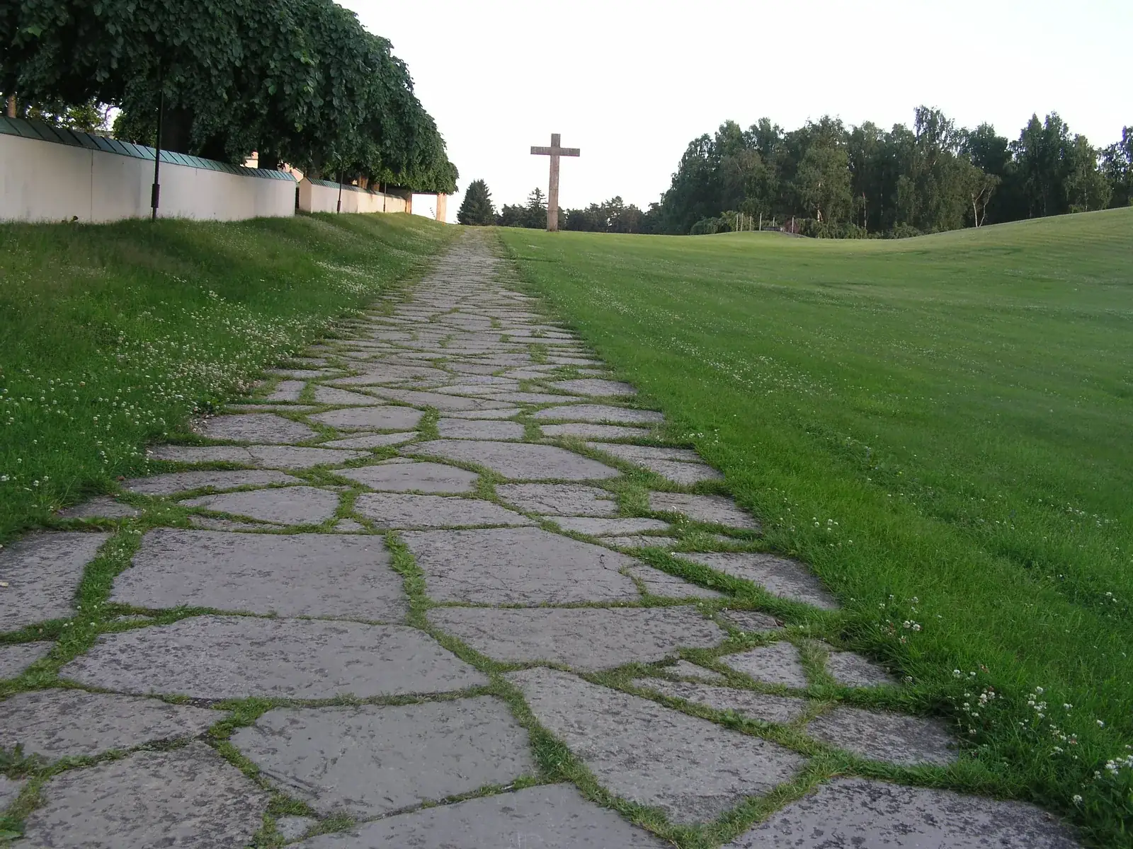
Asplund and Lewerentz won the 1915 competition for a new cemetery in southern Stockholm with an entry called “Tallum,” and work began in 1917 on overgrown gravel pits. The design is a route rather than a set of buildings. From a colonnaded entrance the path splits: one way through a pastoral landscape with a pond and a tree-lined meditation hill, the other up a long slope to a freestanding granite cross and the portico of the crematorium and its chapels.
For mourners this is a rite of passage in van Gennep’s exact sense, and the landscape stages all three phases. The walled entrance separates you from the city. The long, open climb with the cross in view is the transition. The chapels receive you. Asplund’s small Woodland Chapel, set on a Tuscan-style peristyle, repeats the idea at hut scale. His last building, the Woodland Crematorium (1935 to 1940), opened shortly before his death in 1940. The cemetery’s influence on cemetery design worldwide is widely noted, and UNESCO listed it in 1994.
4. Amsterdam Orphanage (1960) – Amsterdam, Netherlands
Architect: Aldo van Eyck | Designed: 1955 | Units: 8 playroom units | Playroom size: almost 10 x 10 m (33 x 33 ft) under a dome | Structure: precast concrete domes on round columns
If one building turned “in-between” into architectural theory, it is this one. Aldo van Eyck, a founding member of Team 10, first raised the idea of the “in-between” in public at the last CIAM meeting at Otterloo in 1959, building on Alison and Peter Smithson’s notion of the doorstep. The Amsterdam Orphanage was his first large building and his test of it: a home for children of all ages organised like a small city.
Eight playroom units are staggered along two diagonals, each with its own small courtyard, and connected by corridors that behave like indoor streets. The big entrance court is neither street nor building. Van Eyck’s point was that every transition, from bedroom to playroom to court to city, should be a place in its own right rather than a gap.
🎓 Expert Insight
“There is the spatial sensation, which makes us envy birds in flight; there is also the kind that recalls the sheltered enclosure of our origin. … The in-between realm provides for both aspects simultaneously.” Aldo van Eyck, architect, in The Child, the City and the Artist
The quote, cited in a study of his theory in the ARENA Journal of Architectural Research, explains why his thresholds are generous: a good in-between space gives you shelter and outlook at the same time.
The building’s later life is a warning. A plan to demolish it was halted only in 1986, thanks to international support. After the orphanage moved out in 1991 it housed offices and the Berlage Institute, then stood empty and decayed until it was bought and declared a national monument in 2014. A renovation finished in 2018 turned it into offices for the developer BPD, which shows that a building made of thresholds can be reused, but only through a careful conversion.
5. TWA Flight Center (1962) – New York City, USA
Architect: Eero Saarinen and Associates | Dedicated: 28 May 1962 | Flight tubes: about 232 ft (71 m) and 272 ft (83 m) long | Now: lobby of the TWA Hotel, opened 2019 with 512 rooms
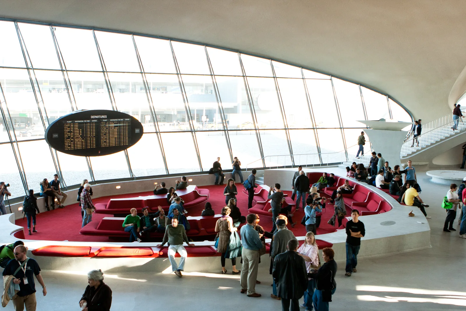
Saarinen’s terminal at what is now JFK is an airport designed around the moment before departure. Four Y-shaped piers carry a thin concrete shell shaped like spread wings, rising up to 75 ft (23 m). Inside, twelve steps lift you about 5 ft (1.5 m) from the ticket hall to a sunken lounge facing the runways. From there two enclosed, red-carpeted flight tubes, elliptical in section and lit indirectly, lead out to the gates. TWA’s own press material said the tubes were meant to heighten travelers’ anticipation before boarding.
The critique is well documented. As aircraft grew, the terminal quickly became functionally inadequate and was poorly suited to wide-body jets; a 2015 study compared it to “successful consumer goods with attractive packaging,” even though it quickly became obsolete. American Airlines stopped flights there in December 2001, and the building stayed closed until it reopened as a hotel lobby in 2019. The site’s roundup of impressive airport design shows how later terminals traded Saarinen’s drama for flexibility.
6. Salk Institute (1965) – La Jolla, California, USA
Architect: Louis Kahn | Client: Jonas Salk | Site: 27 acres (10.9 ha) on a mesa above the Pacific | Courtyard advice: Luis Barragan
Jonas Salk asked Louis Kahn, according to the Salk Institute’s own history, to “create a facility worthy of a visit by Picasso.” Kahn built two mirrored laboratory wings, and as construction went on he still did not know what shape the space between them should take. He had first imagined a garden. After seeing an exhibition of Luis Barragan’s work at the Museum of Modern Art, he invited the Mexican architect to collaborate on the court, and Barragan told him not to add a single plant: make it a plaza, with one water feature.
The result is a travertine court split by a narrow channel of water running toward the ocean. It is the most liminal space on this list in the literal sense. It sits between two buildings, between land and sea, and between the enclosed laboratories and the open sky, and it has no function except to be crossed and looked through. The courtyard works because Kahn resisted filling the gap. Its emptiness is what the architecture is.
7. Dixie Square Mall (1966) – Harvey, Illinois, USA
Developer: Robert Meyer Corporation | Floor area: 600,000 sq ft (55,700 m2) | Stores: 64, with 6 anchors | Opened: 1966 | Closed: 1978 | Demolished: 2012
Dixie Square is the example that ties the architectural idea to the online one, and it is here for the architecture of decline rather than the aesthetic. The enclosed mall opened in 1966 in a Chicago suburb with anchors including Montgomery Ward and JCPenney. By the early 1970s rising crime and falling trade hollowed it out, and it closed in 1978 after only 12 years. It is often cited as an early dead mall.
Its afterlife was long and costly. Director John Landis rented the empty building in 1979 to film the car chase in The Blues Brothers, and then it stood abandoned for more than three decades while redevelopment plans came and went. Demolition finally ended in May 2012, paid for partly with federal disaster recovery funds. A mall is a liminal space by design, a route between parking and purchase. Dixie Square shows what happens when that route no longer leads anywhere. The site’s list of the biggest shopping malls in the world is a useful contrast in scale.
8. Charles de Gaulle Airport Terminal 1 (1974) – Roissy, France
Architect: Paul Andreu, aged 29 at the time | Opened: 1974 | Levels: 5 | Satellites: 7 | Refurbishment: about 250 million euros, 2020 to 2023
Terminal 1 is a round concrete building nicknamed “le Camembert.” According to the Grand Roissy tourism office, Andreu was 29 when he designed it, and passengers reached its five levels on escalators running through Plexiglas tubes, and the interior was designed with a collective that included the type designer Adrian Frutiger. Seven satellite buildings hold the gates. The building turns the transfer from landside to airside into a ride.
It also sits at the center of the strongest critique of liminal space. In 1992 the French anthropologist Marc Auge coined the term “non-places” for airports, motorways, hotel rooms and malls: spaces of transience where people stay anonymous and do not form shared references. Terminal 1 is a textbook example, deliberately beautiful and deliberately placeless. The building has also needed rescue: Groupe ADP closed it in March 2020, when pandemic traffic collapsed, and spent about 250 million euros on a refurbishment completed in 2023, adding a junction building to link three satellites.
💡 Pro Tip
When you want a transition to register, draw it in section before you draw it in plan. Most of the examples here change ceiling height, floor level or light at the threshold, and those changes are invisible on a plan. A long section through the route, with the body drawn at each change, shows immediately whether the passage compresses, releases or just continues.
9. Brion Cemetery (1978) – San Vito d’Altivole, Italy
Architect: Carlo Scarpa | Built: 1968 to 1978 | Area: about 2,000 m2 (21,500 sq ft), L-shaped | Client: Onorina Tomasin-Brion

Onorina Brion commissioned Scarpa in 1969 to build a family tomb as an extension of the village cemetery near Treviso, for her husband Giuseppe, founder of the electronics firm Brionvega. The result is an L-shaped garden of about 2,000 m2 (21,500 sq ft) enclosed by a sloping concrete wall, with two separate entrances, a small chapel, a covered arch over the couple’s twin sarcophagi, a lawn and a reflecting pool with a meditation pavilion.
Scarpa believed that “the place for the dead is a garden,” and the whole site is designed as a threshold between the living village and the dead. The best known device is a pair of interlocking circles, a vesica shape that frames the view like a lens. Water runs through the garden; Scarpa said he liked it “perhaps because I am Venetian.” He continued adjusting the design until his accidental death in Japan in 1978 and is buried next to the sanctuary, which gives the last threshold a literal meaning.
10. Jewish Museum Berlin, Libeskind Building (2001) – Berlin, Germany
Architect: Daniel Libeskind | Opened: 9 September 2001 | Voids: 5 | Holocaust Tower: about 24 m (79 ft) tall, unheated | Visitors before opening: almost 350,000
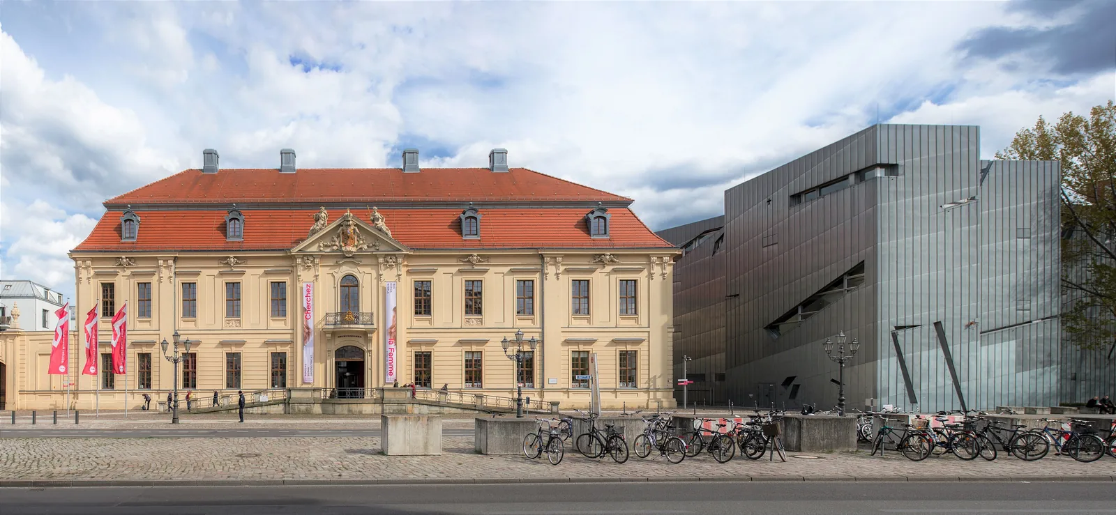
Libeskind’s building has no front door. According to the Jewish Museum Berlin, you enter through the baroque Old Building next door and walk down into an underground passage, where three axes cross: the Axis of Exile, the Axis of the Holocaust and the Axis of Continuity. The last ends in a steep stair of 82 steps up to the exhibition. The Axis of the Holocaust ends at the Holocaust Tower, a bare concrete silo lit by a single slit in the roof.
The plan follows two lines, a visible zigzag and an invisible straight line. Where they cross are five concrete voids, unheated and mostly unlit, that cut the building from basement to roof; you cross some on bridges and can enter only a few. Libeskind uses them to make absence physical. The project nearly did not happen: Berlin temporarily cancelled it in 1991 to finance its Olympic bid. Yet the empty building, before any exhibits went in, drew almost 350,000 visitors, strong evidence that the in-between spaces were the content.
Honorable Mentions
Church of the Light (1989), Ibaraki, Japan. Tadao Ando’s chapel of about 113 m2 (1,216 sq ft) is entered by slipping between two volumes split by a wall set at 15 degrees, and its cross is a slot of daylight. It is left out only because the transition is a single gesture rather than a sequence.
Therme Vals (1996), Vals, Switzerland. Peter Zumthor’s baths, now 7132 Thermal Baths, are built over the only thermal springs in the canton of Graubünden. Since a 2012 sale the baths have been run with the 7132 Hotel, and outside visitors need one of a limited number of tickets booked online in advance, which is why it sits here rather than on the main list.
Louvre Pyramid (1989), Paris, France. I. M. Pei’s glass pyramid turns the entrance to the Louvre into a descent from the Cour Napoleon into a sunlit underground hall. It is a threshold more than a room, but its role as a ticketing hall weakens the sense of passage.
What These Liminal Spaces Have in Common
Taken one at a time, these look like a villa, a mall, two cemeteries, two airports and a museum. Taken together, four patterns come through.
The threshold is a sequence, not a line
Katsura stretches a doorway into room, veranda, deck and water. The Woodland Cemetery stretches a gate into a climb. Libeskind stretches an entrance into an underground crossing of three axes. None of them treats the threshold as a door in a wall; each gives it length and time.
Emptiness is designed, not left over
The Salk courtyard and the Jewish Museum voids are empty on purpose, and both are the parts people remember. Dixie Square shows the other kind of emptiness, produced by failure rather than design. The difference is intent: a planned void holds attention, while an accidental one only records loss.
Transit spaces age fastest
The TWA Flight Center became functionally inadequate within years as jets grew, and CDG Terminal 1 needed a 250 million euro rebuild after five decades. Both were among the most admired terminals of their day, and both were shaped tightly around systems that kept changing. Van Eyck’s Orphanage needed a full conversion once the orphanage left. Buildings shaped tightly around a passage struggle when the passage changes.
Light and level mark the crossing
Twelve steps and a change of ceiling height at TWA, the slot of light in the Holocaust Tower, the drop into the Louvre and the move from tatami to bamboo at Katsura all use the same cues. The site’s piece on the role of light in architecture goes further into how daylight tells the body it has arrived somewhere new.
Looking Ahead
The online fascination with empty hallways is, in a sense, a reaction to non-places: buildings that are all transition and no arrival. The buildings on this list suggest the opposite lesson. The best liminal space architecture gives the in-between its own size, light and purpose, so that crossing it feels like part of the journey rather than a gap in it. For anyone designing a lobby, a corridor or a forecourt, that is the real brief.











Leave a comment