

Table of Contents Show
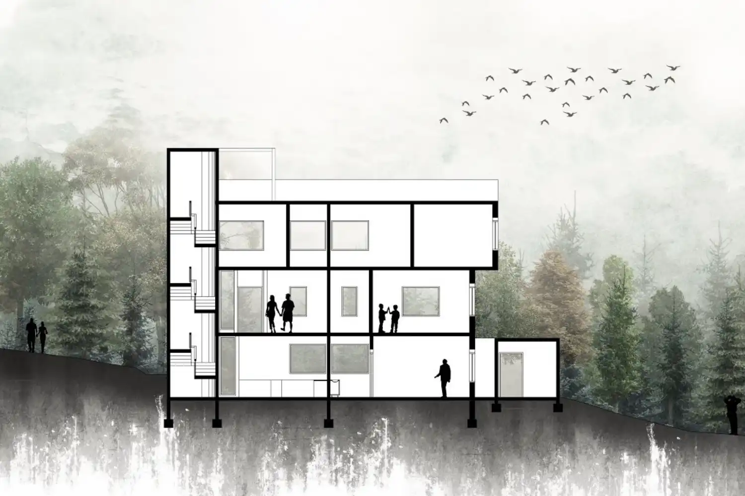
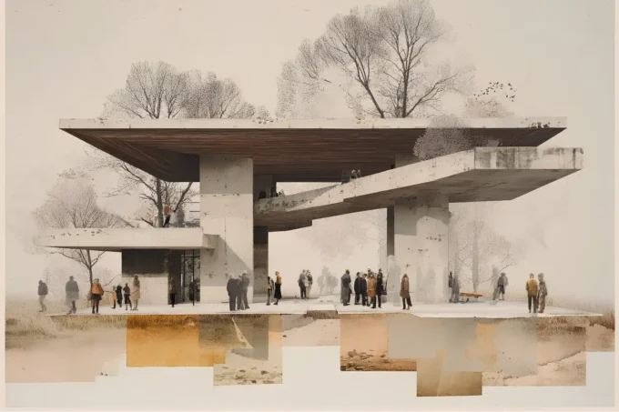
Architectural sections rendered in Photoshop turn flat CAD line work into rich, layered drawings that communicate spatial relationships, materiality, and atmosphere in a single image. The process involves exporting clean section cuts from your modeling software, building up layers of texture and tone in Photoshop, and finishing with entourage and lighting adjustments that bring the drawing to life.

Why Photoshop Still Dominates Section Drawing in Architecture
Despite the rise of real-time rendering engines and AI visualization tools, Photoshop remains the go-to application for architectural section post-production. The reason is control. Unlike automated render pipelines, Photoshop lets you decide exactly how each material reads, where the eye travels, and what mood the drawing conveys. Firms like BIG, OMA, and MVRDV still rely heavily on Photoshop-processed sections for competition entries and publications because the tool allows a level of graphic storytelling that automated renderers cannot match.
Section drawings produced in Photoshop also adapt faster than 3D renders when design changes arrive late. Swapping a texture, adjusting a shadow, or repositioning a tree takes seconds in a well-organized PSD file, while the same change in a full 3D scene might mean re-rendering an entire image. For students and small practices working on tight deadlines, this flexibility is critical.
Preparing Your Section for Photoshop
The quality of your final section in architecture depends heavily on what you export from your CAD or BIM software. A messy export creates hours of cleanup work in Photoshop, so invest time here.
Exporting from CAD or Revit
Start by isolating your section cut in AutoCAD, Revit, or Rhino. Hide all annotation layers, dimensions, and grids. You want clean geometry only. Export the drawing as a high-resolution PDF or EPS file at a minimum of 300 DPI. If you are working in Revit, use the “Export Image” function with anti-aliasing turned on to avoid jagged edges on curved elements.
Separate your line work into at least three groups before export: the section cut itself (the thick “poche” lines where the building is sliced), elements visible beyond the cut plane, and the ground line. This separation gives you independent control over line weights and fills once you open the file in Photoshop. Some architects prefer exporting each group as a separate PDF, then stacking them as layers in a single PSD file. Others use a single export and manually separate lines using Select by Color in Photoshop.
💡 Pro Tip
Before exporting, set your CAD viewport to a precise scale (1:50 or 1:100) and note the exact pixel dimensions. Open your Photoshop canvas at those same dimensions and 300 DPI. This prevents scaling distortion and keeps your line weights consistent from CAD to final output.

Setting Up Your Photoshop File
Open a new Photoshop document at your target output resolution. For portfolio-quality section drawings, work at a minimum of 4000 pixels wide. Place your exported line work on the topmost layer and set its blending mode to Multiply. This makes the white background transparent while preserving all black and gray lines. Lock this layer and name it “Lines” so you never accidentally paint over it.
Create a folder structure beneath the line layer: “Cut Fill” for the poche, “Materials” for textures beyond the cut, “Entourage” for people, trees, and furniture, “Background” for sky and context, and “Effects” for shadows, glows, and color overlays. Spending two minutes on this organization saves significant time later, especially when a tutor or client asks for revisions.
Building Up Materials and Textures
This is where your architecture section drawing starts to gain depth. The goal is not photorealism but clarity: each material should be instantly readable at presentation scale.
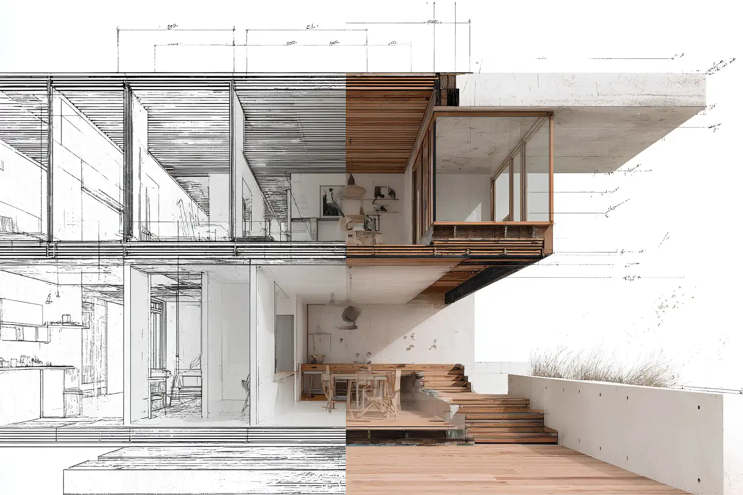
Filling the Section Cut (Poche)
Select the cut areas using the Magic Wand tool (set tolerance to about 10 and check “Contiguous”). Fill these selections with a solid dark tone, typically a deep charcoal (#2D2D2D) or a dark version of your chosen palette color. Avoid pure black, which looks flat on screen and prints too heavy. The poche layer sits directly beneath your lines.
Some architects add a subtle concrete or hatching texture to the poche to distinguish structural walls from partitions. If you choose this approach, clip a texture layer to your poche fill and reduce its opacity to 15-25% so the hatching reads as a secondary detail rather than competing with the line work.
⚠️ Common Mistake to Avoid
Using too many different textures in a single section is one of the fastest ways to make a drawing look cluttered. Limit yourself to 4-6 distinct material fills maximum. Group similar materials (all types of wood, for example) under one texture with slight color variations rather than sourcing a separate image for each.
Adding Floor, Wall, and Ceiling Textures
For spaces beyond the cut plane, apply material textures on separate layers clipped to their respective selections. Use high-resolution seamless textures from sources like Textures.com or ambientCG (both offer free PBR-ready architectural textures). Scale each texture to match the section’s drawing scale. A timber floor plank that reads at 150mm wide in your 1:50 section should measure exactly 3mm on the printed page.
Reduce the saturation of all textures by 30-50%. Raw texture photos tend to overpower line work. A desaturated palette keeps the drawing readable and gives it a more polished, editorial look. If you are working on a portfolio presentation, consistent desaturation across all your section drawings creates visual coherence between pages.
How to Add Entourage That Strengthens the Drawing
People, trees, and furniture in an architectural section serve two functions: they establish human scale, and they suggest how the space will be used. Poorly placed entourage, on the other hand, distracts from the architecture.
Source cutout figures from sites like Skalgubbar or Nonscandinavia, which provide free, diverse silhouettes with transparent backgrounds. Place people at activities that match the program: reading in a library, cooking in a kitchen, walking through a corridor. Avoid the common mistake of scattering random standing figures throughout every room.
For vegetation, use high-resolution PNG cutouts of real trees rather than Photoshop brush stamps. Position trees so their canopies frame the building section without obscuring key architectural details. A single well-placed tree with visible trunk and branch structure adds more to an architecture section than a dozen generic green blobs.
💡 Pro Tip
Desaturate all entourage elements to match the overall color palette of your section. Then apply a Color Overlay layer style using a single tint (a warm gray or muted blue works well). This unifies figures, trees, and furniture into the drawing rather than making them look pasted in.
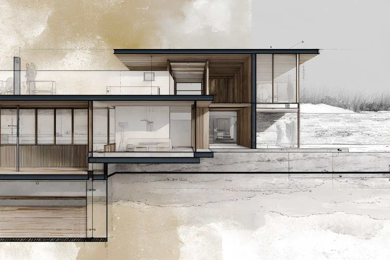
Lighting, Shadows, and Final Adjustments
Light and shadow give a section drawing architecture piece its atmosphere. In Photoshop, you build these effects manually rather than relying on a render engine, which means you control the exact direction and softness of every shadow.
Creating Interior Shadows
On a new layer set to Multiply, use a large soft brush (hardness 0%, opacity 10-15%) to paint gradual shadow gradients inside rooms. Shadows typically fall from the ceiling down and from walls inward. Build up density gradually with multiple strokes rather than painting at high opacity in a single pass. The result should feel like natural ambient light falloff, not hard-edged darkness.
For cast shadows from overhangs, balconies, or deep window reveals, use the Polygonal Lasso tool to select the shadow shape, then fill with a soft gray on a Multiply layer at 20-30% opacity. These sharper shadows anchor floating elements to the building and add a sense of depth that flat sections lack.
📌 Did You Know?
The architectural section as a representational tool dates back to the 18th century, when French architect Jean-Nicolas-Louis Durand standardized the section cut as part of his systematic approach to design at the École Polytechnique. His method of using sections alongside plans and elevations as a unified set became the foundation of modern architectural drawing conventions still taught today.
Color Grading and Final Polish
Add a Curves adjustment layer at the top of your layer stack to fine-tune contrast. Pull the midtones slightly toward warm tones for interior-focused sections, or toward cool blues for exterior-dominant drawings. A Gradient Map adjustment layer set to 5-10% opacity can unify the entire color scheme. For Photoshop architecture post-production in general, subtle color grading is what separates polished work from raw composites.
Finally, flatten a copy of your entire file (Ctrl+Alt+Shift+E) and apply a gentle Unsharp Mask (Amount: 50%, Radius: 1.5px) to crisp up your line work for print or screen output. Save both the layered PSD and a flattened TIFF or high-quality JPEG for submission.
Video: Rendering an Architectural Section in Photoshop
This step-by-step walkthrough by McKern Architecture covers the full workflow of rendering an architectural section in Photoshop, from importing line work to adding textures and entourage.
Where to Go From Here
Your Next Step: Open one of your existing CAD sections, export it as a clean PDF, and build a single Photoshop section from scratch following this workflow. Start with just the poche fill and one material texture. Once those read clearly, add entourage and shadows one layer at a time.
Frequently Asked Questions
What file format should I export from CAD for Photoshop sections?
PDF or EPS at 300 DPI gives the cleanest results. These vector-based formats scale without losing line quality when you open them in Photoshop. Avoid exporting as JPEG or PNG directly from CAD, since raster exports at lower resolutions produce blurry or aliased lines that are difficult to work with.
How many layers should a typical Photoshop section file have?
A well-organized section drawing usually has 20-40 layers grouped into 5-6 folders. The key is grouping by function (lines, poche, materials, entourage, effects, background) rather than creating a flat list of unnamed layers. Name every layer as you create it.
Can I create architectural sections in Photoshop without a 3D model?
Yes. You can draw section line work directly in Photoshop using the Pen tool or import hand-drawn sketches scanned at high resolution. Many architecture students produce expressive photoshop drawing architecture sections from hand sketches, especially for conceptual projects where precision is less important than atmosphere.
What resolution should I work at for print-quality sections?
For A1 or A0 portfolio boards, work at 300 DPI at the final print size. For A3 portfolio booklets, 300 DPI is also standard. If your file becomes too large to handle (above 2-3 GB), you can work at 200 DPI and upscale for print, but 300 DPI remains the professional standard for architectural visualization output.
How long does it take to produce a finished section in Photoshop?
With a clean CAD export and an organized template file, an experienced user can produce a polished section in 2-4 hours. First attempts typically take 6-8 hours. Building a personal library of textures, entourage cutouts, and a PSD template with preset layer groups cuts production time significantly on subsequent drawings.


Leave a comment