


Table of Contents Show
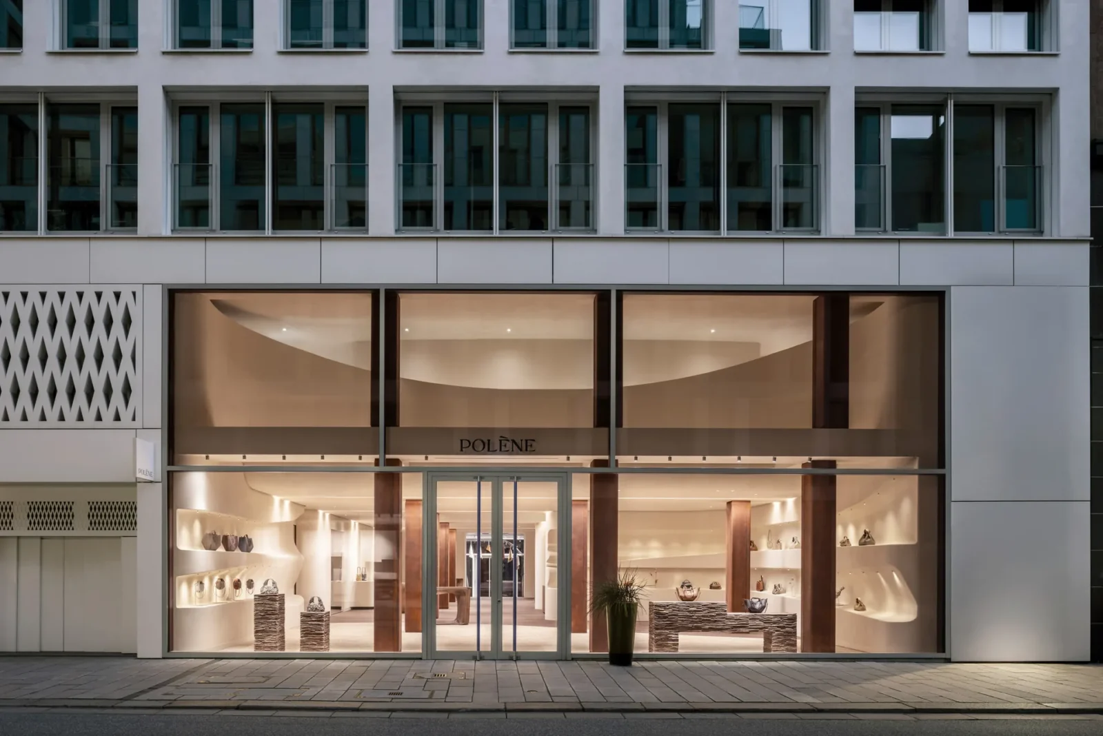
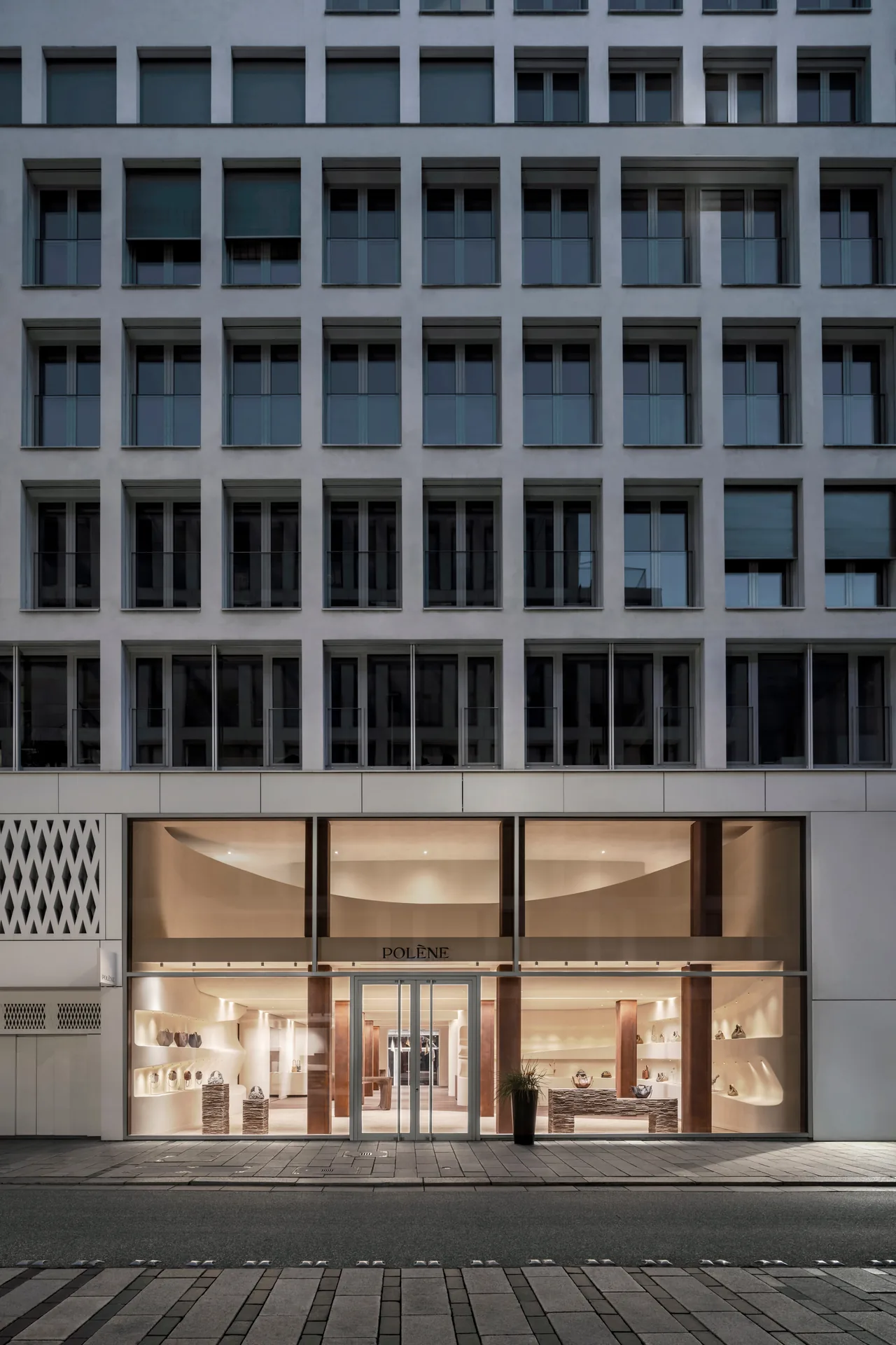
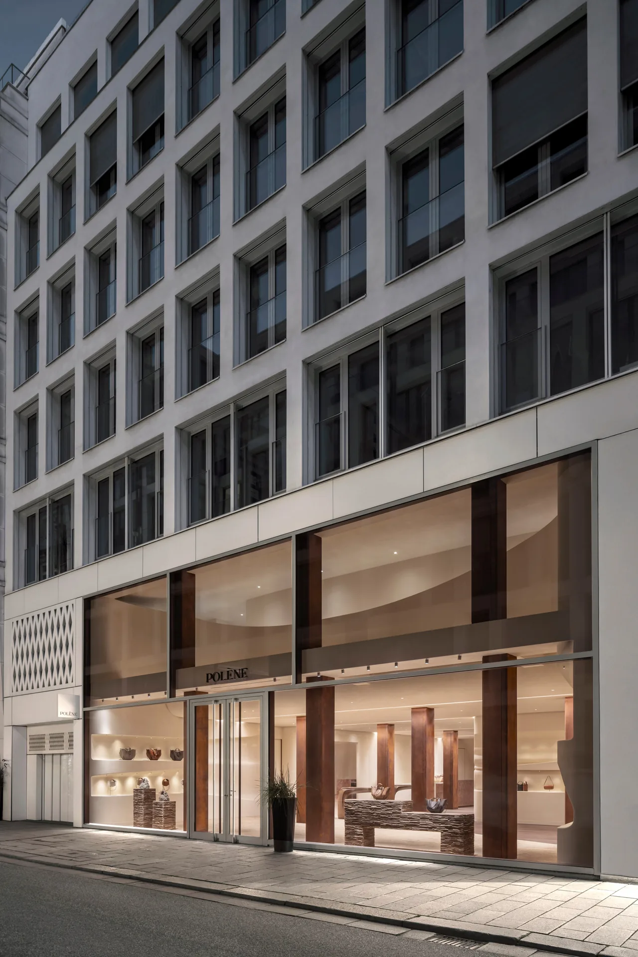
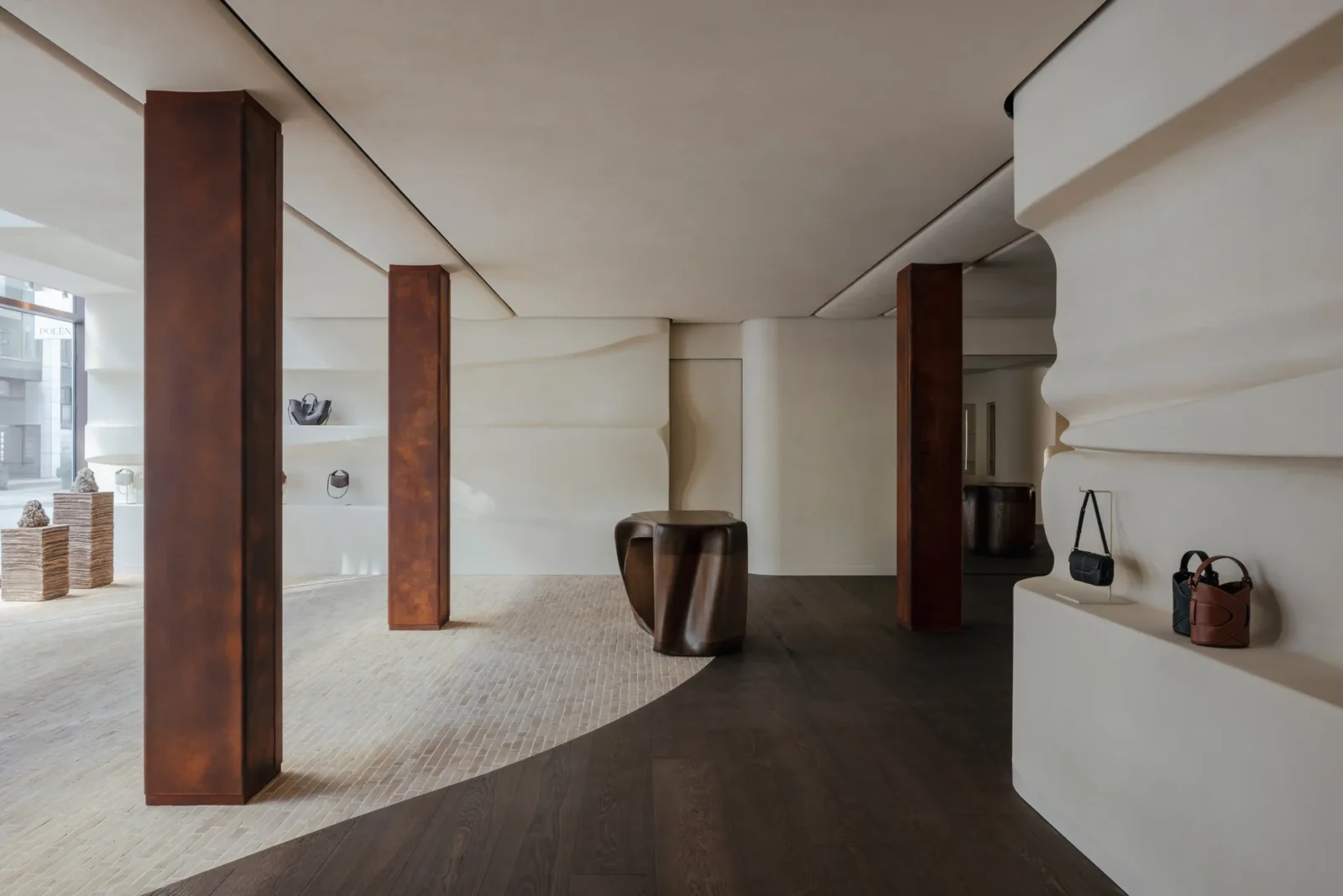
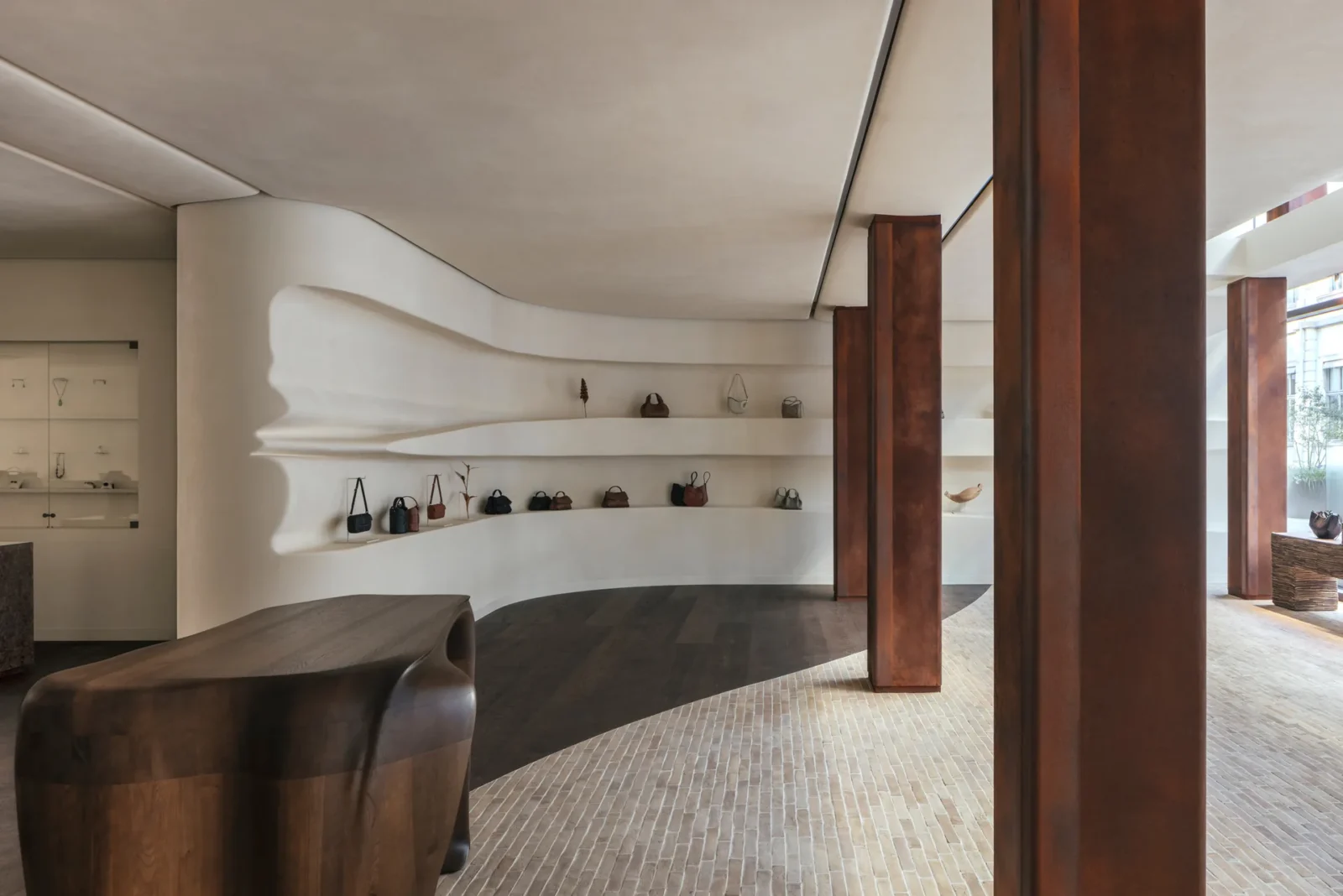
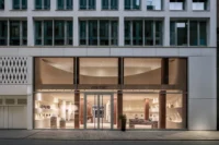
Polène Hamburg is the French leather goods brand’s first flagship in Germany, 570 square metres at Neuer Wall 71 designed by Snøhetta. The interior runs on one contrast held steady throughout: sculpted clay plaster that folds like fabric, set against metal, wood and stone left deliberately unrefined.

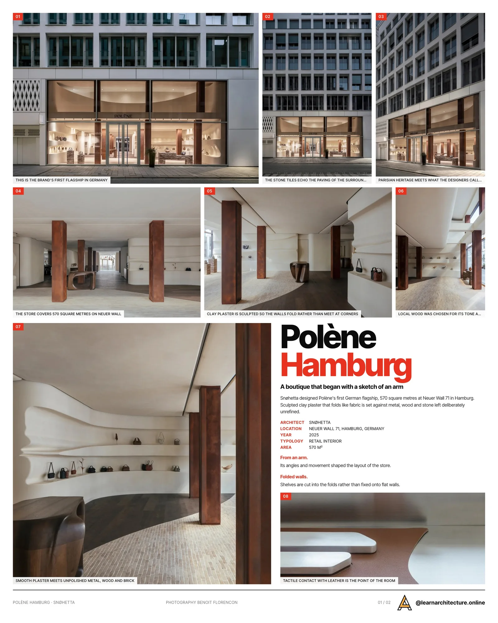
It started with an arm
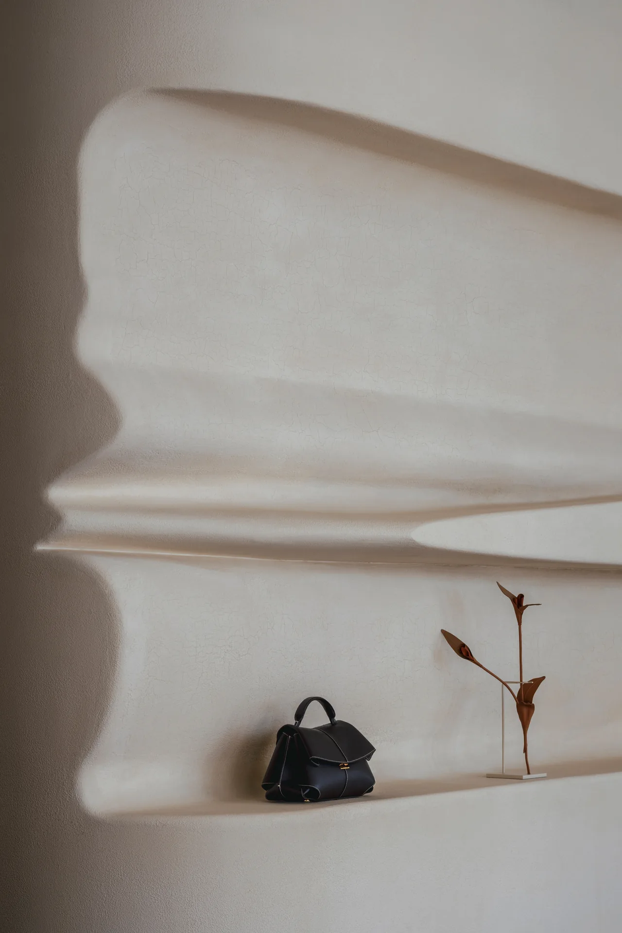
The concept has an unusually specific origin. “The concept began with a simple sketch of a human arm on a flight to Paris,” the design team explains. “Its natural beauty, the angles, the way it moves and interacts with what it carries, inspired the store’s layout. Just as form follows function, the arm’s dialogue with a handbag became the starting point for the entire design.”
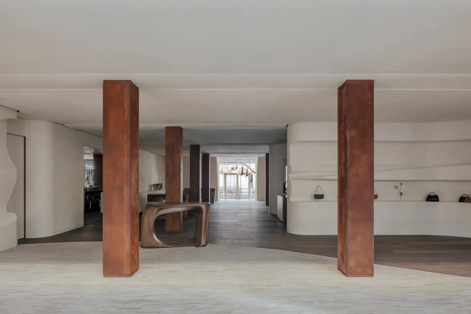
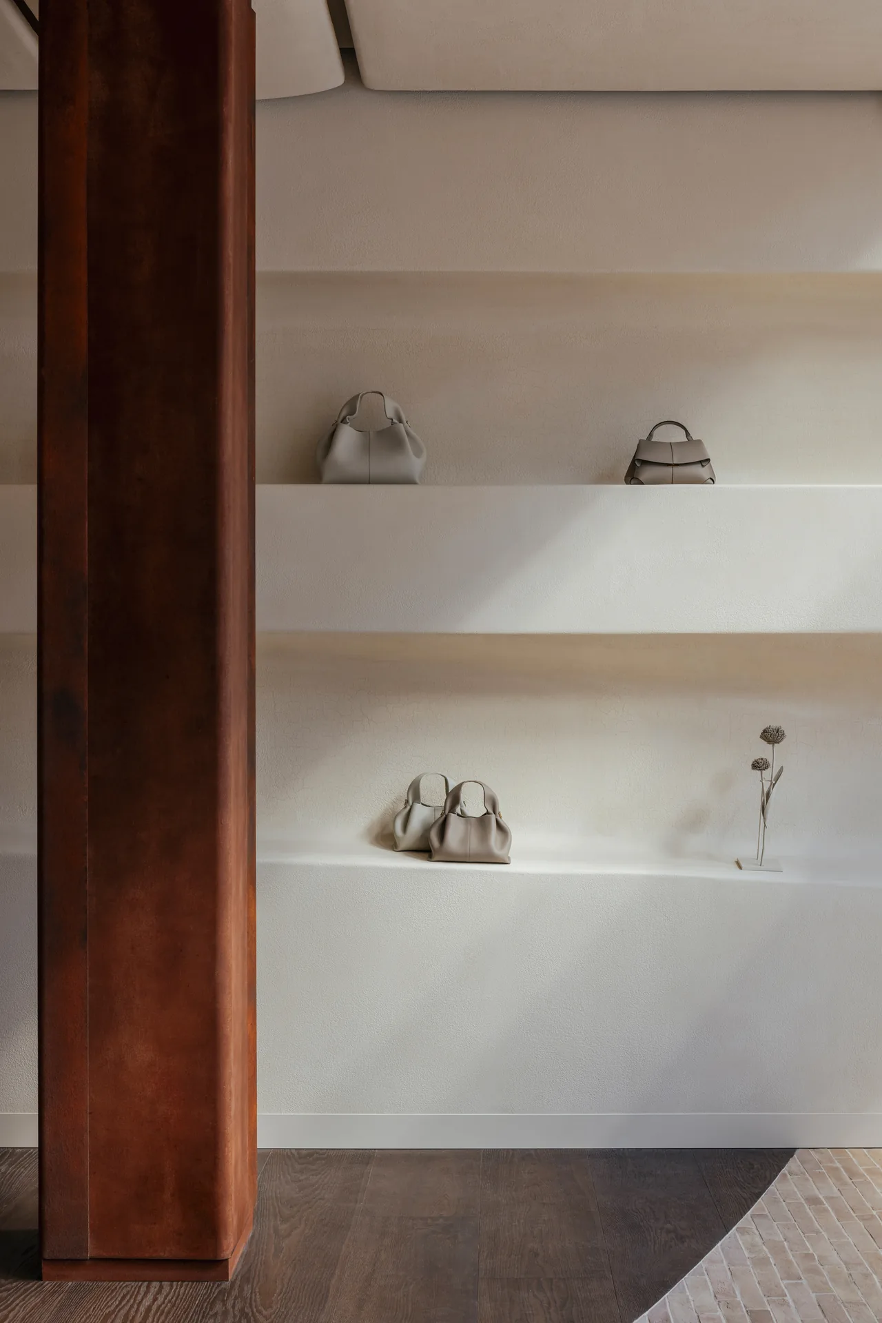
That reads as a nice story until you look at the walls. They do not meet in corners; they fold, curve and taper the way a limb does, and the shelves are cut into those folds rather than fixed onto flat surfaces. The geometry of a body holding an object is doing real work in the plan.
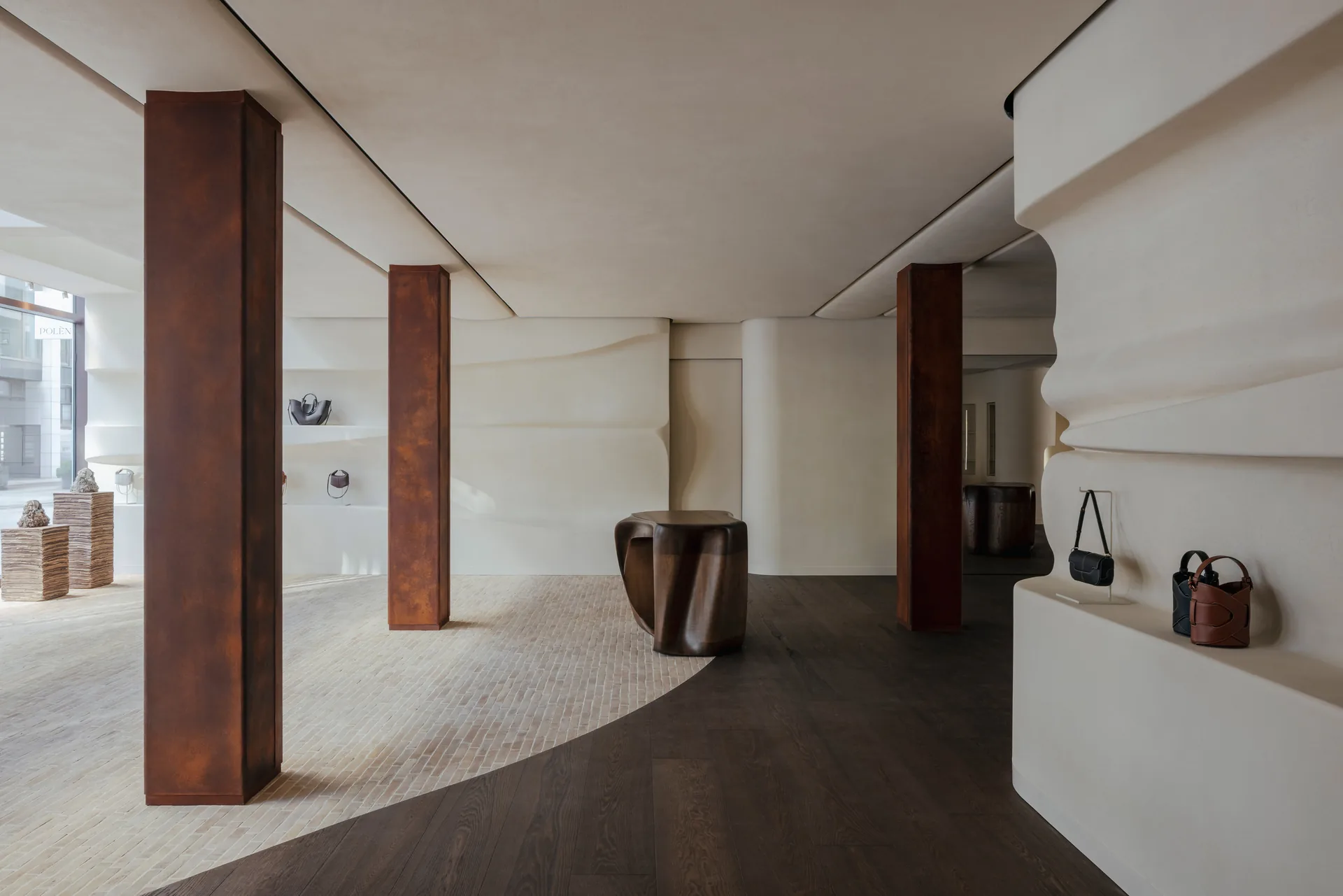
Smooth against rough at Polène Hamburg
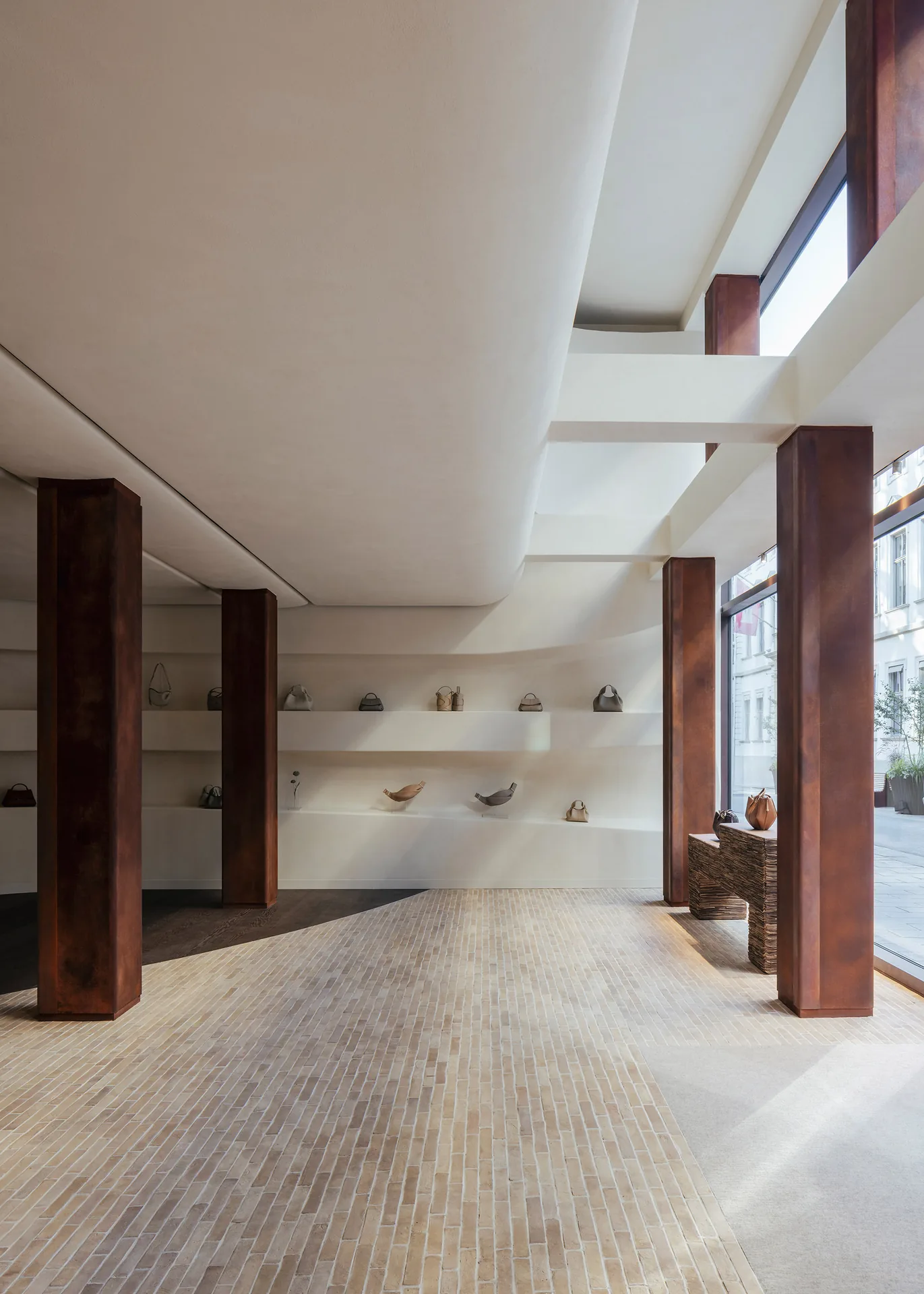
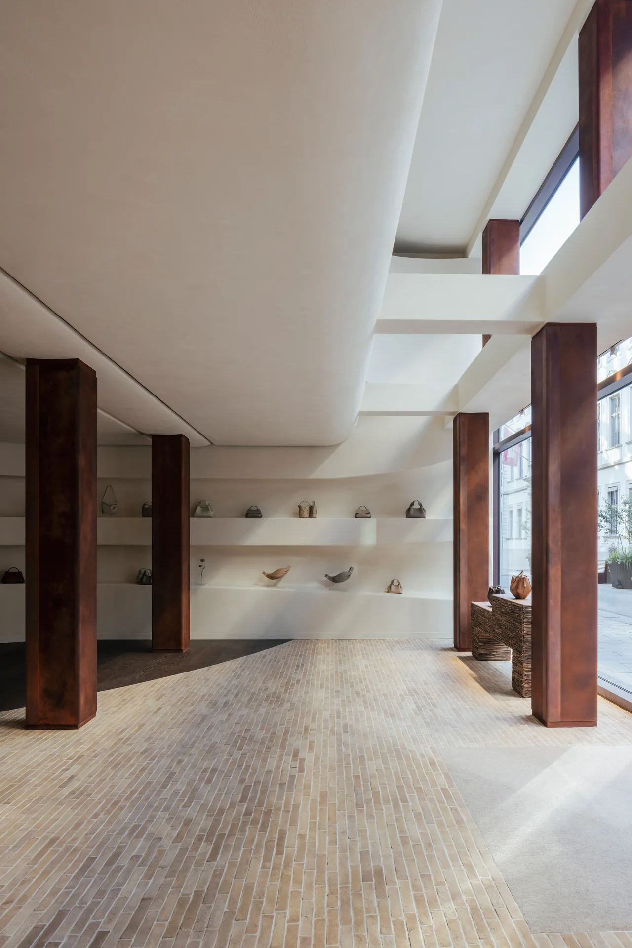
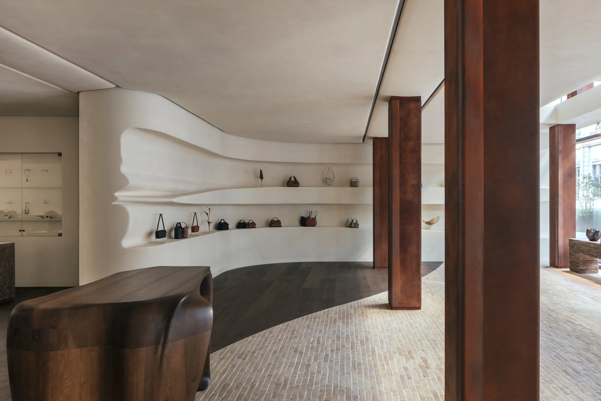
Clay plaster gives the soft half of the equation, worked until the surface reads as one continuous mass. Against it stand columns in patinated metal, floors in stone, and warm local wood chosen for its tone and grain. The effect is a room where nothing is quite uniform and every material is doing the opposite job of its neighbour.
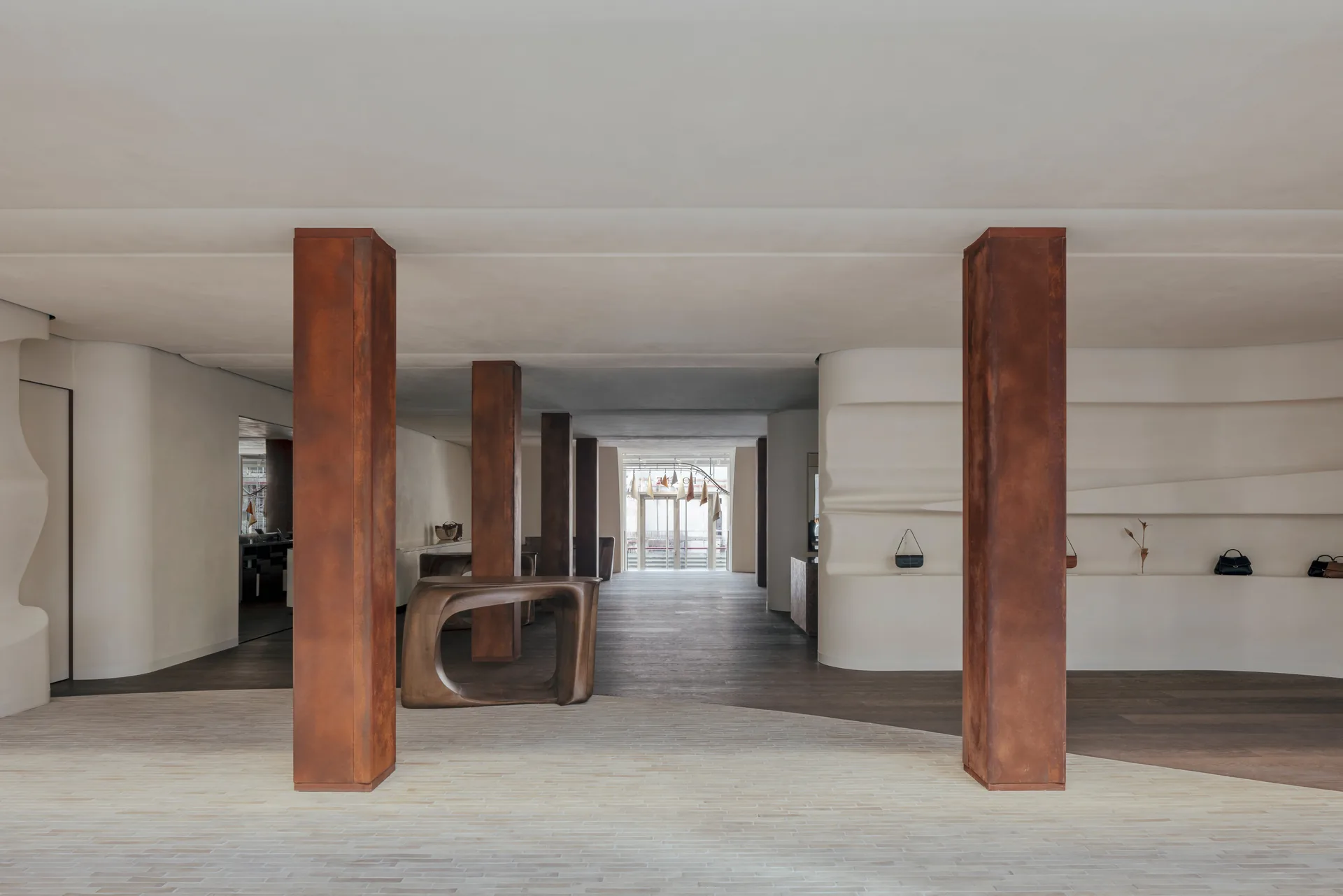
“For us, the design was about harmony, between a place and a brand, between people and space,” the team says. “Out of that dialogue, something new could emerge: a boutique that feels rooted and alive, elegant yet raw, intimate yet open.”
Bringing the pavement inside
The single smartest material decision is the stone. The tiles echo the ones on the streets outside, so the floor carries the fabric of Hamburg across the threshold and the boundary between public and private ground softens. A customer walking in is, in a literal sense, still on the same surface.
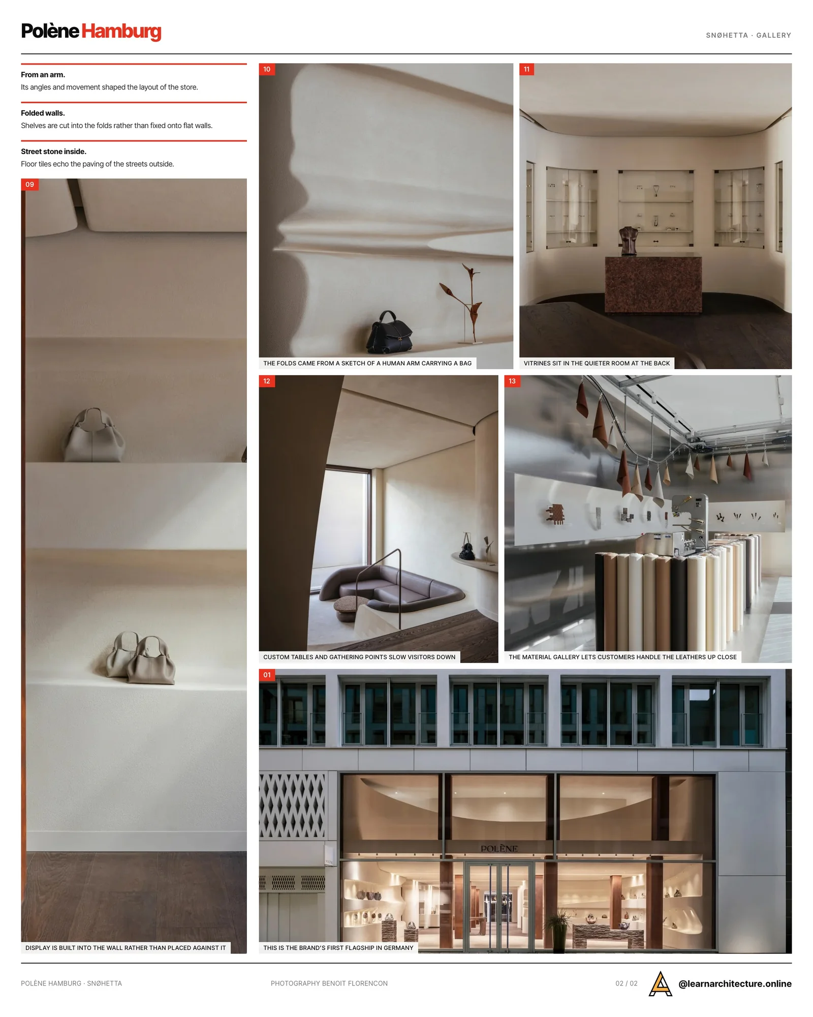
The result is a store that could not be reproduced elsewhere without redoing the research, because the reference is local and physical rather than stylistic. Material choices that carry this much of their setting are the subject of our guide to choosing interior materials.
A room for handling things
Custom tables and curated gathering points are placed to slow people down and encourage conversation, and the shop keeps a separate material gallery where the leathers can be handled up close. That section is Polène’s own design rather than the architects’.
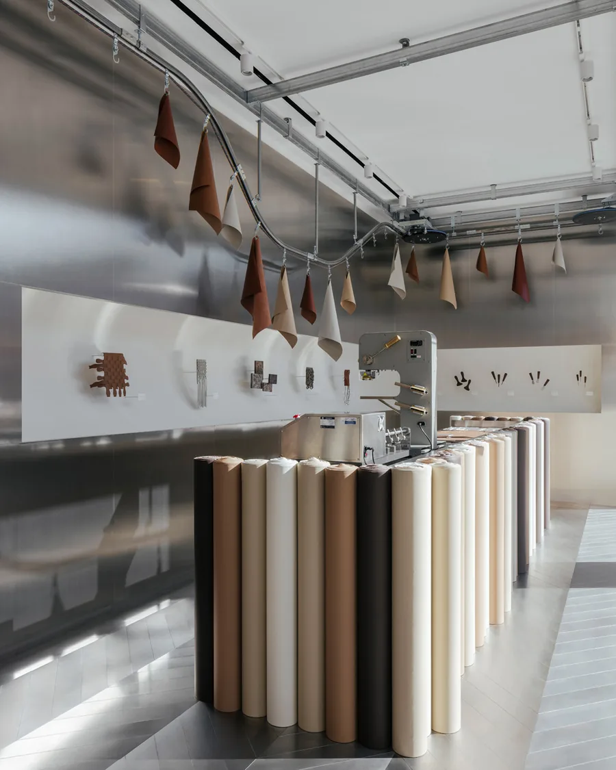
For a brand whose product is defined by touch, giving over floor area to a room where nothing is for sale is a real commitment. It turns the shop into a place where the making is explained rather than only the finished object displayed.
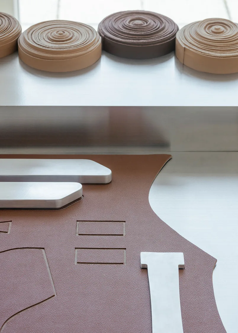
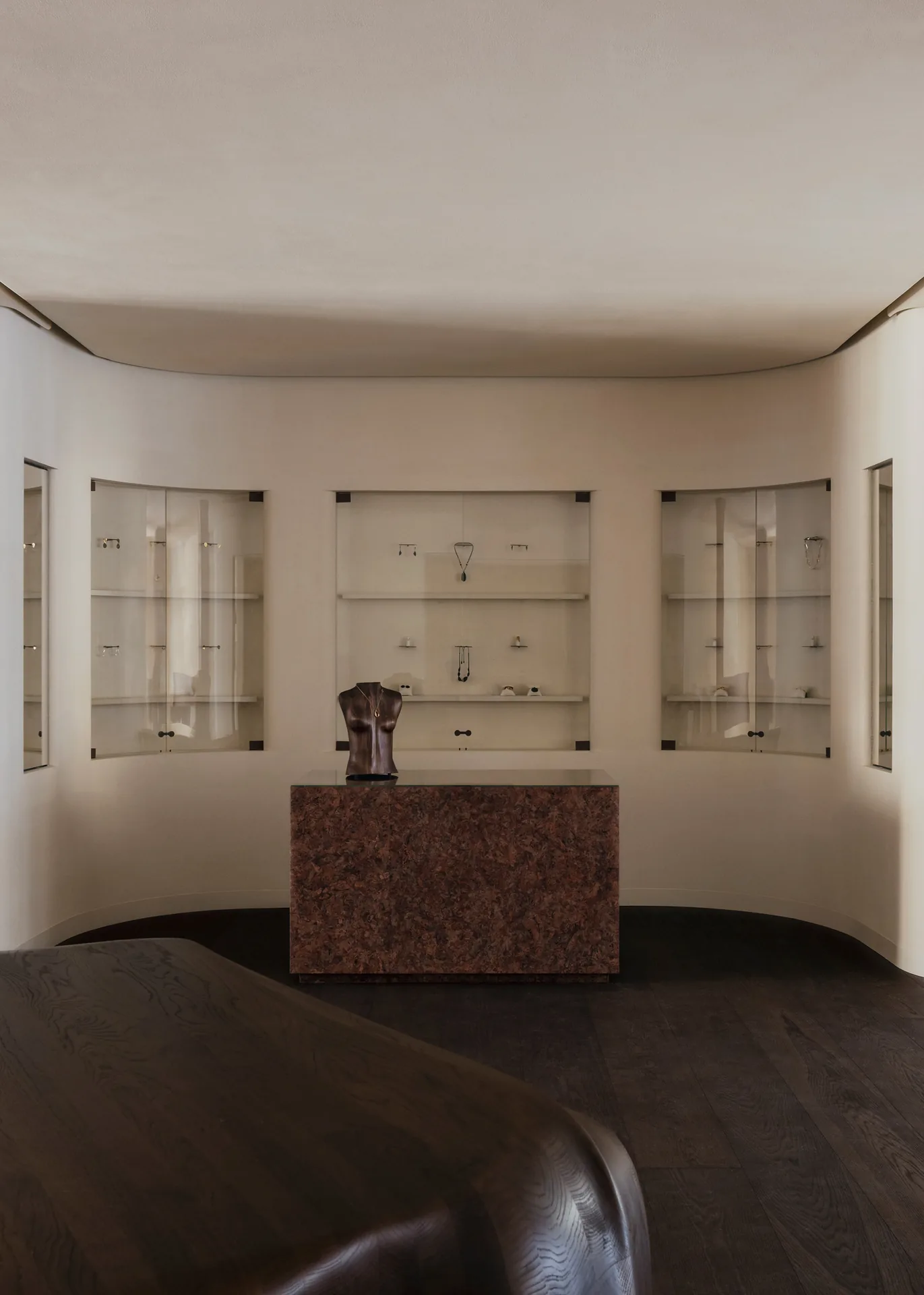
Around it, the quieter rooms at the back hold glass vitrines and a stone counter, and a curved leather bench sits by the window where the daylight arrives. The sequence moves from street to display to handling to sitting down, which is more structure than most retail interiors bother with.
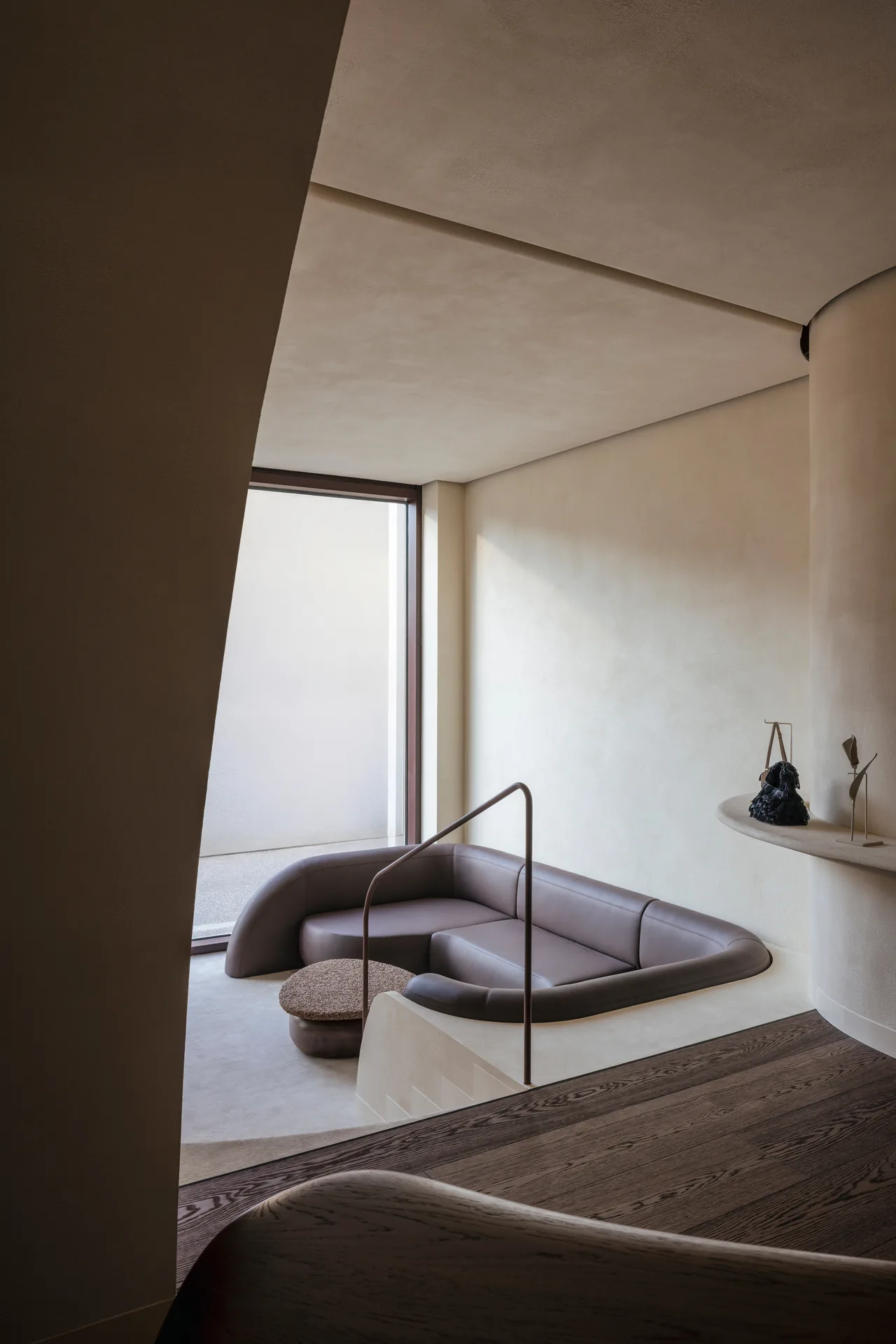
Polène describes the boutique as a sanctuary, which is the sort of word brands reach for easily. What makes it stick here is the plaster: a surface with no sharp edges and no repeated module, in a shopping street built almost entirely from flat glass and straight lines. For more on how a facade and an interior can argue different cases, see our piece on adaptive reuse in architecture.








Leave a comment