


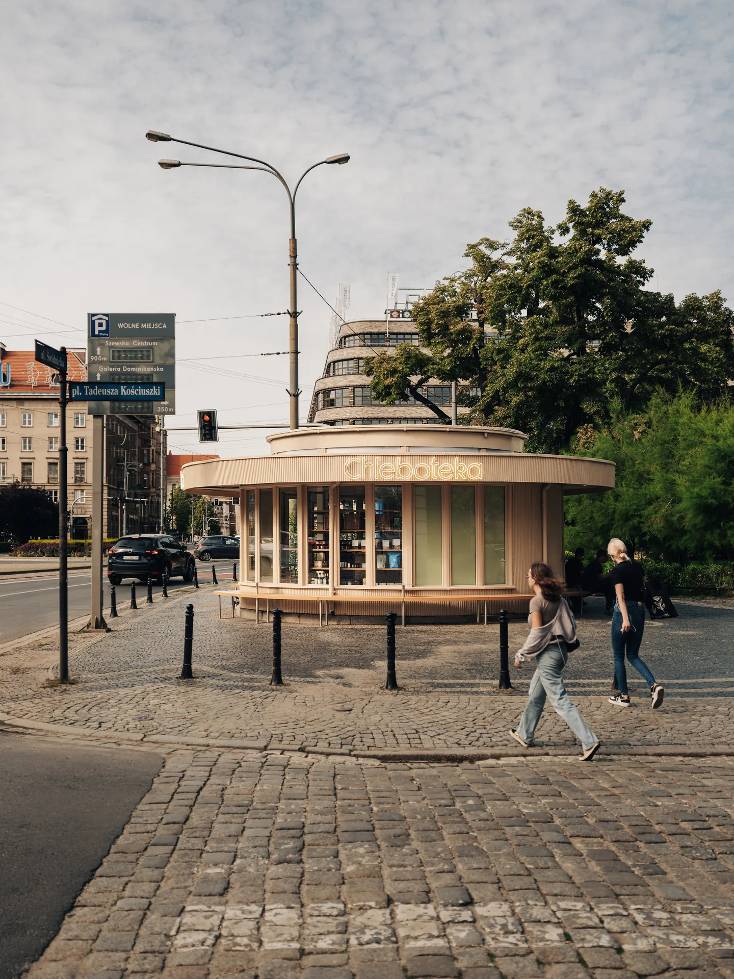
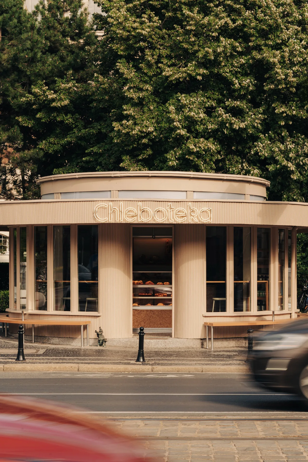
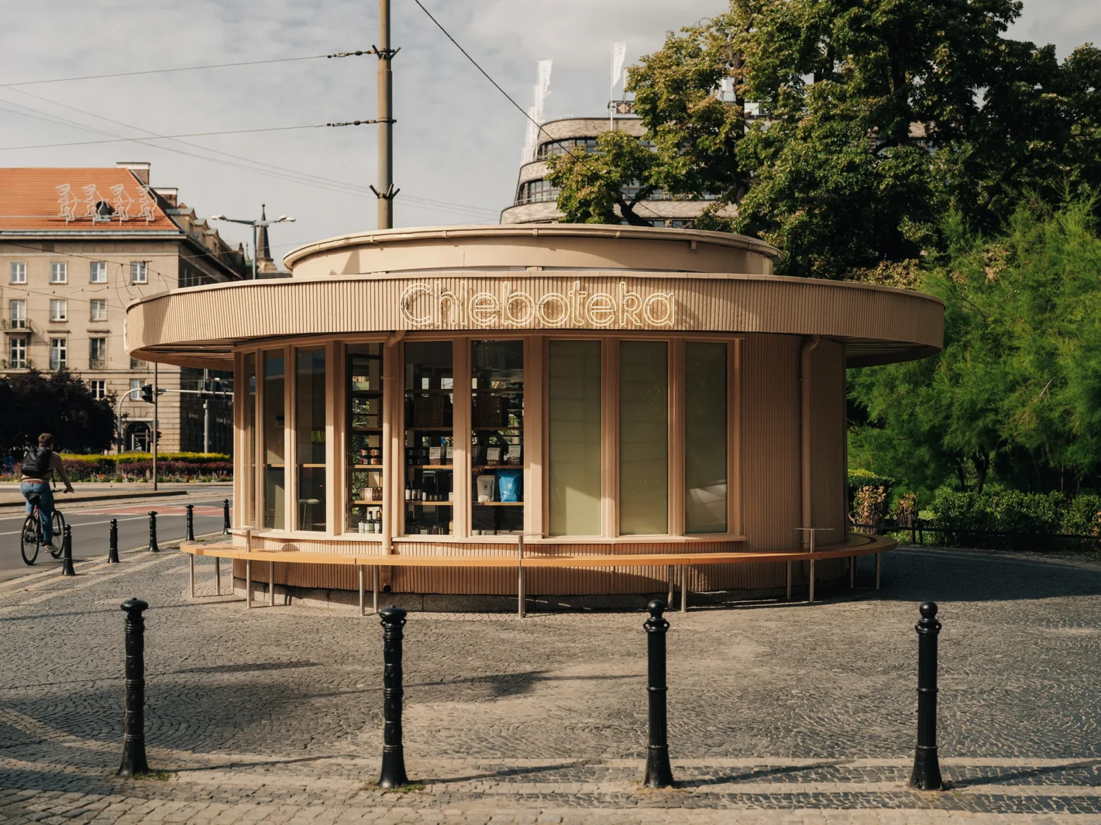
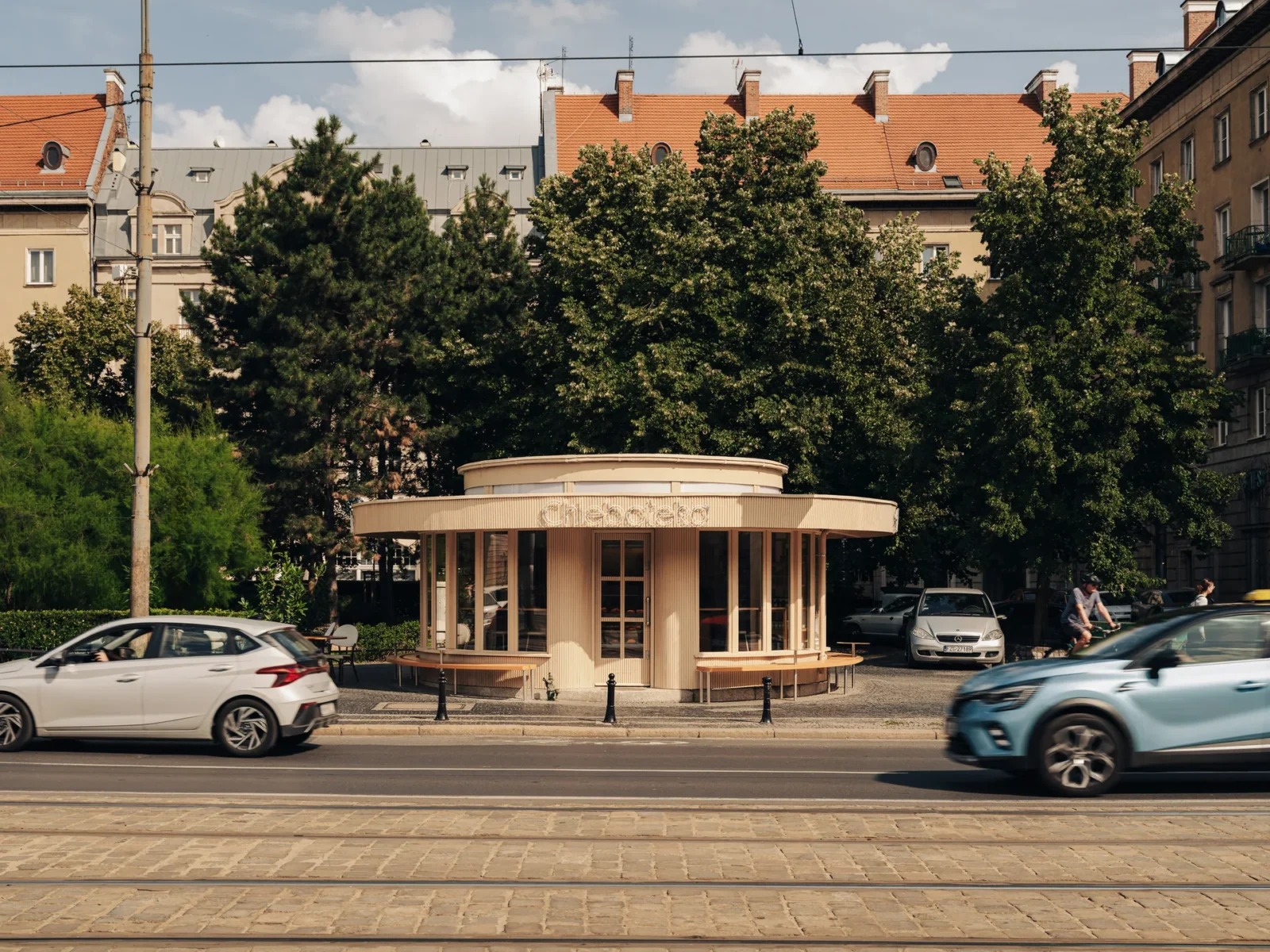

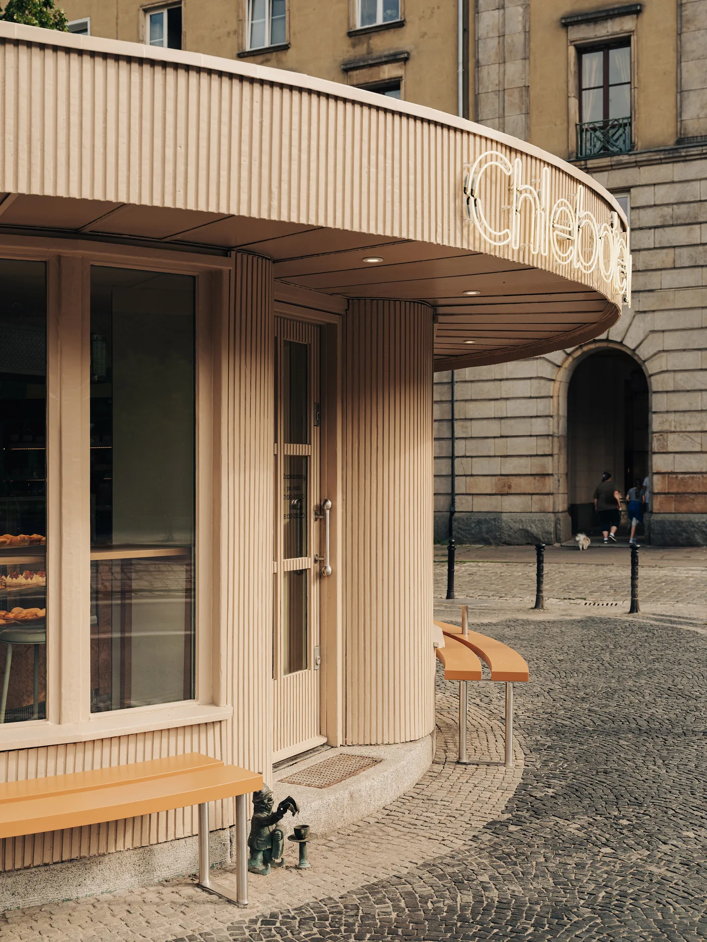

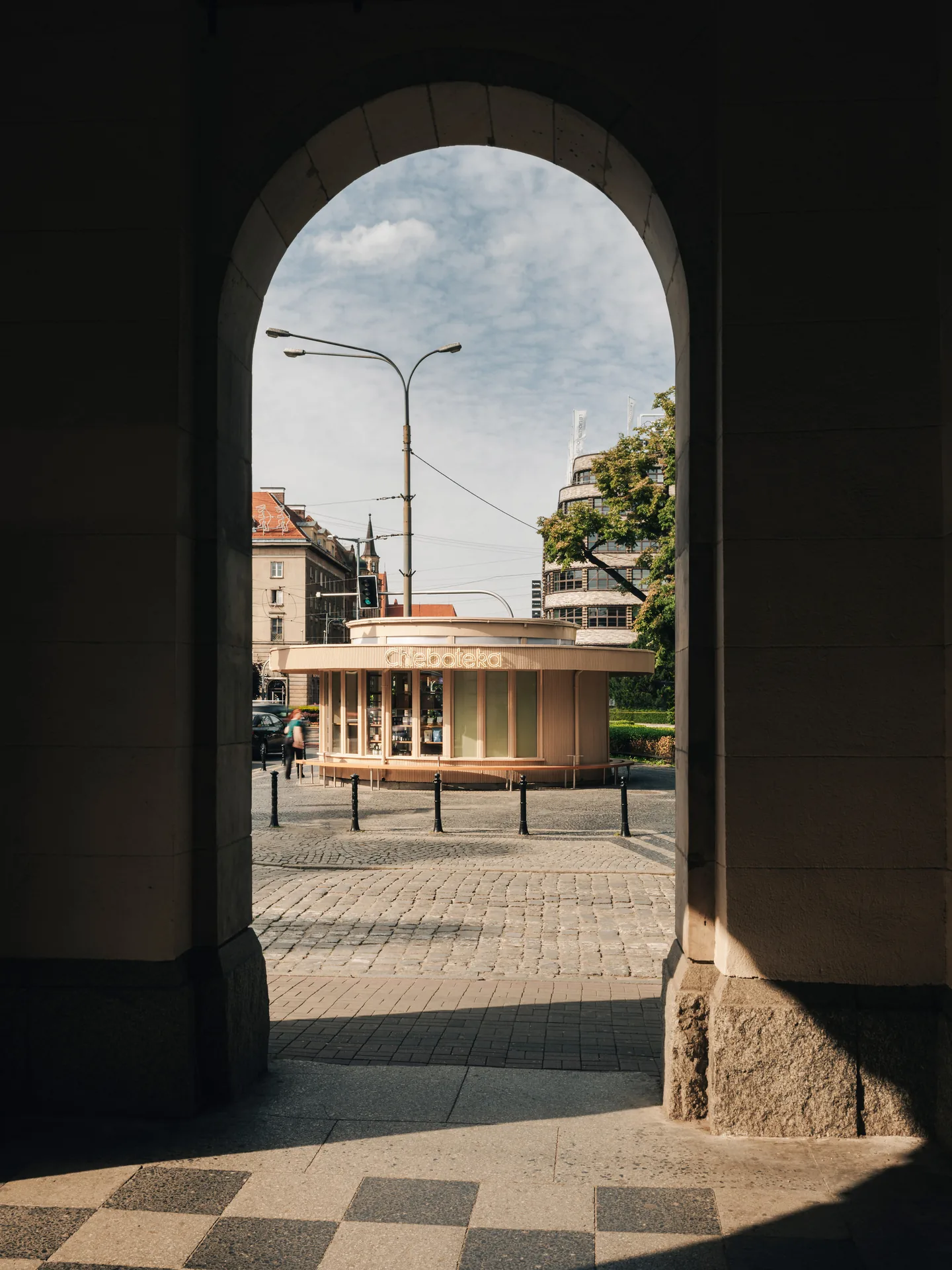




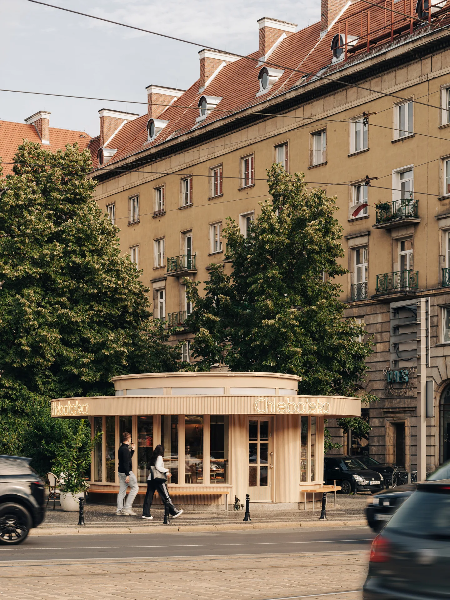
The main inspiration for Chleboteka Okrąglak was the building it takes its name from: Okrąglak, one of Wrocław’s iconic modernist landmarks. CUDO’s brief was to put a bakery at its foot, and the studio decided against reproducing a historical interior. What they did instead was carry the language of the building over into something contemporary, which in this case means taking one property, the rounded geometry, and running it through everything.
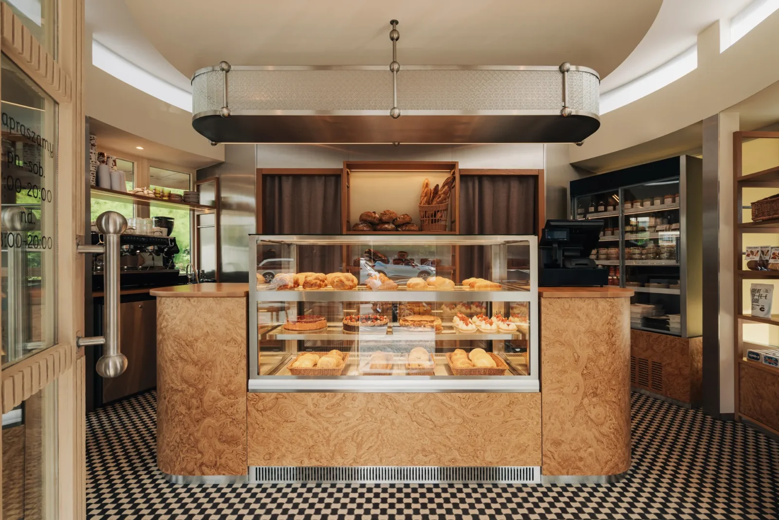
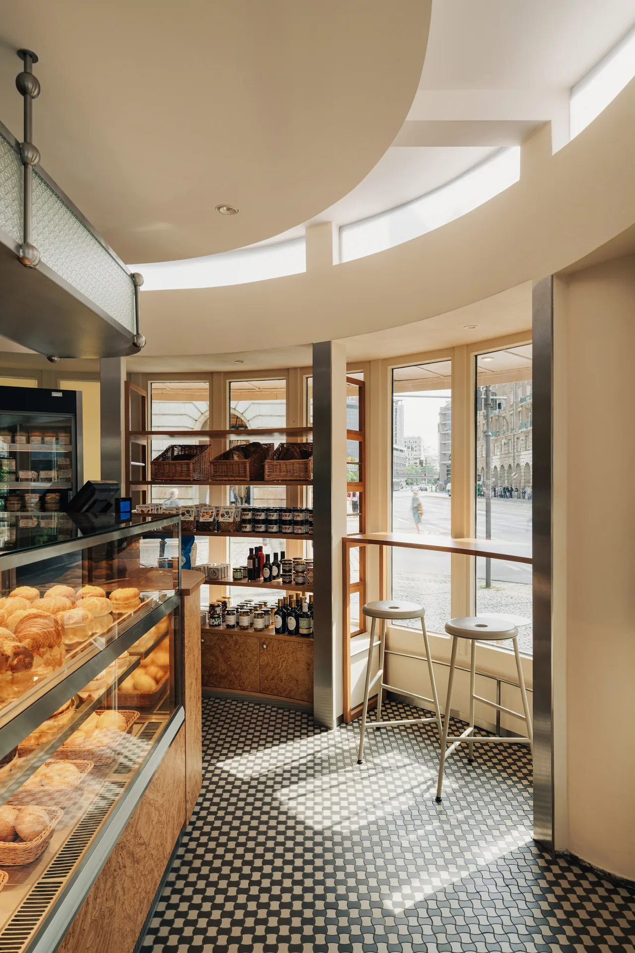
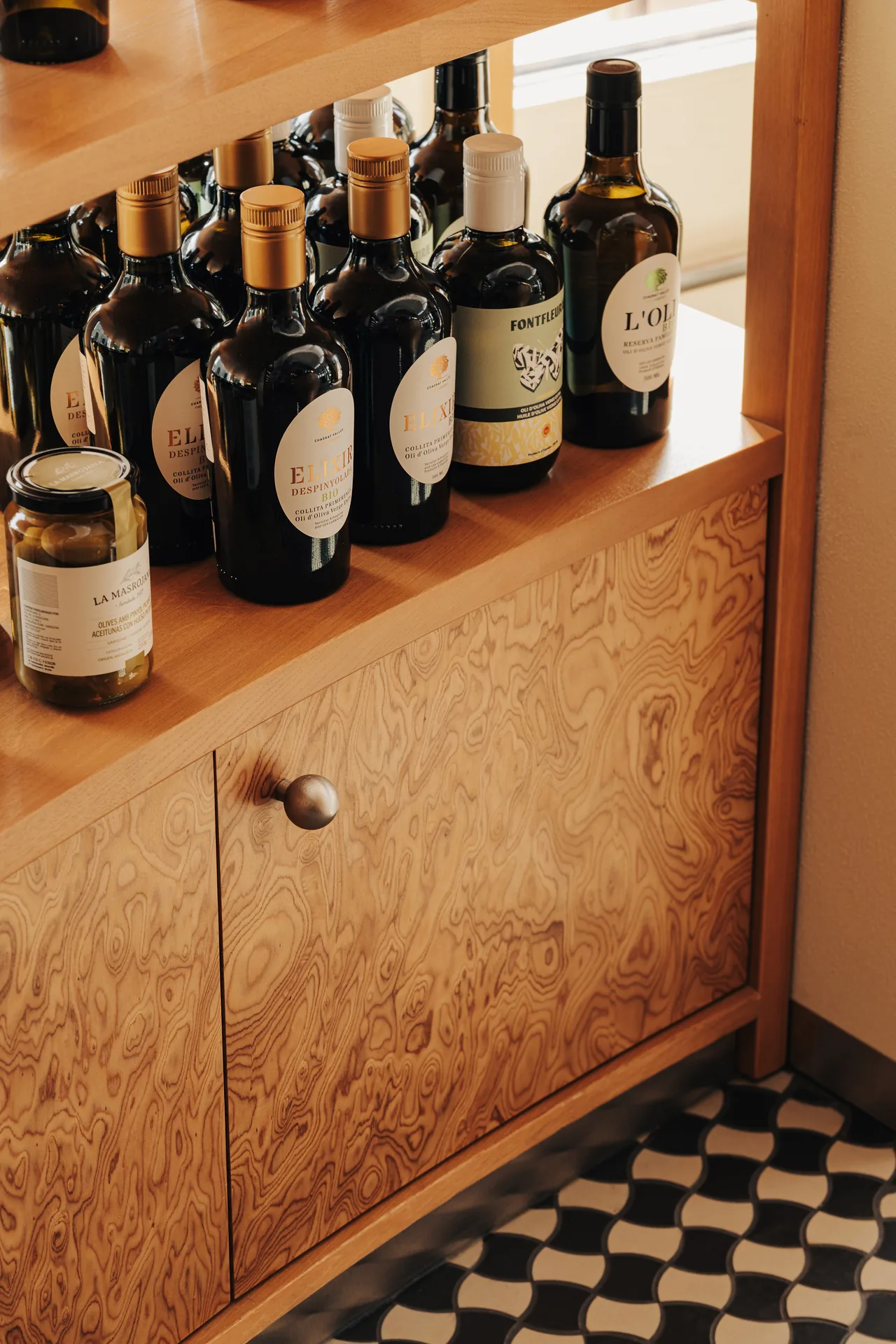
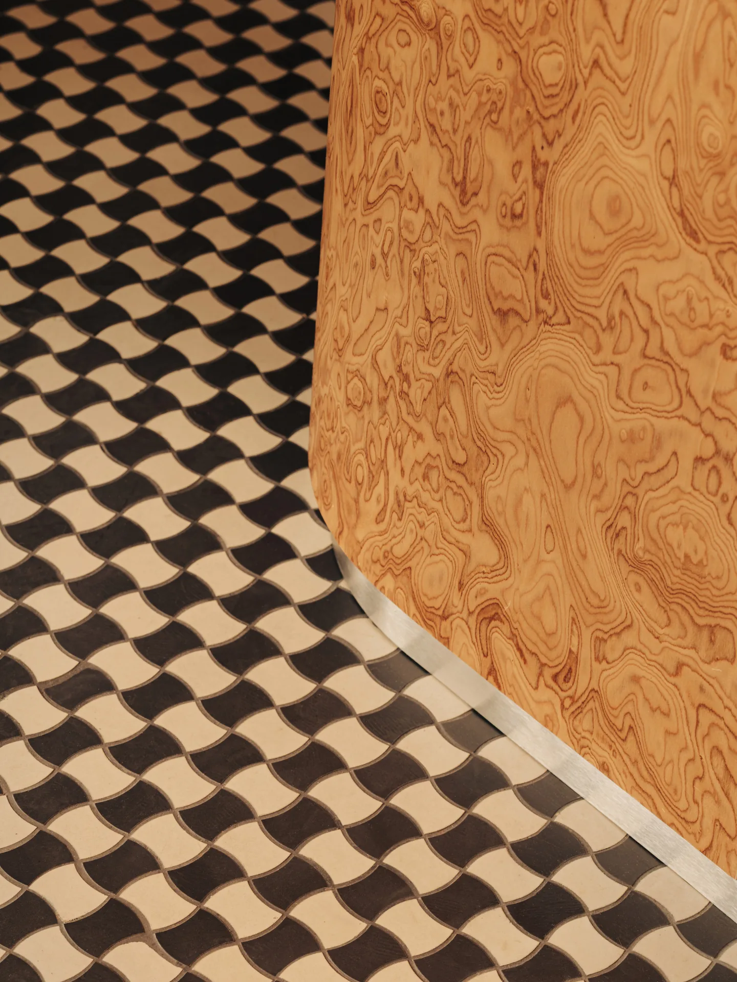
That geometry ends up in the counter, in the cabinetry, in the ceiling and in the smaller details. The materials carry the same reference without becoming pastiche: custom-made Warsaw gorseciki tiles, figured wood veneer, ornamental glass and steel, all of them pointing at modernist architecture while staying inside Chleboteka’s own contemporary identity.
Twenty-five square metres, and a bench
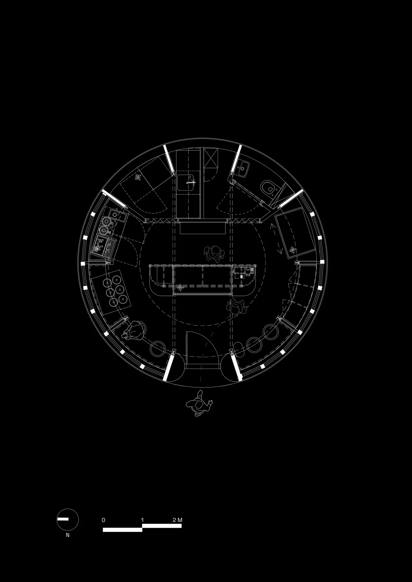
The hard constraint was area. Twenty-five square metres had to take the goods on display, the selling, the making of coffee, storage, the plant and everything the staff need. With numbers like that every element has to justify itself against a clearly defined purpose, and several functions were simply moved outside the walls.
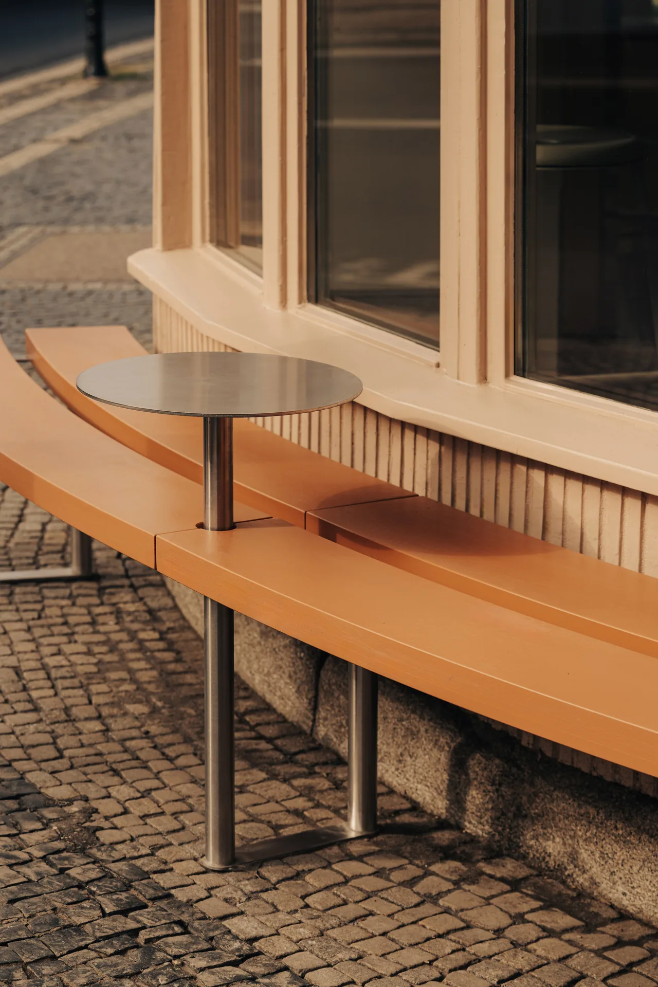
The most useful of those is the bench that runs around the building, which supplies the seating the interior could never have found room for. Together with the large glazed surfaces it does a second job as well, restoring the relationship between Okrąglak and Kościuszki Square. The boundary between inside and public space blurs, and the bakery becomes part of the ordinary life of that corner rather than a shop behind a window.

Working with the conservators
The other challenge was the building’s conservation status. A change as apparently minor as the new facade colour had to go through the conservation authorities, and the design had to hold two things at once: a refreshed appearance, and respect for what Okrąglak is architecturally.
Furniture drawn for the room it stands in
Nearly every important piece was drawn for this project alone: the counter you buy at, the display units, the shelving, which is the only way to get a plan this small to work. The display counter in the middle sets where customers go and where the transaction happens; shelving on the walls is display and storage in one. Plant and staff areas are squeezed as tight as they will go, so whatever is left over belongs to customers.
The result is a small interior with an unusually clear logic: the plan answers at once to how a bakery has to work and to the geometry of the building above it, and the two turn out not to conflict.










Leave a comment