


Table of Contents Show
A diagram is not a drawing of the building. It is a drawing of the decision: which spaces need each other, which must stay apart, how people move, what the single organising idea is. Diagrams are cheap and fast on purpose, because their whole value is that you can be wrong on them without it costing anything. This page sets out the types that matter, the order they come in, and the conventions that make them readable to someone other than you.
Why Diagrams Come Before Drawings
Once a plan has dimensions, every change is expensive to test. A wall moved on a dimensioned drawing pulls structure, services and area schedules with it. A circle moved on a diagram costs nothing. That asymmetry is the entire argument: the questions that are hardest to answer are the ones best answered while the answer is still free to change.
The failure this prevents is specific. A building can be geometrically resolved and functionally wrong: the plan closes, the areas add up, and the patient still has to walk through the procedure suite to reach an examination room. Diagrams catch that in an afternoon. Plans catch it in month four.
The Order They Come In
The types below are not alternatives. They are stages, and taking them out of sequence is the most common reason a diagram feels like busywork.
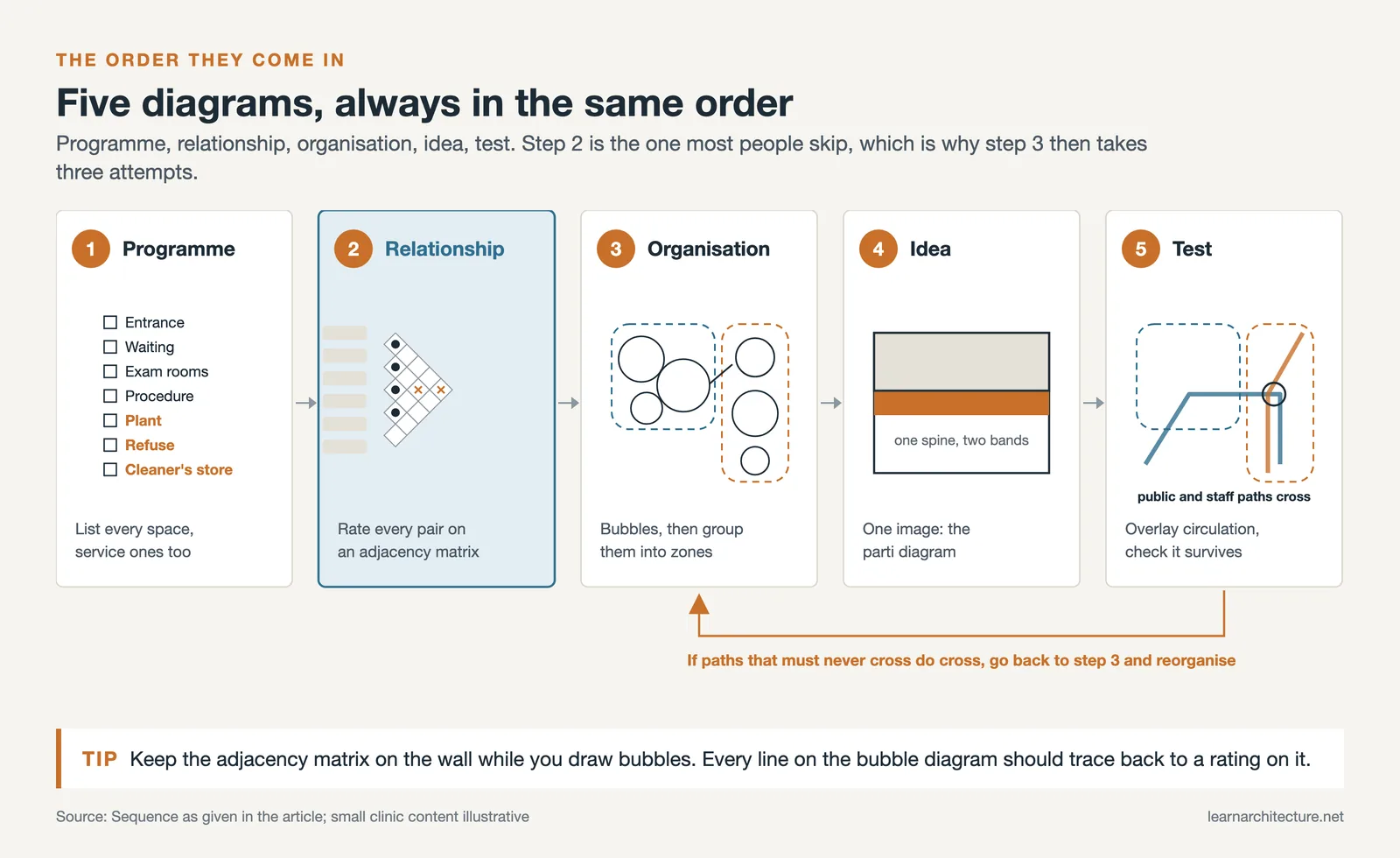
- 1: Programme. List every space the brief demands, including the service spaces everyone forgets: plant, refuse, cleaner’s store.
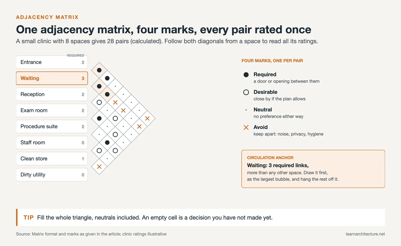
- 2: Relationship. Decide what needs to touch what, on an adjacency matrix. This is the step most people skip, and skipping it is why the next stage takes three attempts.
- 3: Organisation. Arrange the result as a bubble diagram, then group it into territories with a zoning diagram.
- 4: Idea. Distil the whole scheme into one image, the parti diagram.
- 5: Test. Overlay movement with a circulation diagram and check the organisation survives it.

The Types, and What Each One Is For
Adjacency matrix
A triangular grid with the programme down one side, where every pair of spaces is rated once: required, desirable, neutral or avoid. It is the least glamorous diagram and the most useful, because it forces a decision on every relationship rather than only the obvious ones. Guide: adjacency diagrams and how to build one. There is also a blank worksheet to print.
Bubble diagram
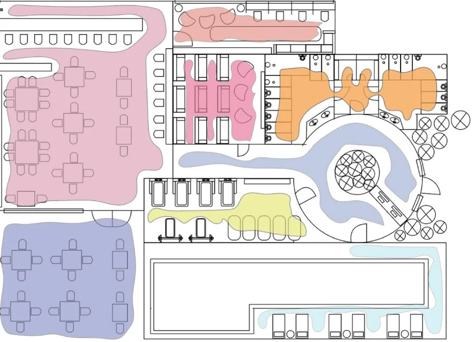
Circles for spaces, lines for relationships. Circle size carries hierarchy rather than area, and position carries relationship rather than geometry; nothing on it is measured, which is the point. This is the workhorse of early design. Full guide: how to design a bubble diagram, and for rooms rather than buildings, bubble diagrams in interior design.
Zoning diagram
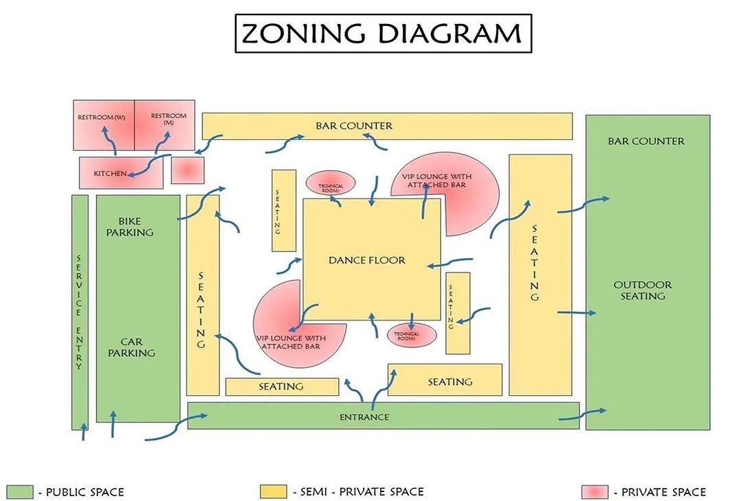
One level up from bubbles: spaces grouped into territories (public, private, service) and often related to the site. Where a bubble diagram asks what connects to what, a zoning diagram asks what belongs together. Guide: how to create a zoning diagram, which also covers the difference between this and municipal land-use zoning, a distinction briefs regularly confuse.
Parti diagram
The whole scheme reduced to a single organising idea: an axis, a void, a shift, a stacking. If it takes more than one image, it is not a parti yet. Guide: mastering architecture parti diagrams.
Circulation diagram
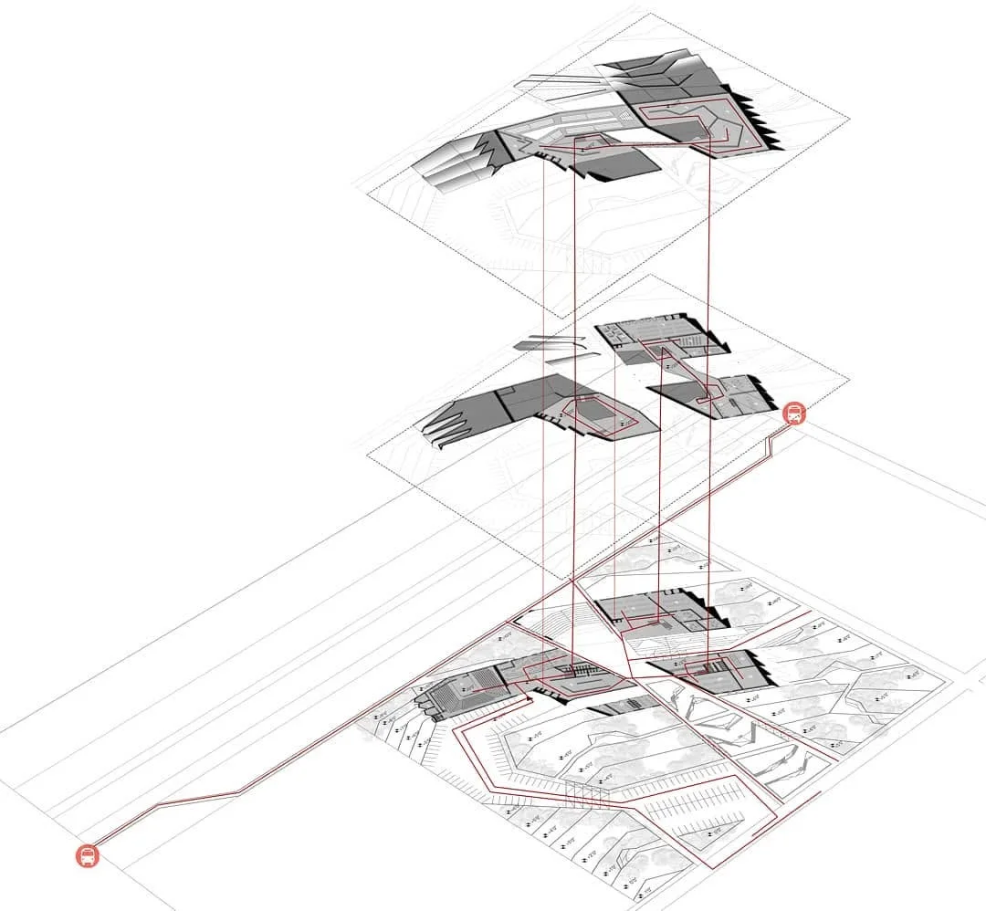
Movement drawn as its own layer: who goes where, and whose paths must never cross. Overlaid on a zoning diagram it exposes conflicts that neither drawing shows alone. Guide: architecture circulation diagrams.
Concept diagram
Not the same as a parti. A concept diagram explains the reasoning (why the scheme is organised as it is) while a parti shows the result at a glance. Guide: architectural concept diagrams.
SWOT analysis
Borrowed from strategy rather than from design, and unusually useful on site and brief analysis where the constraints are not spatial. Guide: SWOT analysis in architecture.
For the wider family and where each sits in the process, see understanding architectural diagrams.
Conventions That Make a Diagram Readable
There is no universal standard. What makes a diagram legible to someone else is using the same visual language consistently and stating it on the sheet.

- Circle size: large for primary spaces, medium for secondary, small for service. Hierarchy, not area.
- Solid line: a direct physical connection is required: a door or an opening.
- Dashed line: indirect or optional, including a visual connection only.
- Double line: main circulation, a corridor or a spine.
- Colour: warm for public, cool for private, neutral for service.
Add a short legend to every sheet. Clients who have not seen the convention read circles literally, as round rooms or as final sizes, and one line of explanation prevents most of that. We keep a free symbols and legend sheet you can print and work from.
Common Mistakes
- Going straight to the floor plan. The layout that results works geometrically and fails functionally, and by then it is defended by hours of drawing.
- Treating the diagram as a deliverable. It is a working tool: loose, fast, disposable. If a version takes more than half an hour, it has become too detailed for the stage it is at.
- Colour-coding without a legend. An unexplained colour is worse than no colour.
- Confusing zones with rooms. A zone is a group with shared requirements, not a space with walls.
- Drawing one diagram and stopping. The types answer different questions. A bubble diagram that has never been tested against circulation has only been half checked.
Frequently Asked Questions
What is the difference between a bubble diagram and a zoning diagram?
A bubble diagram works at the level of individual spaces and the connections between them: which room needs a door to which. A zoning diagram works one level up, grouping spaces into territories such as public, private and service, and often relating those to the site. In practice you draw bubbles first and zones second, because you cannot group what you have not yet related.
What is the difference between a parti and a concept diagram?
A concept diagram explains the reasoning behind the scheme: the drivers, the response, the logic. A parti diagram is the result of that reasoning distilled into a single image: one axis, one void, one move. The concept is the argument; the parti is the conclusion. A project usually needs both, and they are not interchangeable in a presentation.
Which diagram should I start with?
An adjacency matrix, even though it is the least visual. It forces a decision on every pair of spaces rather than only the ones you were already thinking about, and it usually reveals that the brief has not been asked a question it needs to answer. Everything after it is faster because of it.
Do I need software to make architectural diagrams?
Not for the first pass, and using it early is usually counterproductive. Paper and a pen beat any software when the point is to draw badly and fast. Vector tools such as Illustrator, Affinity Designer or Figma are worth reaching for once a diagram needs to be presentable rather than exploratory.
How many spaces should a diagram show?
Ten to fifteen elements on one sheet is comfortable. Beyond that, split by floor or by zone and draw a second sheet showing how those zones connect. A diagram nobody can read has stopped doing its job, and the fix is always another sheet rather than smaller circles.










Leave a comment